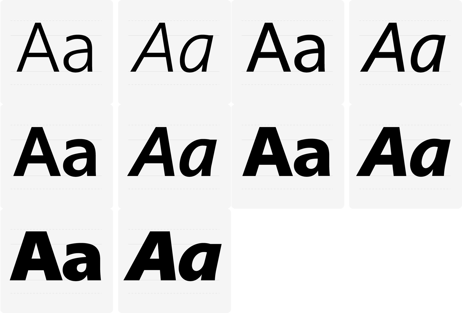
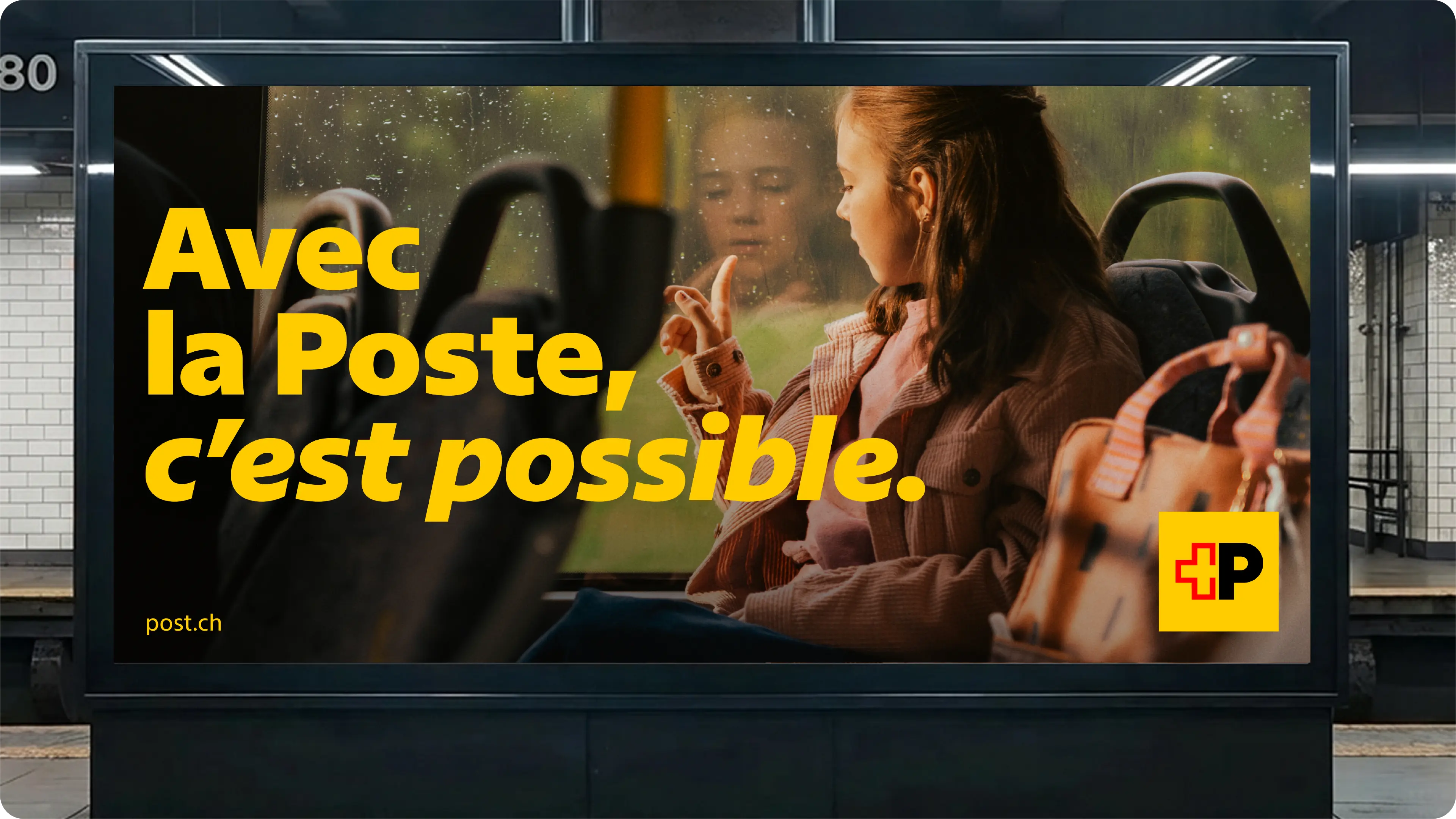
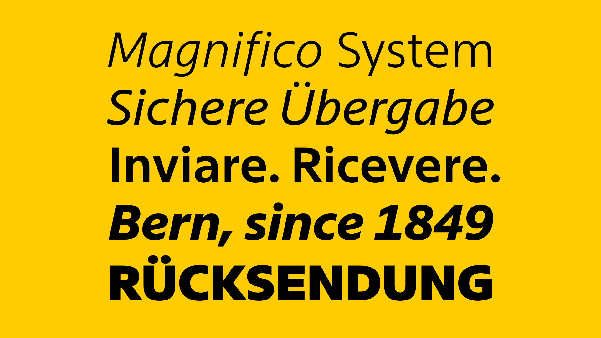
Some projects are career-defining, and among those, some still hold a special place. The job we present here is one of those. With immense scope, exacting constraints, and high visibility, it checks all the boxes. Most importantly, it is for (and with) an institutional client, Swiss Post, a staple of Swiss lifestyle, and thus our own lifestyle, adding to the professional achievement an emotional one.
Swiss Post selected Swiss Typefaces on the strength of the catalogue’s overall aesthetic and positioning. It then issued a clear and comprehensive brief, characteristic of institutions of this kind: a custom corporate typeface, with a custom licence tailored to the specificities of their complex uses. Radical transparency — including on financial matters — paired with an iterative process and continuous communication, established a strong collaborative framework. Within it, the project evolved into an entirely new, tailor-made typeface. Together with the client, we completed the ambitious task of replacing the historical typeface with a new one: Swiss Post Sans.
While it is impossible to fully represent a process spanning over more than three years and hundreds of hours of work, here is an overview of the key takeaways.
Uprights: a controlled transition
The job comprised two deliverables: an Upright and its Italic. Given the Uprights’ key role in the Post’s visual identity and a sensitive timing, they were developed first. The Italics came second, designed as a complementary stylistic element.
The development of the Uprights of Swiss Post Sans came with a simple, but major constraint: there would have to be a “Hard Switch”. The new typeface should allow the previous one to be replaced by a simple swap of font files, not requiring any adjustment or change to the designs or layouts in which they are used. A challenge made exponentially more complex for companies with such a variety of uses.
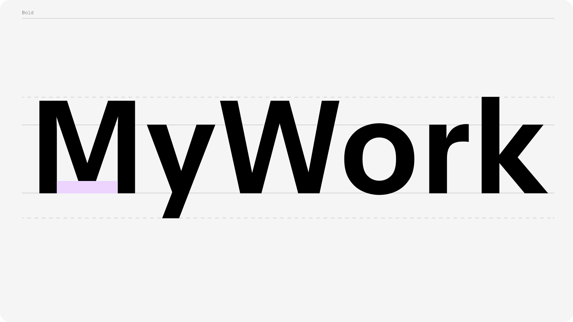
To achieve this, it was necessary to strictly maintain the original font’s “encombrement”. In other words: the font had to maintain overall typographic volume. This parameter required that we exceptionally granted the client a very early access to beta files, allowing them to test in real-life conditions its technical performance. Additionally, Swiss Post, always in pursuit of optimal thoroughness, had recruited a group of external experts informing and guiding their reviews. Thanks to highest-level engineering, we ensured all characters would behave exactly as needed. Collected feedback led to enhanced directions for the font’s development.
“The most memorable moment of the project was taking the very first beta files for a test drive. Although the project came with very strict restrictions, seeing the initial results was genuinely exciting — the typeface felt subtle yet distinctly different and fresh. It was the moment when the full potential of the project became tangible.”
— Swiss Post —
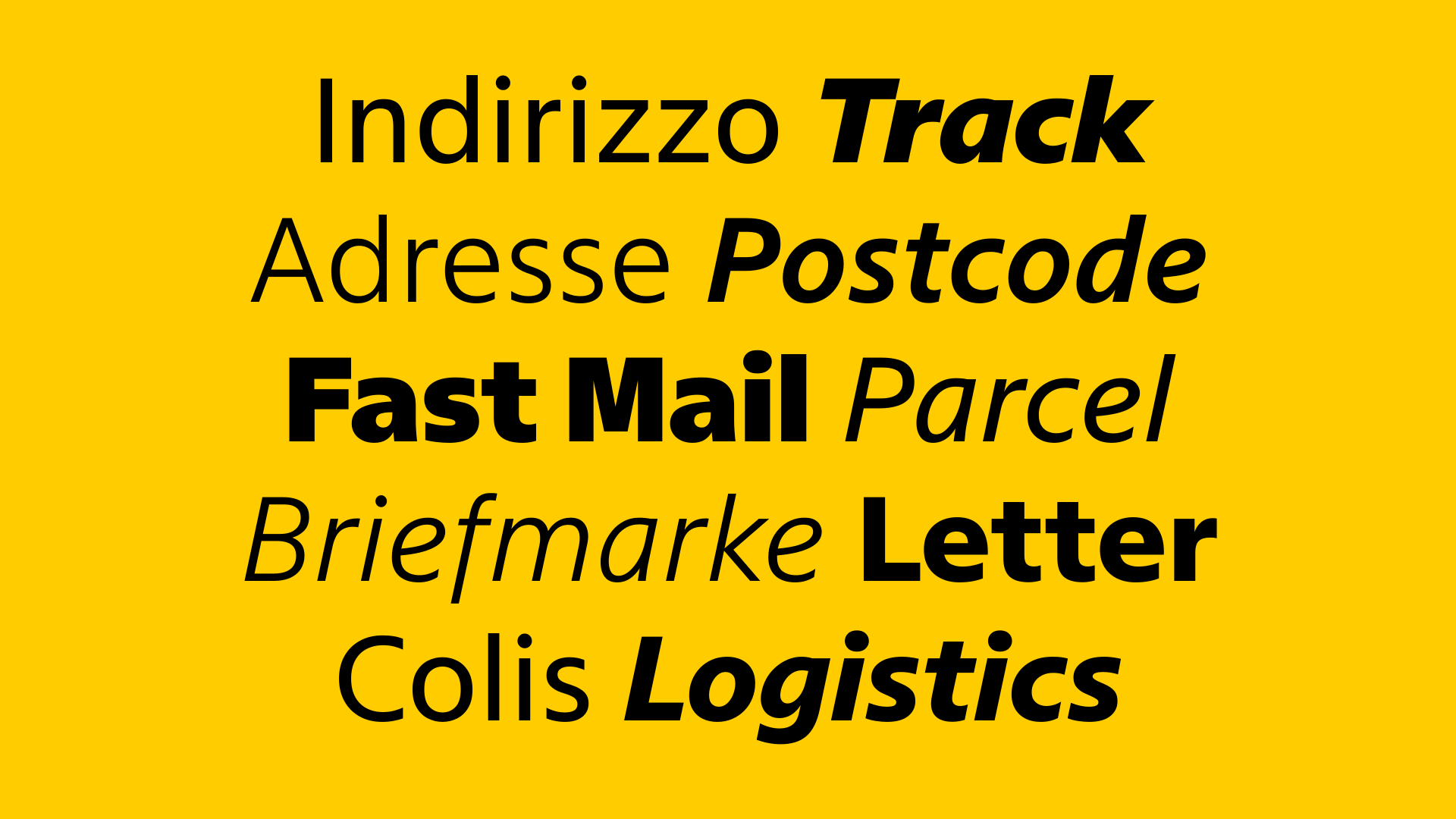
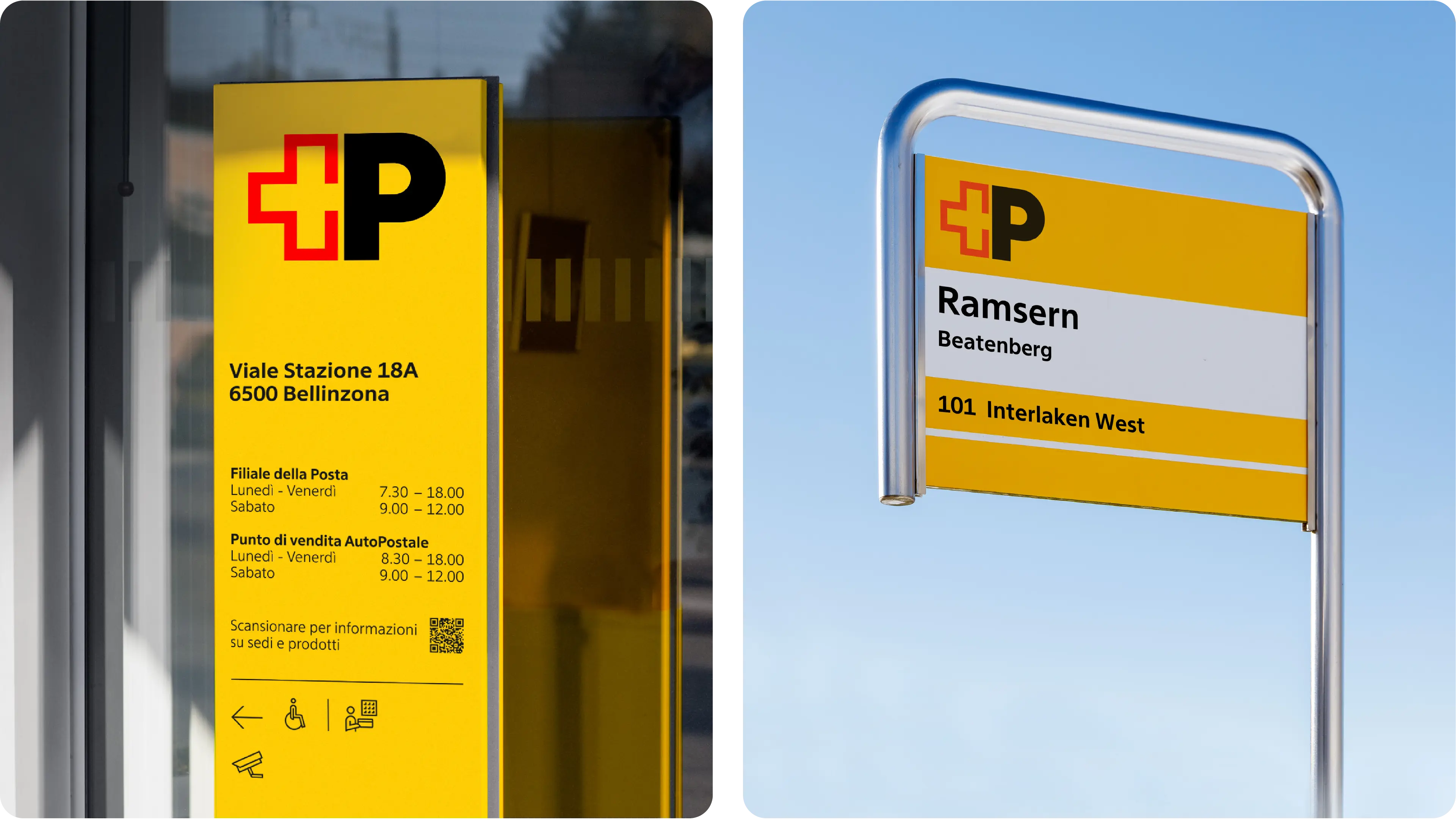
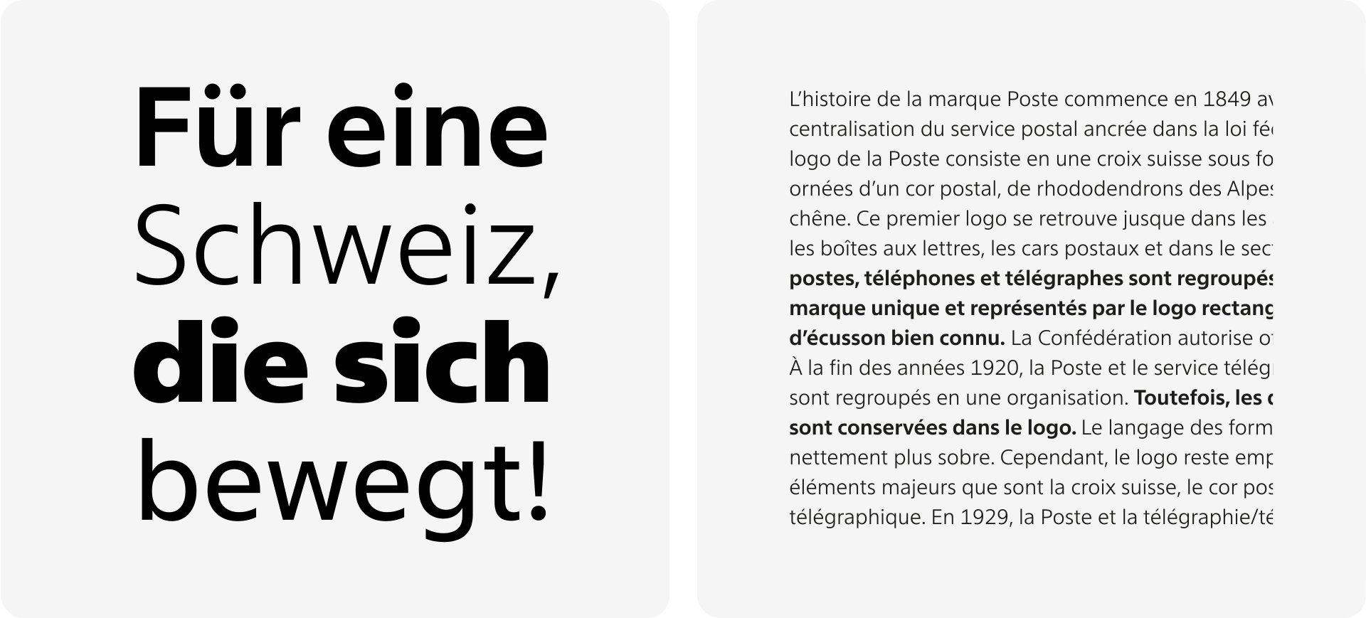
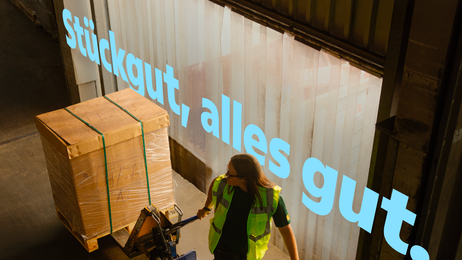
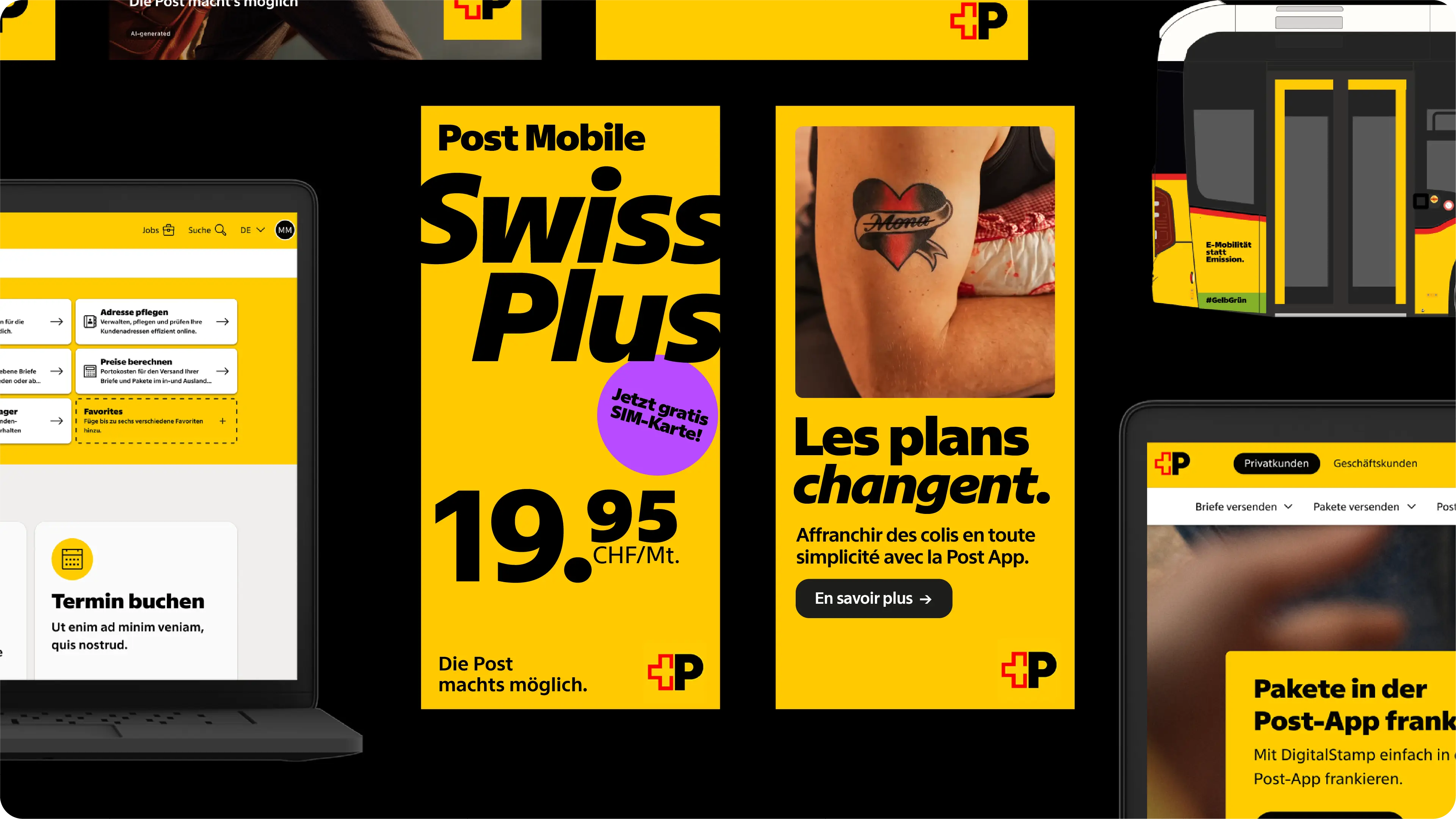
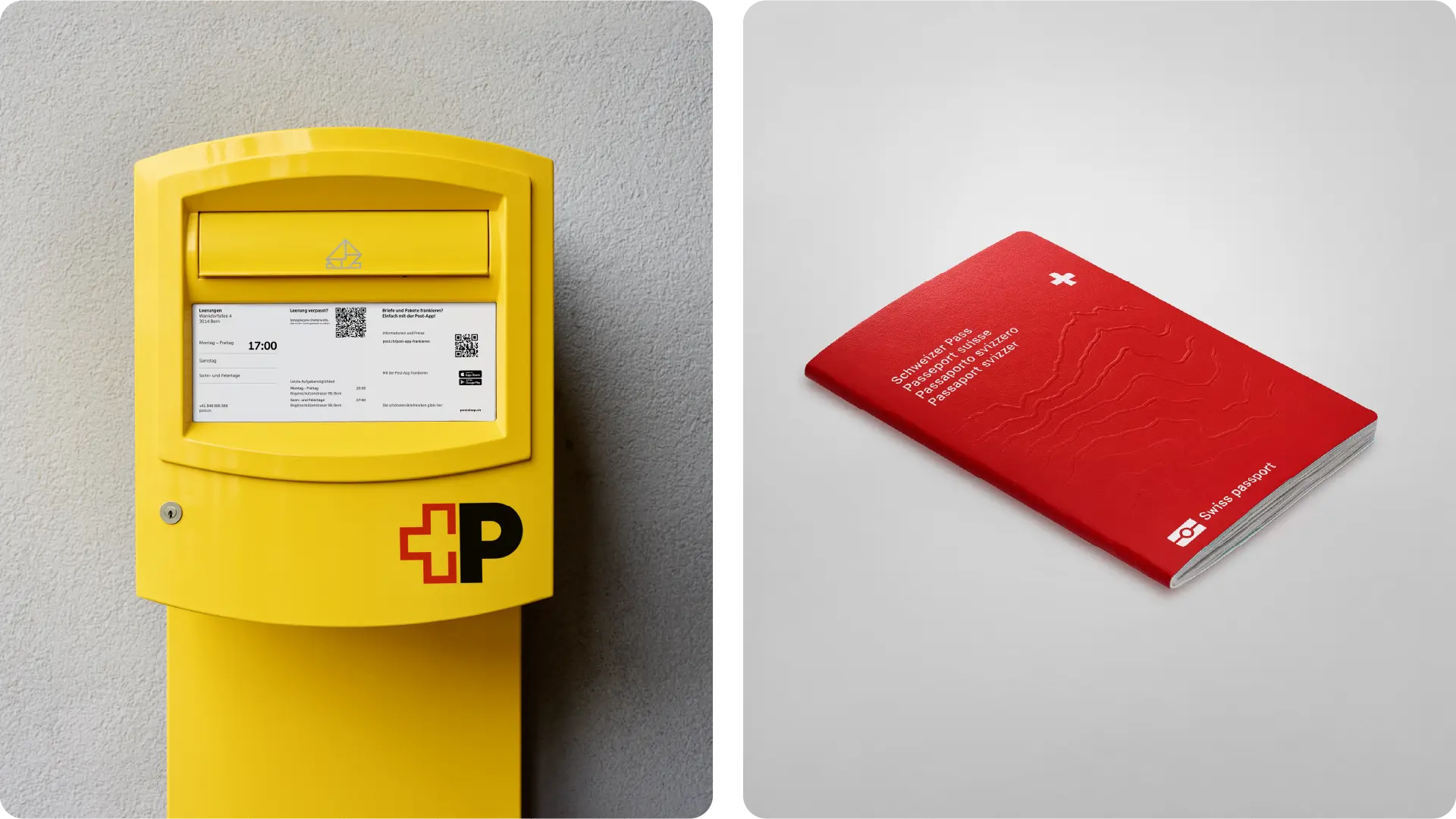
The new Swiss Post typeface was designed for optimal coherence in every context, on any support, and in any design. It has to perform flawlessly both in digital or printed environments, because it is used everywhere: on street adverts, signage, trains, trucks, bus stops, pamphlets, stamps, mailboxes, websites, apps, and more. While the original brief mentioned separate screen and print versions of the typeface, we made the bet that the right combination of formal refinement and top-tier engineering would result in a single font able to fit all bills.
The unusual wide range of uses, in addition to Switzerland’s multilingual context — which often results in communications produced in four different languages — further drove the point that nothing in the font could be overlooked. The same level of attention was applied to every character, letter, punctuation mark, numeral, less common glyph, accent, special kerning pair. Due to the predominant need for numeric information such as pricing schemes or timetables, it was decided to keep the numerals tabular by default, a reminder of its utilitarian role.
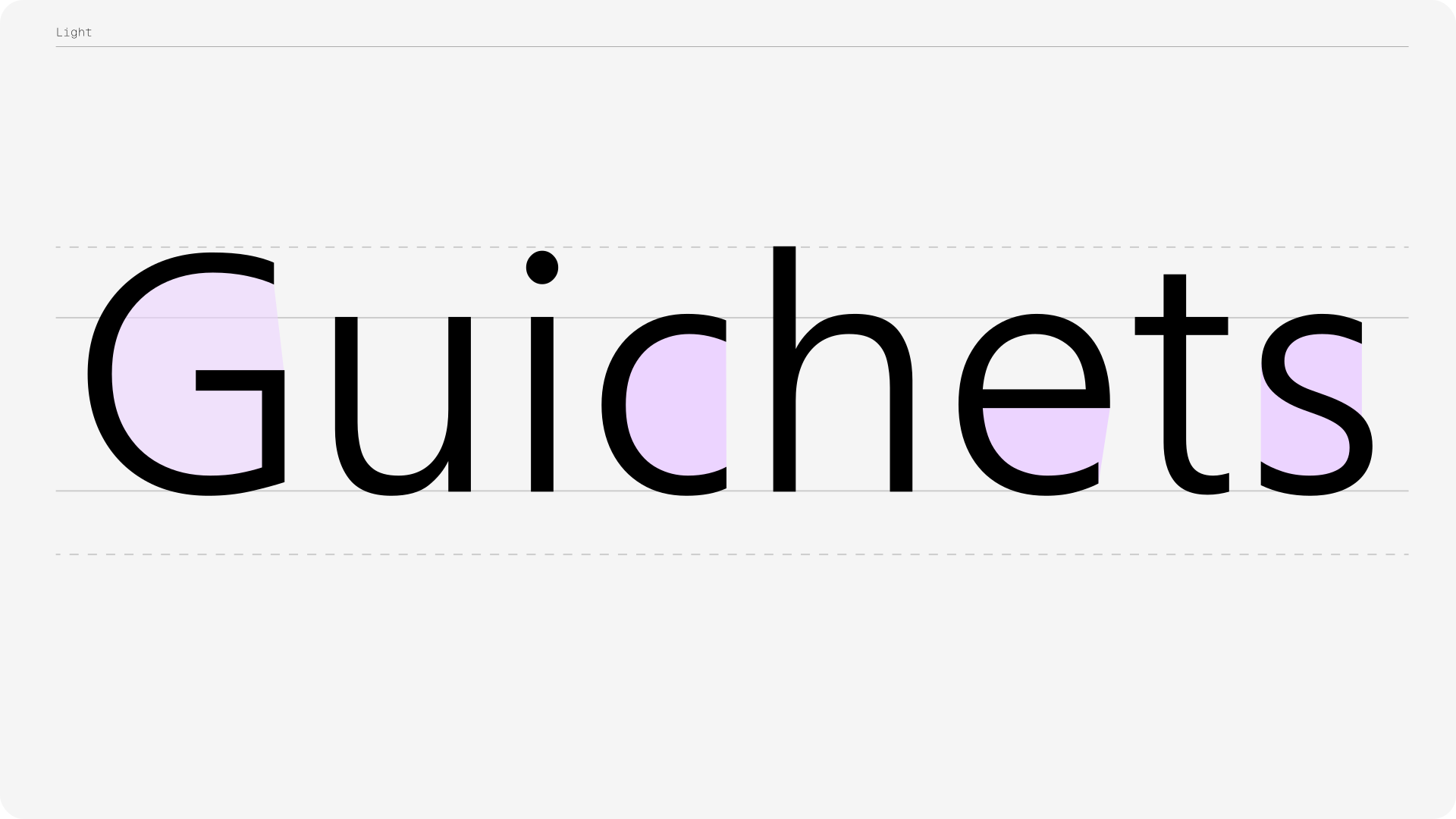
One of the goals was to respect Swiss Post’s established brand image, building on their heritage, tone, and widely recognized presence, while infusing it with a new contemporary dimension. Although not originally intended as a change to the visual identity, nor a design statement, Swiss Post met the opportunity to update their overall visual presence with a lot of enthusiasm. The new typeface consequently needed to balance technical performance with corporate identity. The typical lifespan of a typeface for such a company is not measured in months or years but in decades. With such longevity in mind, the new font was designed to bring an innovative tone to the timeless “Swiss” base we were working from. It was decided to give to the design some “humanistic” characteristics, gently redefining Swiss Post’s identity as inclusive, warm and inviting through softer shapes. While staying far away from quirky, the new typeface would be friendlier than its predecessor. An easily recognizable change, for instance, was the client’s request to move on from a square dot to a round one.
“The combination of rounded, humanistic forms with very precise, sharp endings brings together an approachable, human quality with a sense of reliability and trustworthiness. In this balance, the typeface is truly tailored to our brand identity.”
— Swiss Post —
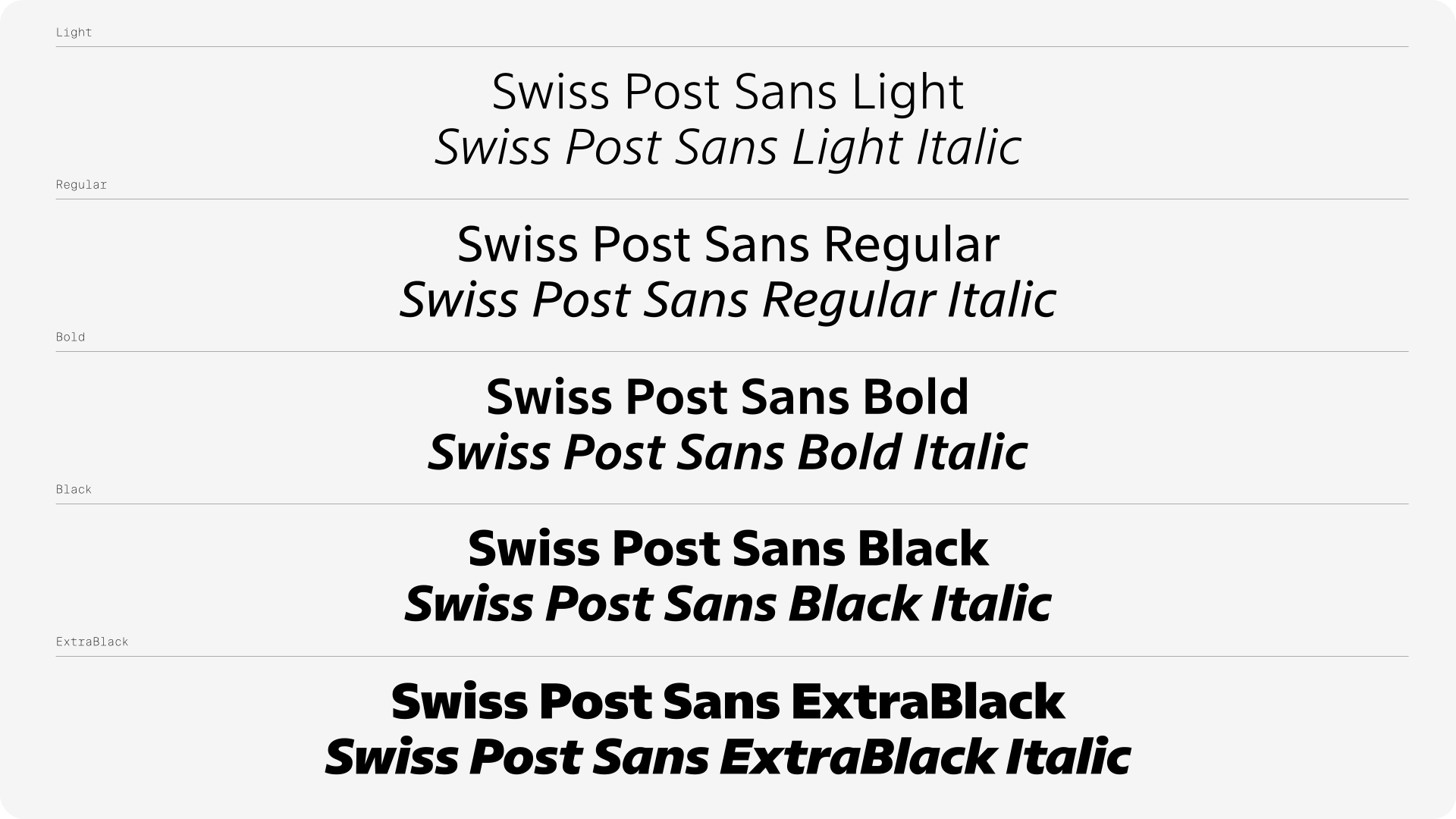
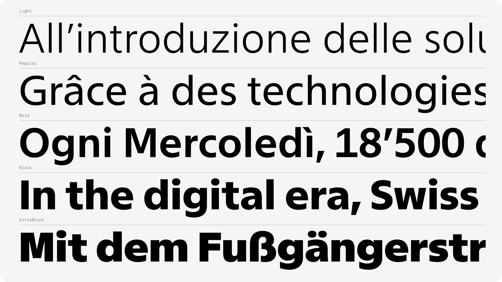
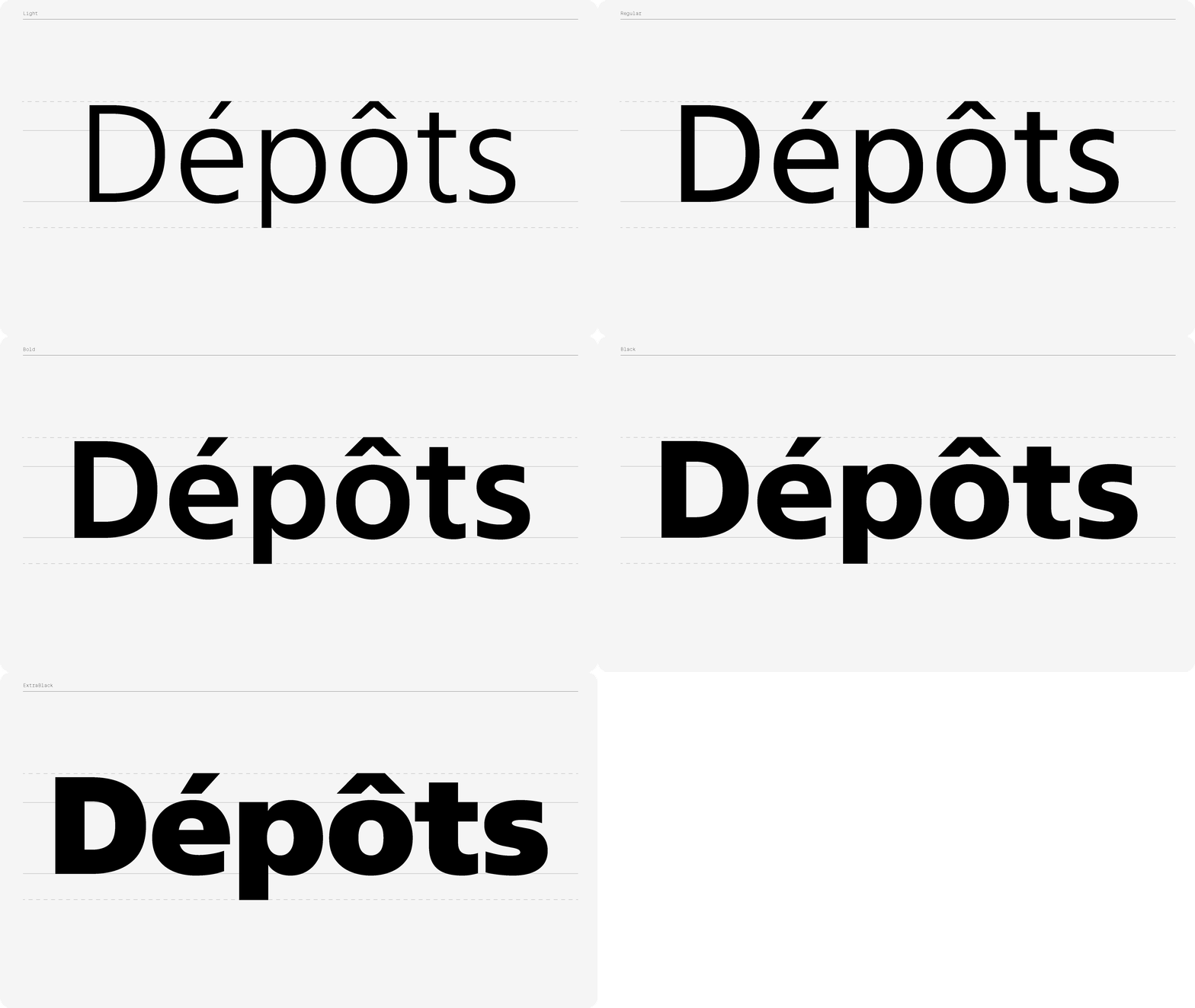
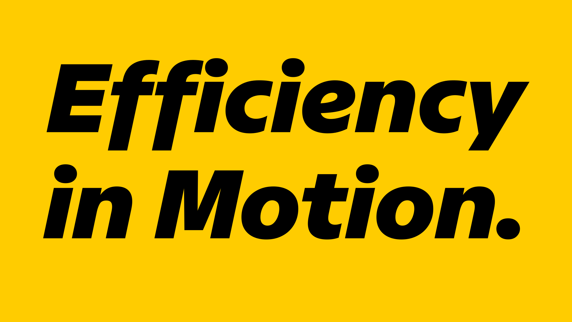
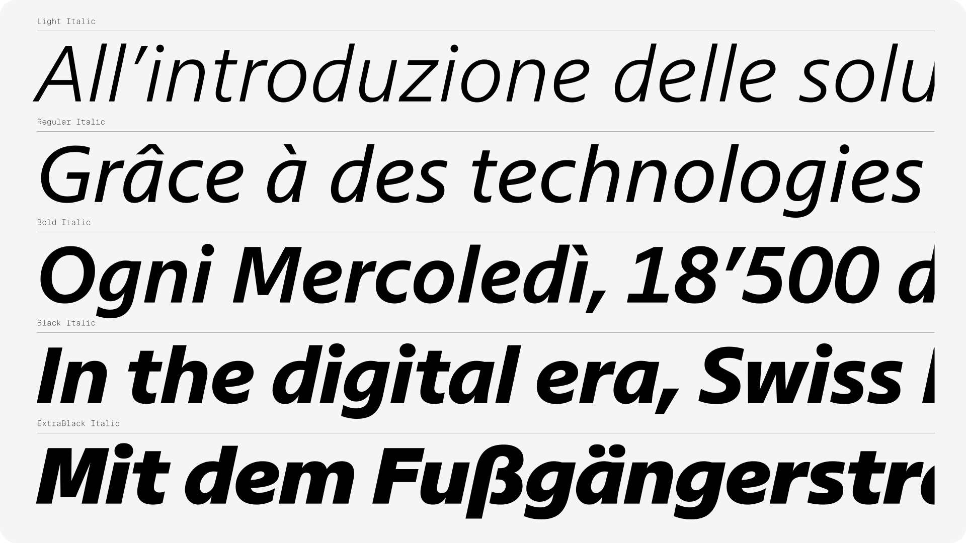
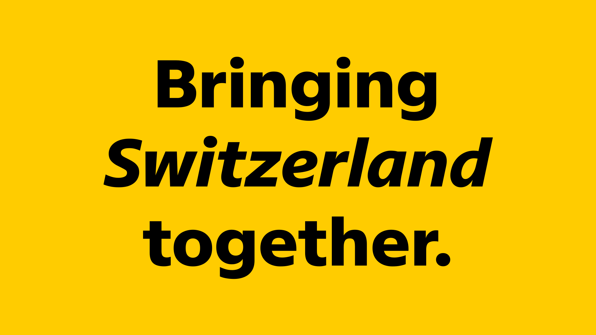
Five weights were developed for the font: Light, Regular, Bold, Black and ExtraBlack. Of all of them, it was the bolder weights which turned out to receive the most attention. Black and ExtraBlack were specifically emphasized by the client for their role as core DNA of the Post’s identity. They now meet the need to be highly distinctive while still remaining space-efficient. In their application, they are now often balanced with a growing use of the Light weight, which at times even surpasses the Regular.
The Italics: a new voice
While the development of the upright styles was constrained by the need to replace the old typeface, the Italics required no reference to the old fonts and therefore came with a welcome increase in creative freedom. Swiss Post team’s engagement and enthusiasm, along with the confidence gained during the first “Uprights” phase, made the second phase all the more collaborative and fun.
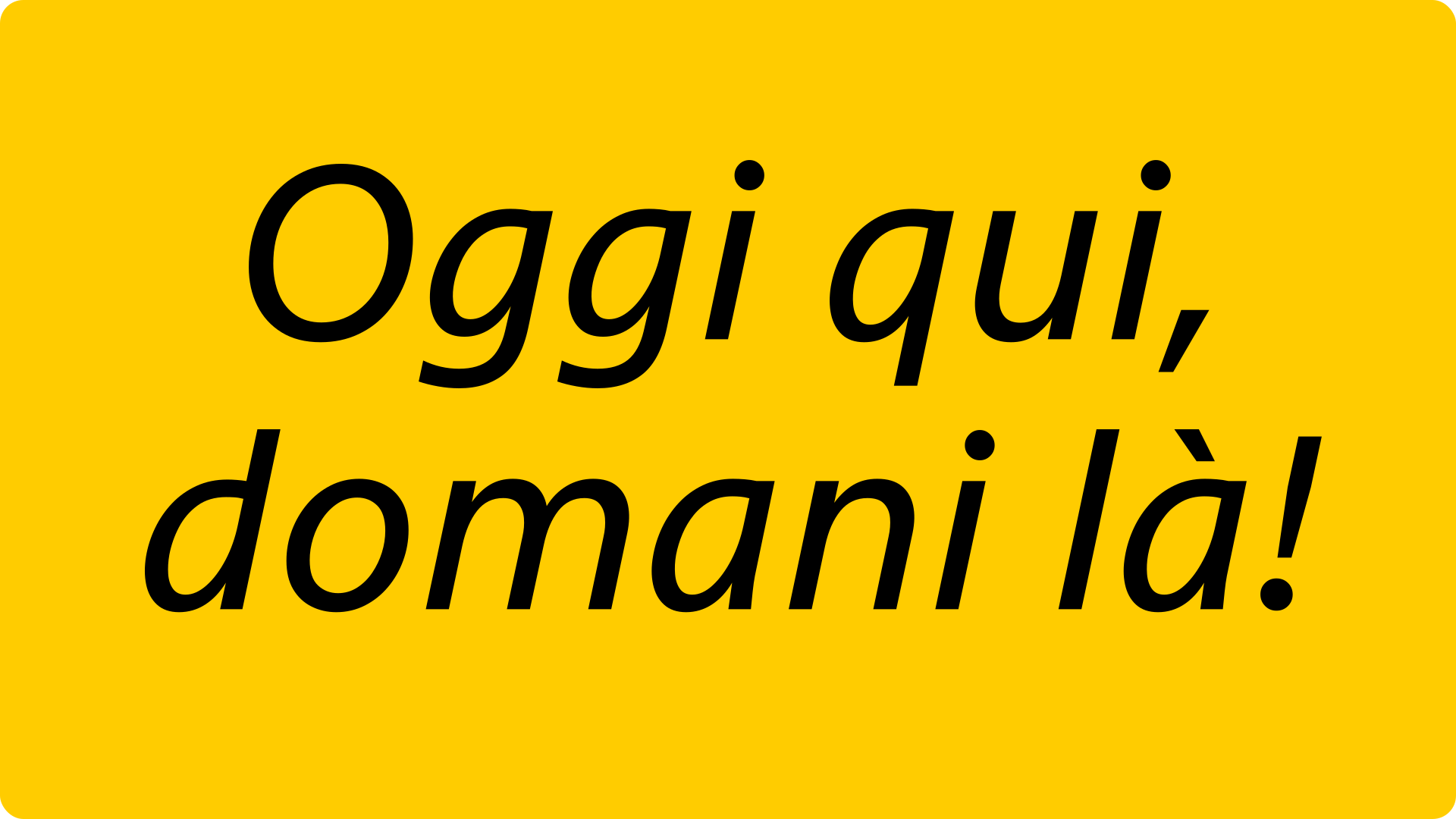
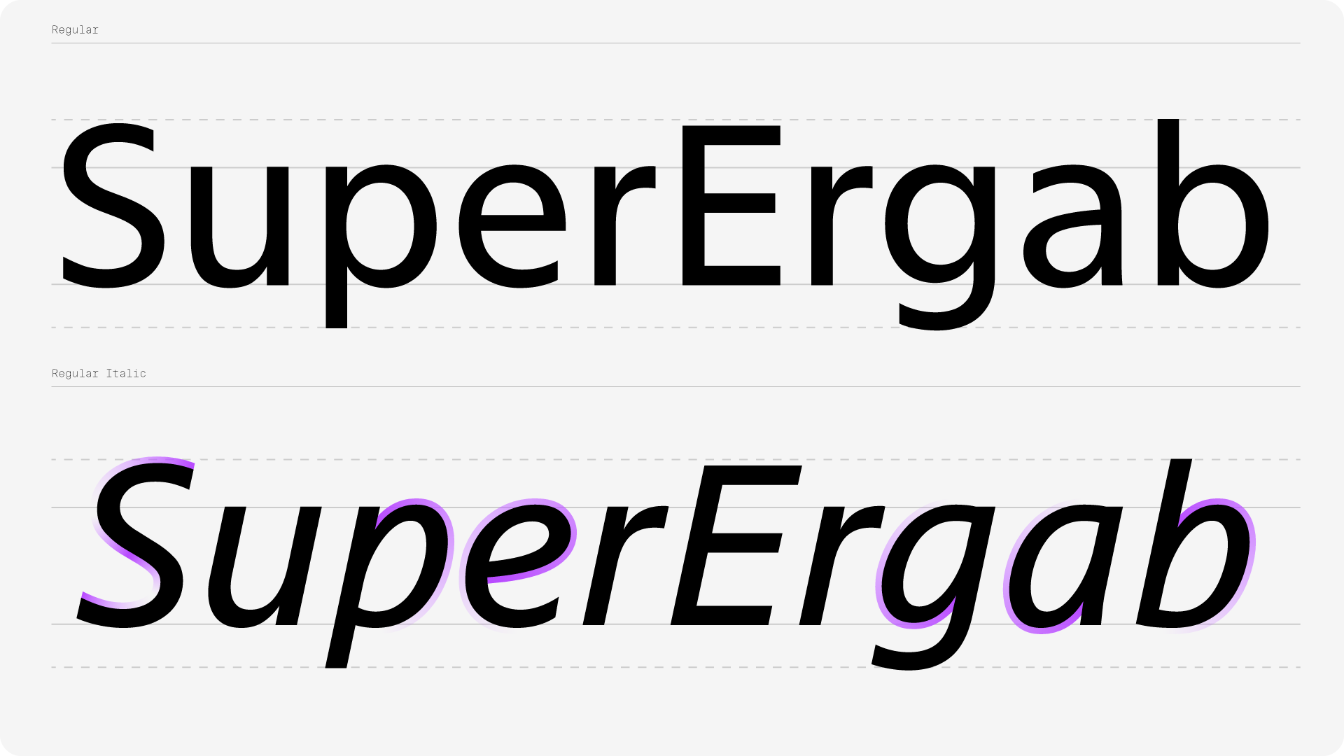
Historically, Italics were a key part of Swiss Post’s visual identity, particularly in its old logo, set in uppercase Italics, which could be perceived as conveying movement and speed. Outside of the logo, however, Italics had usually mostly served as a supporting element to the upright styles. Now that the logo has been redesigned in favor of a steady, bold, upright ‘P’, Italics are free to claim a role within the branding. The new Italics were meant to be expressive and distinct, but needed to keep the flexibility to cover all possible needs. They shared with the Uprights the prerogative to be usable in small to large sizes. A specific attention was given to its slant angle, as it means a delicate choice between expressiveness and functionality.
The new Italics were meant to be expressive and distinct, but needed to keep the flexibility to cover all possible needs. It shared with the Uprights the prerogative to be usable in small to large sizes. A specific attention was given to its slant angle, as it means a delicate choice between expressiveness and functionality.
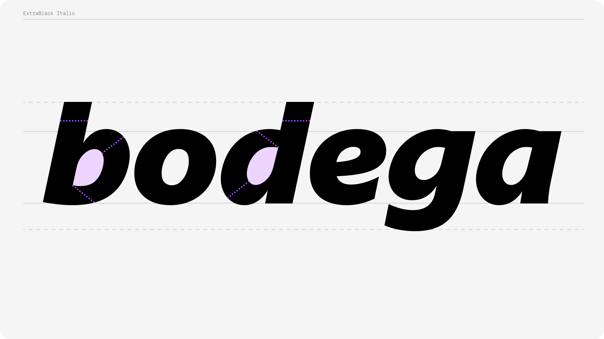
To design Swiss Post’s Italics, we opted for a hybrid approach, not basing the Italics on a simple slanted version of the Uprights, but rather integrating cursive qualities — as seen on letter ‘e’, ‘a’, ‘b’, ‘g’, etc. If such combinations can be found in some other humanistic typefaces, the formula stays a minority even in those, as they are indeed somewhat of an aesthetic statement. This unusual choice reflects a know-how increasingly harder to find.
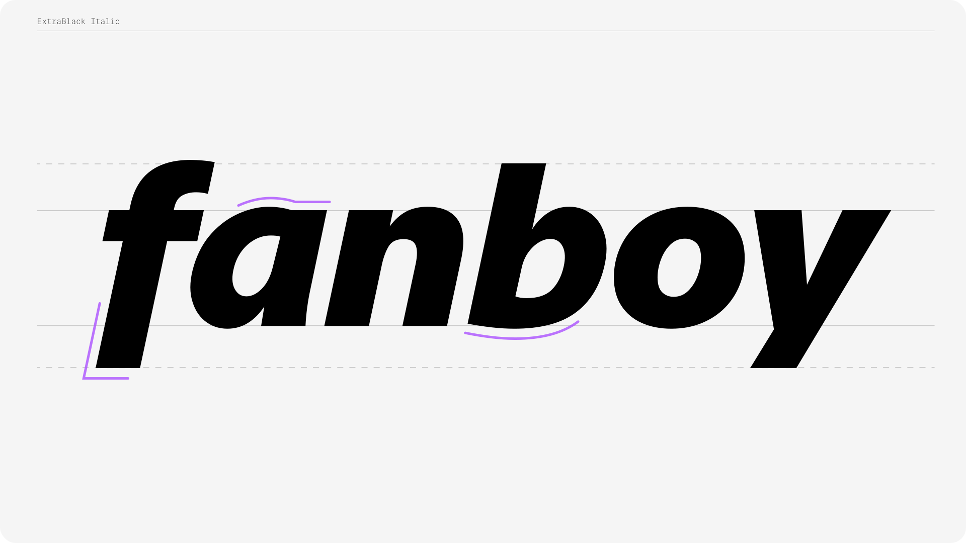
The upper connection of the curved part with the stem in the lowercase italic ‘a’ illustrates the innovations which emerged from this very “Swiss Typefaces“ design posture: the juxtaposition of a curve and a straight, sharp ending is a subtle yet affirmative choice displaying both traditional and contemporary components. The lowercase italic ‘f’ perfectly illustrates the same search for a hybrid harmony: the stem dropping below baseline is typical to calligraphy, but while the traditional approach could then have warranted a returning stroke at its lower end, we still opted for a sharp ending.
Like a beautiful proof that the client had perfectly understood the concepts underlying this ambitious design project, Swiss Post opted for the most daring proposition we made for the italic ampersand (‘&’). As one of the last glyphs to be designed, it came as the crown jewel on an already audacious design.
With Italics largely absent from web design in general, we can say that they are, in today’s context, a statement in themselves. Together, both teams made the winning bet that Swiss Post Sans’ Italics could be a key component of the brand’s graphic expression. They work both as autonomous or in conjunction with their upright counterpart. They are a signature element. One that will likely be the most noticeable aspect of the typographic change Swiss Post is making, while the switch of upright styles is designed to be subtle. We expect to witness a prevalent use of the Italics outside of running text, like in titling and XXL signage sizes, making it an integral part of the branding and, at times, even taking center stage as a whole new voice for Swiss Post.
Swiss Precision
Unlike most bespoke typefaces, the Swiss Post Sans family does not rely on a “gimmick” or exuberant design tweaks to make a font visually unique and/or legally “ownable”. Its uniqueness is in the pursuit of true answers to practical constraints, in a true modernist attitude.
A mix of high standards and innovation is what makes Swiss Post Sans quintessentially “Swiss Typefaces”. It is the expression of the designers’ deep understanding of the Swiss design heritage, mixed with a true maturity in the craft to execute it. It is not something that can be explained in words, but it will be naturally experienced visually, it will be seen in its curves, its shapes, in all the choices that were made. The high quality of its concept and process serendipitously resulted in the quality of its design.
“With our backgrounds rooted in classic Swiss typography, the project definitely broadened our perspective. It showed how a contemporary interpretation of typographic legacy can remain true to its roots while still feeling fresh, flexible, and forward looking. It reinforced the idea that tradition and innovation don’t contradict each other — instead, they can coexist and enrich one another in meaningful ways.”
– Swiss Post —
It is also not by chance that a company called Swiss Typefaces finds itself working for Swiss Post. While not all clients have to come with such a background, the common cultural frame of reference makes for a fertile base, but, more importantly, seemed to equip such a client with an above-average appreciation for the importance of type design in a visual identity. Direct work with the client provided the necessary efficiency to try new things while never compromising on any detail.
After providing custom typefaces for the Swiss Confederation through the Swiss passports, Swiss Post is not just any job, it is another milestones for our studio.
Such entities are true cultural references for graphic design through time and space. With historical applications, particularly in Switzerland, across industries such as pharmaceutical companies, the railways and many others, Swiss graphic design has long been part of the global heritage of design. The standards applied in such structures, from the diversity of contexts or supports to the need to meet legal accessibility requirements, but equally the contractual constraints related to the product’s licensing, are amazing learning opportunities for a studio like ours. And it will trickle down to all future experiences.
The mutual trust between the two parties meant trust for the process, to the final stroke. Swiss Post team trusted our expertise, allowing processes to happen in optimal conditions, and in return we delivered work to the highest standard.
The project is supported by a true synergy with the client and a shared vision. No breathing down the designers’ necks, but no compromises on the client’s needs either. We will always try to push boundaries, while ensuring to meet the client’s needs as well as maintaining the highest standards in design and engineering. It is true to the design ethos Swiss Typefaces has been developing for two decades now. The solid foundation our processes constitute gives us the confidence to challenge our clients’ expectations without taking risks we can’t fully control.
“Swiss Typefaces’ unique span of expertise – navigating both public institutions and large corporate environments, while also being adept with smaller cultural projects – paired with a distinct edge in their approach, set the bar high from the very beginning.”
– Swiss Post —
With three full years in the making, it is our longest, but crucially our most accomplished and comprehensive undertaking to date. Swiss Post Sans is one of the most accomplished utilitarian typefaces Swiss Typefaces has ever produced. It is as refined as a sans serif can be: no frills, no gesticulation, only elegant performance. The kind of typeface that would be equally at home in our public catalogue.
We are thrilled to experience first-row the curtain drop on what is our most ambitious job to date and we hope that the users will equally enjoy experiencing its results.
“Swiss Post Sans is Swiss by nature, not only by design.”
— Emmanuel Rey (Executive Creative Director at Swiss Typefaces) —
CREDITS
Client:
La Poste / Die Post / La Posta / Swiss Post
Project Direction:
Isabelle Hofmann / Swiss Post
Emmanuel Rey / Swiss Typefaces
Art Direction:
Swiss Typefaces
Design:
Quentin Schmerber / Swiss Typefaces
Font Development & Technology:
Benedikt Bramböck / Swiss Typefaces
Swiss Post Team:
Michel Noverraz, Marc Hadorn,
Isabelle Hofmann-Meister, Christian Meier,
Nora Tanner, Thomas Rütti,
Stefano Cometta, Rouven Steiger,
Philipp Gfeller, Kurt Blaser
Article and illustrations:
Maxime Plescia-Büchi & Océane Torti / Swiss Typefaces