Typeface Design: Ian Party / Swiss Typefaces
Font Engineering: Christoph Koeberlin
ABOUT THEW


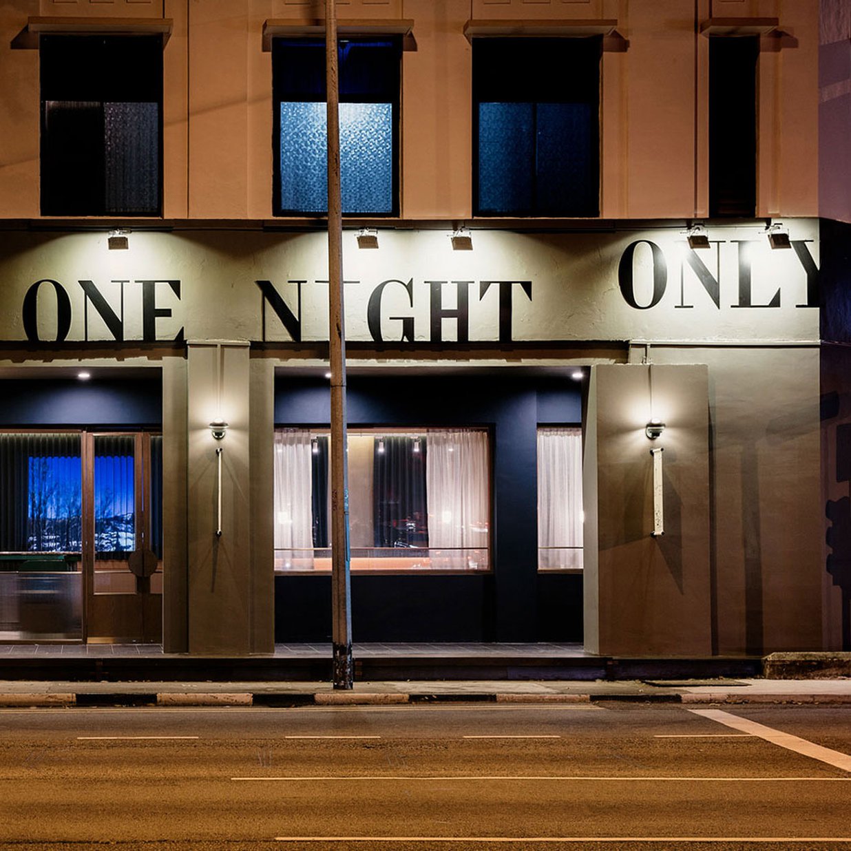
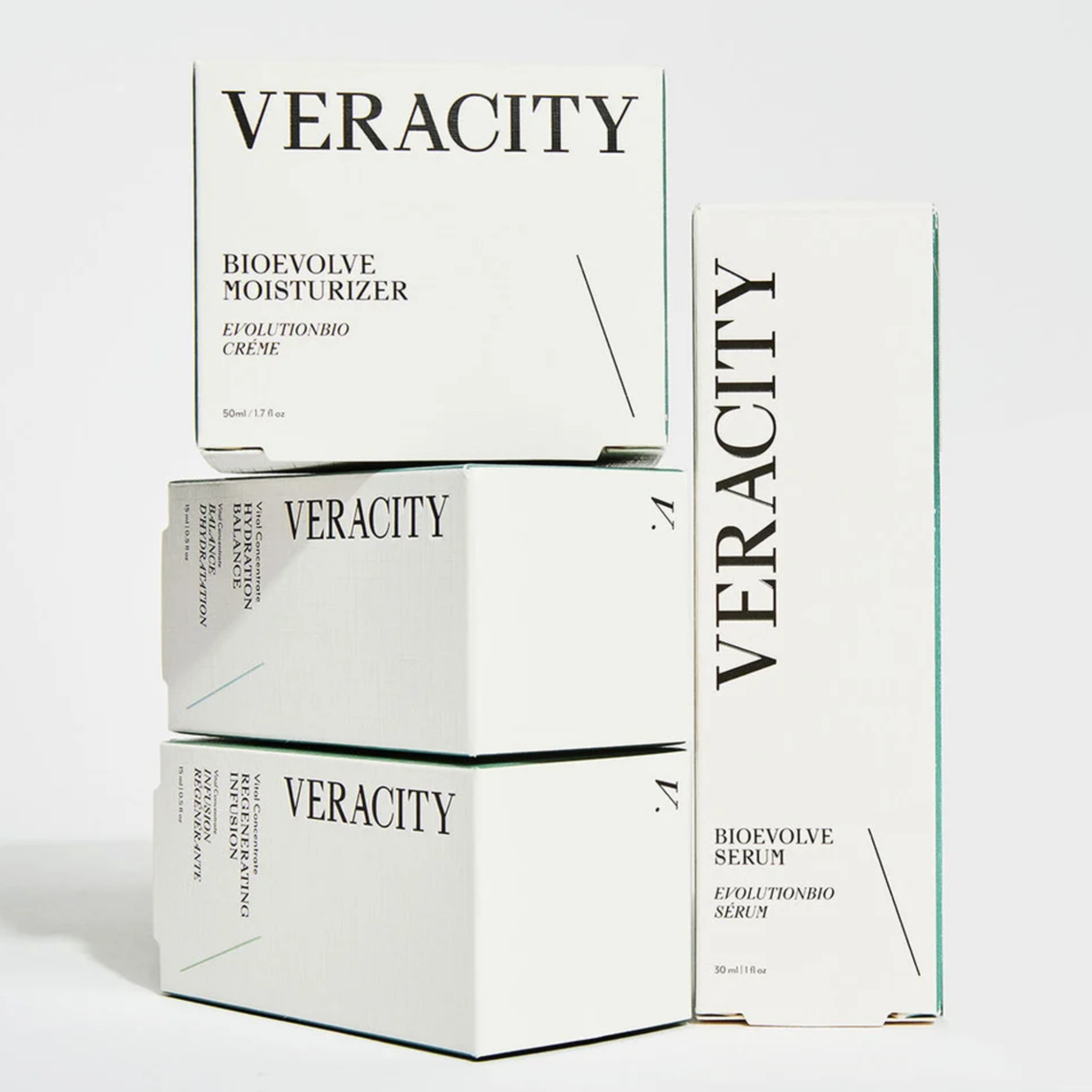
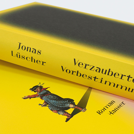
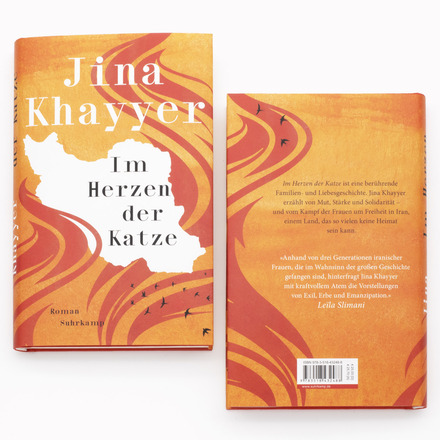
Enter TheW typeface
TheW comprises two collections: TheW Clan is a series of display styles, and currently has three members, RZA, GZA, and ODB. While they all have a monospaced look, each of them brings a special flavor to the page. TheW NYC is a slightly tamed-down offshoot with proportional spacing, made for text use. It comes in regular and italic styles.
The trinity of TheW Clan
In the begining, there was TheW RZA, a fixed-width style with vertical stress, high stroke contrast, and a bold attitude. It first emerged in the Lab, our testing field for new ideas, and proved to be a big success. In some of its shapes, RZA embraces the limitations of being monospaced: Caps are tight, ‘i’ is airy. In other places, RZA doesn’t give a hang about rules: ‘m’ occupies the space of two characters. Can it be all so simple?
TheW RZA is now joined by two new clan members, GZA and ODB. They lend themselves to similar attention-grabbing tasks, but offer a distinct voice. TheW Clan GZA comes close to what a sans serif version would look like. It isn’t totally serifless, though: In an anti-dogmatic manner, GZA retains the wide bases for ‘f’, ‘i’, ‘l’ etc. It has the same triangular top serifs on ‘C’ and ‘G’ as its cousin RZA, while ‘E’ or ‘L’ exhibit hairline slab serifs for better balance. GZA accentuates the x-height via bold bars in ‘a’, ‘f’, ‘r’ and ‘t’, and isn’t afraid of asymmetrical solutions, see the ‘T’ with serifs of different length, or the ‘H’ with a weight distribution as in ‘M’. Other defining features of GZA are the pointed vertices in ‘A’ or ‘N’ and the top-heavy ‘K’ and ‘Z’.
TheW Clan ODB emphasizes the vertical dimension. It’s distinguished by tighter glyphs, with more surrounding space. Serifs on ‘3’ or ‘E’ are square instead of triangular. Where RZA has drop terminals, ODB has beaks. Exit strokes of ‘a’ or ‘t’ shoot to the top, and diagonals in ‘k’ or ‘R’ get guillotined. This verticality is counterbalanced by long bars for the dots on ‘i’ and ‘j’. ‘W’ is a special character in all TheW fonts. In ODB, we chopped off its right diagonal. ODB’s look is infused with monospacedness. True to its name, it’s not really monospaced, though: ‘G’ and ‘r’ are narrower, ‘t’ is wider. In addition to ‘m’, ‘æ’, ‘œ’, ‘fi’, ‘fl’ (like RZA & GZA) and the ampersand (like GZA), we gave ODB a double-wide glyph for the question mark, too.
The style of TheW NYC
TheW NYC is a unique interpretation of the Didot genre, made to be more flexible and less mechanical. Initially developed for Sport&Style magazine under the creative direction of Régis Tosetti and Simon Palmieri, it largely follows the logic of a traditional Didot with straight serifs and condensed proportions. Even the triangular top serif on the lowercase ‘l’ doesn’t deviate much from the historical Didot. TheW NYC revitalizes the conventional model with highly novel elements, borrowed from TheW Clan RZA. While the middle bar of ‘E’ is typically designed as a fine line with a triangular terminal, we transformed the black values of this letter part into a bare bold line. The ampersand (&) is designed completely outside a pen-derived logic of thick and thin strokes. It generates a contrast of its own, with an undogmatic weight distribution that simply works. ‘G’ is drawn in a rather brutalist fashion. Its pointed beard has just the right amount of black. The high center of ‘M’ shows the influence of monospaced typefaces and introduces a very special temper.
We kept RZA’s straight-line serifs at the bottom of the letters. For the top, however, we opted for triangular serifs in NYC. This further disrupts the linear effect of an old-school Didot. Some letters like ‘f’ were adjusted for greater readability. Simon and Régis asked for an italic, too, so we drew it. The outcome is a hybrid Didot-styled italic. As a typeface for text, one might expect that TheW NYC featured a ‘g’ with a more conventional weight distribution. We preferred to maintain the unique placement of the black as seen in the monospaced style, though. Once this design decision was made, this maverick ‘g’ allowed us to apply a similar treatment to the figures ‘3’ and ‘5’, among other glyphs. Some letters in TheW were shaped solely by playfully pursuing a certain black value. This playfulness was integrated into the design logic of the typeface.