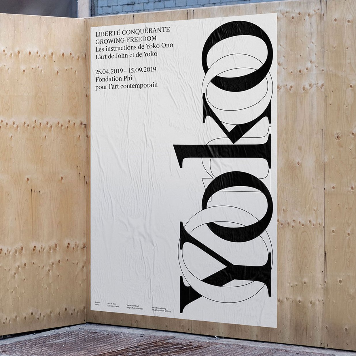
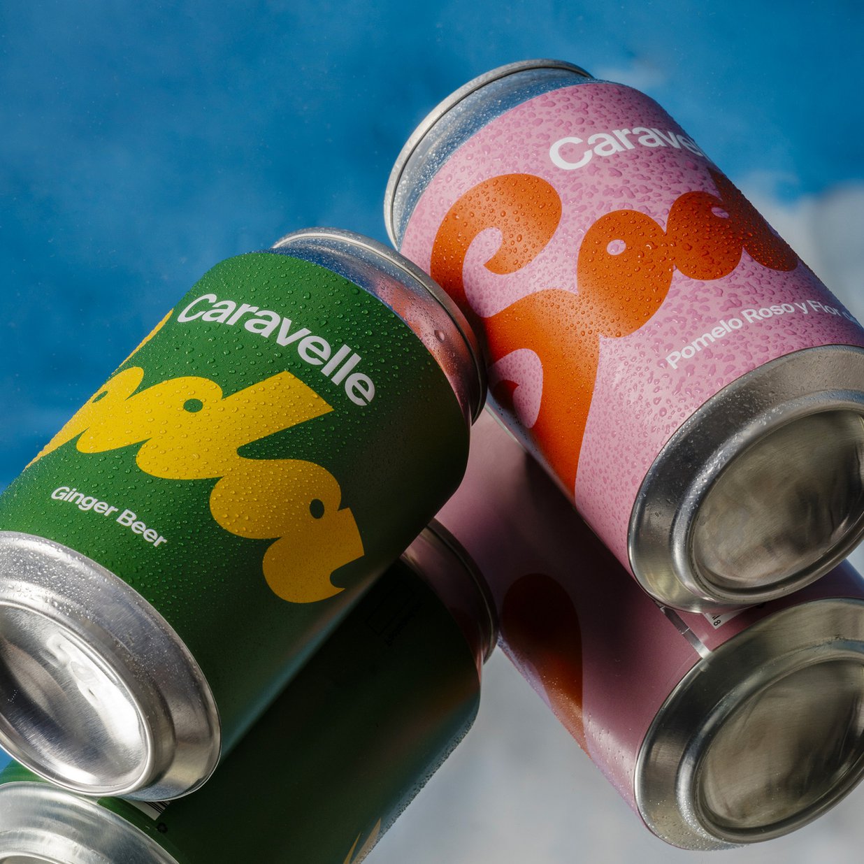
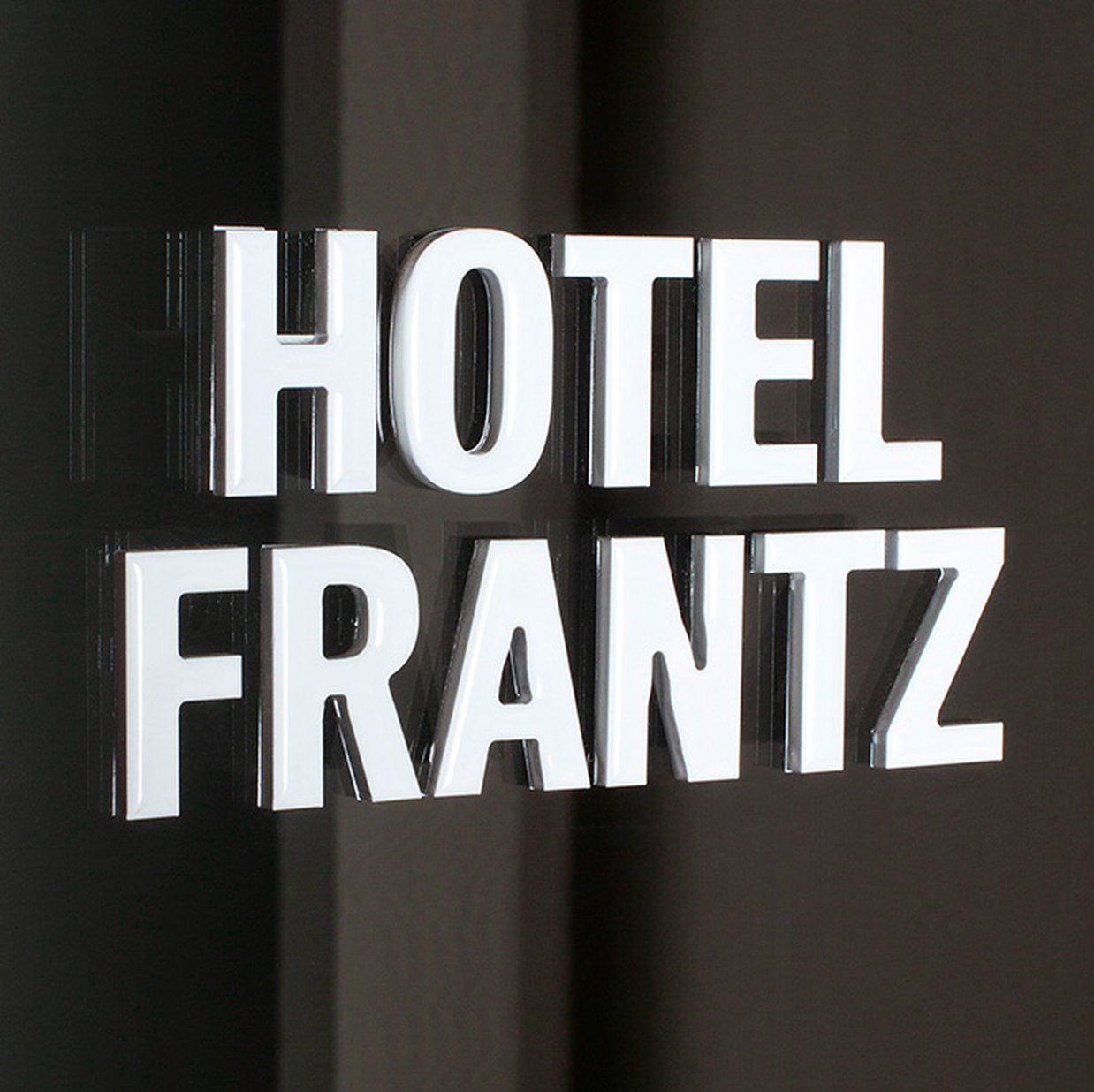
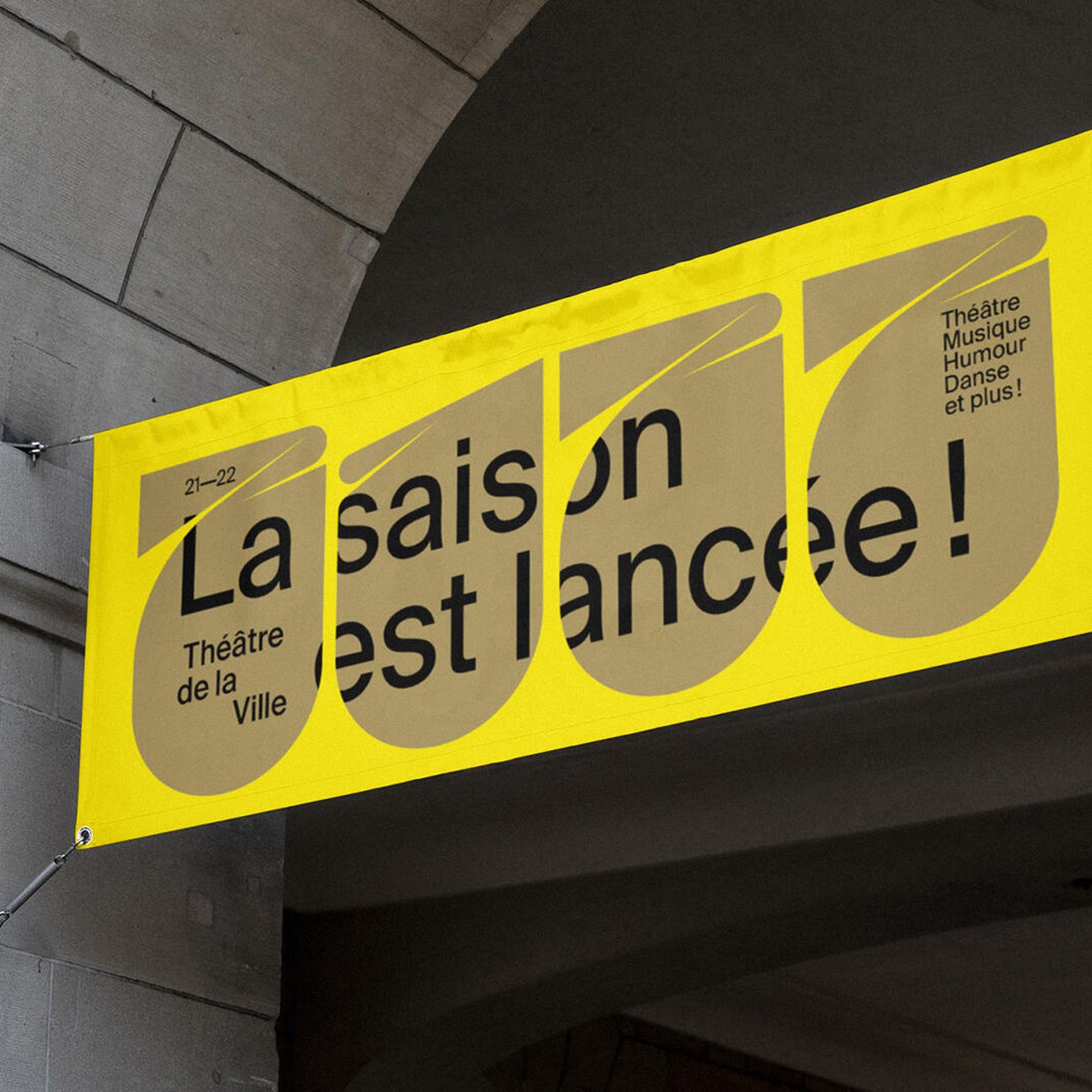
Art Direction: Swiss Typefaces
Original Typeface Design: Ian Party / Swiss Typefaces
Font development and updates: Quentin Schmerber / Swiss Typefaces
Arabic development: Pascal Zoghbi / [29LT], Naïma Ben Ayed
Cyrillic development: Ilya Ruderman & Yury Ostromentsky / CSTM Fonts
Vietnamese consulting: Donny Trương / Vietnamese Typography
Font Engineering: Benedikt Bramböck / Swiss Typefaces, Christoph Koeberlin
ABOUT SUISSE


The Suisse Family

Suisse Int'l

The Suisse Family

Suisse Int'l vs. Suisse Screen

Suisse Neue vs. Suisse Works

Suisse Int'l Multi-language
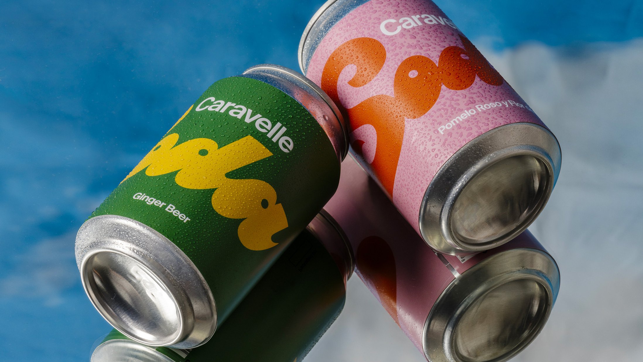
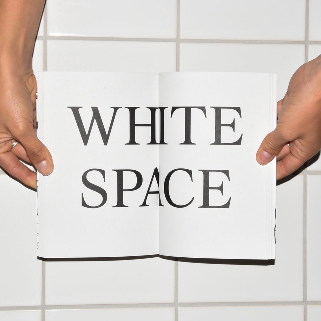
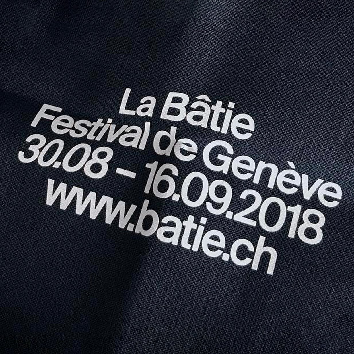
The Suisse typeface forms the centerpiece of the Swiss Typefaces library. Comprised of 6 collections with a total of 55 styles, Suisse is a utilitarian font set that covers all basic needs of the contemporary typographer, from Suisse Int’l, the go-to Grotesk with its monospaced and condensed companions, to the sturdy text serif Suisse Works, the clear-cut sans serif Suisse Screen, and the reliable slab serif Suisse Neue. Suisse combines classic style with cutting edge design quality and the most user-friendly license.
Suisse Int’l
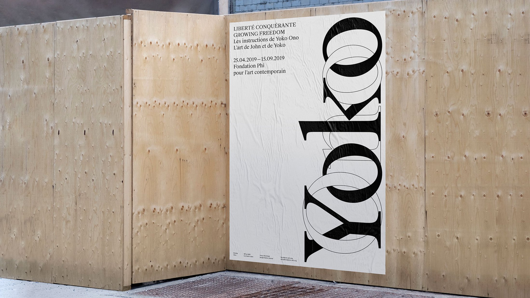
Suisse Int’l is the best Swiss Grotesk available in digital form. It’s the typeface of choice for any designer who’s fond of the Swiss Style and its legacy. This movement emerged around the schools in Basel and Zürich in the 1950s and aimed to present information objectively. Also known as International Typographic Style, it’s characterized by sans serif type typically set flush-left, in grid-based layouts that are derived from the content. Suisse Int’l is the present-day equivalent of the type used by the pioneers in Switzerland and beyond. Whether you want to perpetuate their modernist approach, whether your design references this aesthetic in more playful, even ironic ways, or whether you’re just looking for a plain, hard-working sans serif – Suisse Int’l won’t let you down. The collection comprises 18 styles: 9 weights from the chic Hairline to the forceful Black, all equipped with italics. And it’s truly international: The current version supports Latin, Cyrillic, and Arabic alphabets, all in one file, for one price. By the way: At Swiss Typefaces, one license purchase secures you the lifelong right to use the fonts for print, websites, apps, e-publications, broadcasting, and more. There are no limits in regard to the number of uses, domains, or website visitors.
Suisse Works
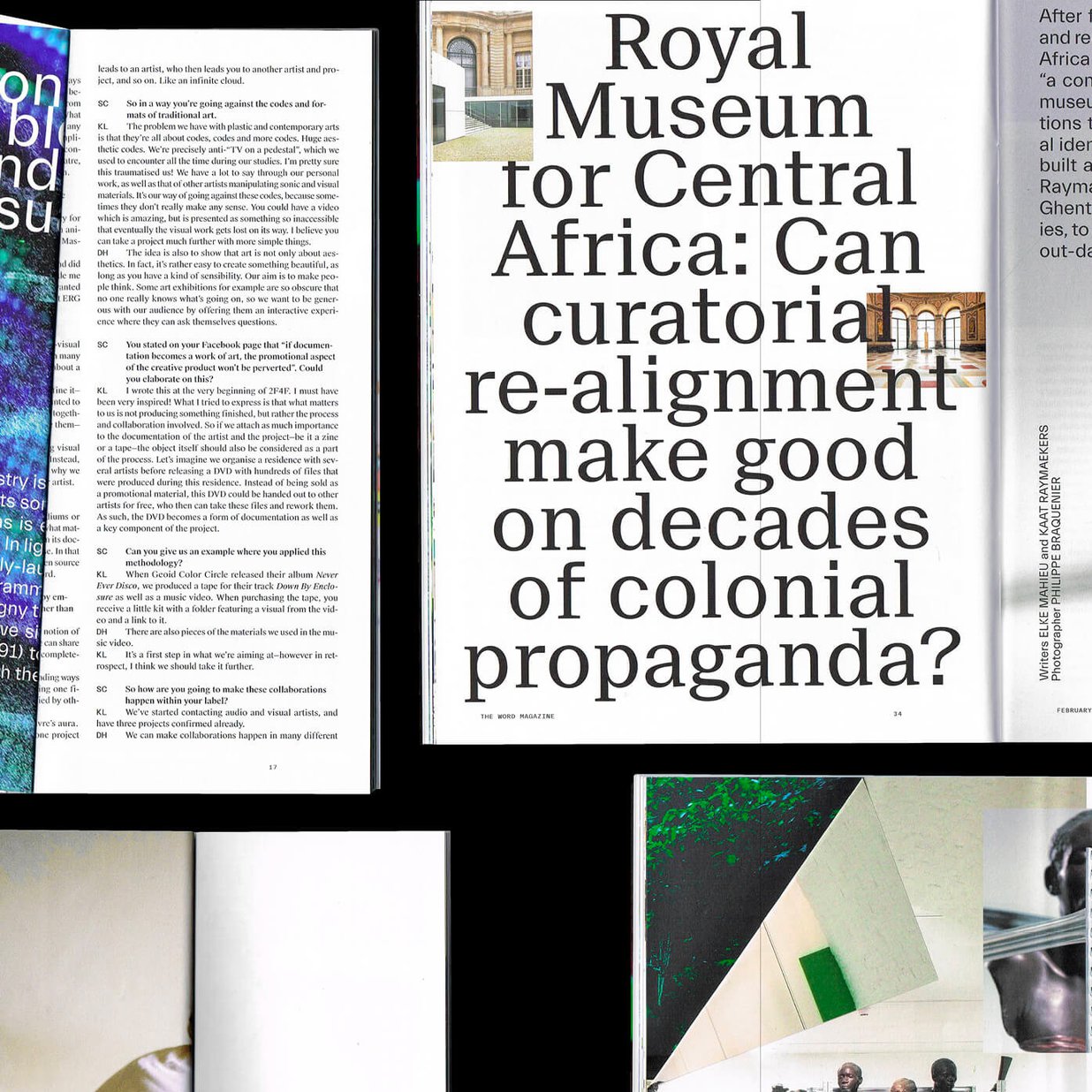
Suisse Works was developed as a serviceable text serif for the 21st century. It’s characterized by wide capitals, a very large x-height, and open apertures, guaranteeing superb readability both in print and on screen. The sturdy build provides for an even texture. Thanks to the efficient spacing, it’s a smart choice for longer texts, in newspapers, magazines, and beyond. At the same time, Suisse Works is elegant, too: Especially the italic and bold styles introduce an expressiveness that may serve for catchy titles and headings. With its tapered serifs and the pronounced contrast along a diagonal stress axis, Suisse Works stands squarely in the tradition of classic reading faces. It’s more sophisticated than the transitional serif typefaces of former times, though, with smoother, consistent details and balanced proportions across all styles. Suisse Works’ forward-looking attitude is exemplified by the absence of upward-pointing serifs in C, G, S, or the a’s terminal that doesn’t carry a ball but instead is horizontally cut – a feature it has in common with Suisse Int’l and Neue. The collection includes 8 styles. The Book weight sits between the Regular and the Medium, and is only a notch heavier than the former. It can be used in situations where the Regular is just too light – think of glossy paper, negative text, or smaller sizes on screen. Suisse Works has lining figures by default. Ranging oldstyle figures which blend in better with the lowercase can be activated via OpenType features.
Suisse Screen
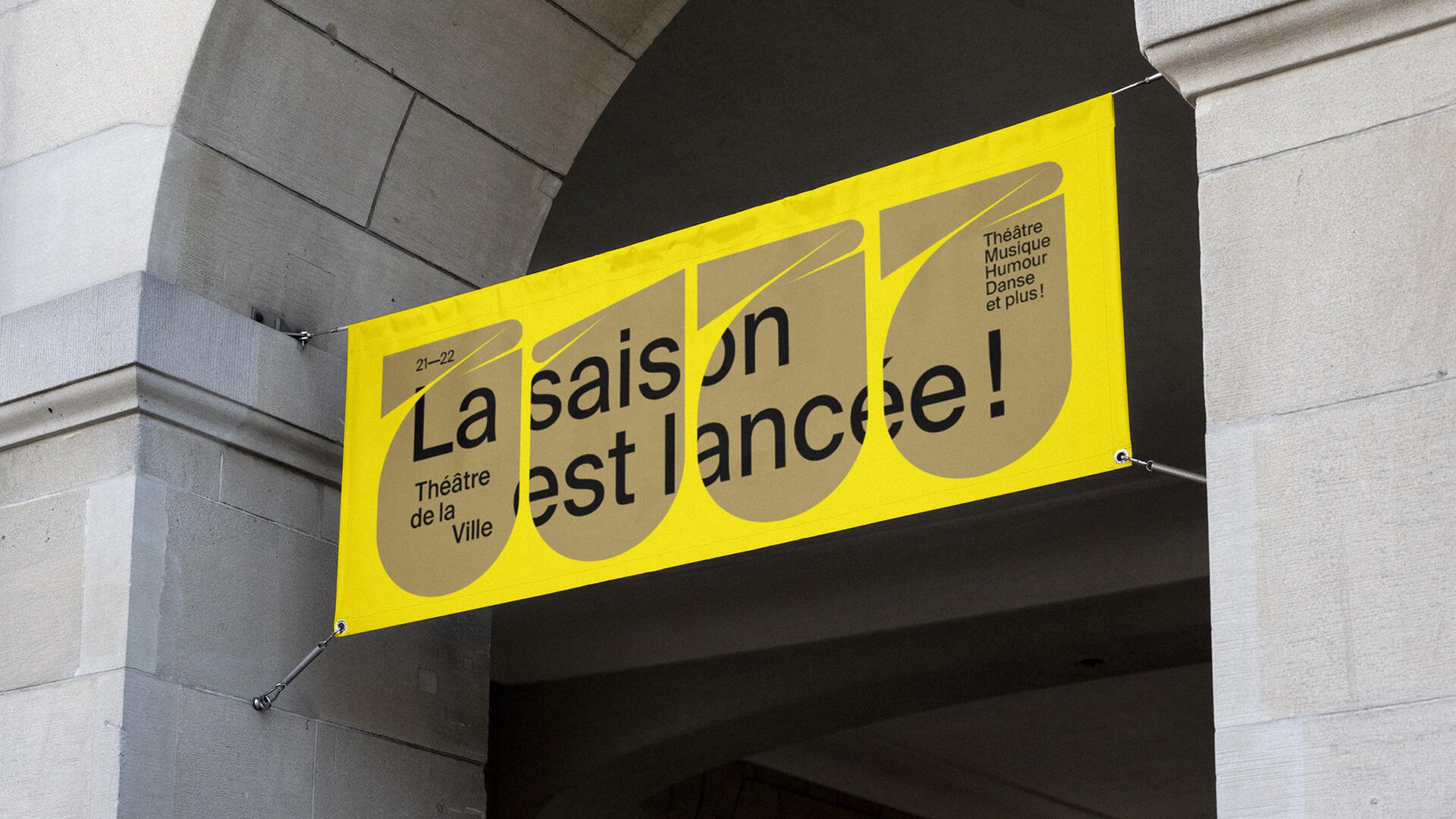
Suisse Screen is a sans serif made with high legibility in mind, and offers one more aesthetic choice within the Suisse typeface range. It’s drawn on the same basis as Suisse Int’l, and in fact a great number of letterforms are virtually identical across the two collections. What sets Suisse Screen apart is its large apertures – most evident in a, e, g, s – and the reworked uppercase glyphs. The design deviates from the classic Grotesk model, and instead tunes into the new sans serif as it emerged in the last third of the 20th century, with open shapes and a more economical set width. Suisse Screen covers a wide range of applications from small text sizes to big headlines. As the name implies, it’s particularly well suited for screen usage: Characters with open counters are less ambiguous and easier to identify. A letter like c can’t be mistaken for an o, even under poor lighting or other limiting viewing conditions. The barred I is another means that helps in situations were impeccable legibility is required. Suisse Screen comes in Thin, Light, Monitor, Regular, Medium Semi Bold, and Bold, with italics and Cyrillic for all weights.
Suisse Int’l Mono
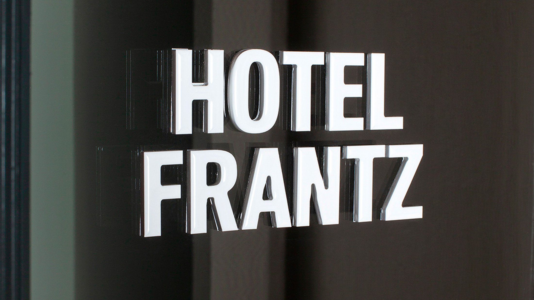
Suisse Int’l Mono is the monospaced variant of Suisse Int’l: All characters have the same width, like on a typewriter. Suisse Int’l Mono comes in handy when you want to fuse the objectivity of a Swiss Grotesk with the credibility of a typewritten document. It has been used successfully on its own, in branding, for stationery, on posters and on the web. Suisse Int’l Mono also excels as a complement to Suisse Int’l or other members of the Suisse typeface, for setting transcripts, captions, indices, code snippets, and other supporting roles in complex editorial projects. With the fixed-width letterforms, it’s particularly well-suited for establishing vertical relationships. Suisse Int’l Mono’s shapes are distinguished by a shorter middle part in M, w, W, and bars on i, l, r, 1 etc. – a formal consequence of the non-proportional spacing. The capitals with their narrow proportions present a stylistic link to the Condensed styles. Suisse Int’l Mono is available in 3 weights; Thin, Regular, and Bold.
Suisse Int’l Condensed
A narrow companion to Suisse Int’l, Suisse Int’l Condensed measures about 80% of the width of the regular styles. It lends itself to the use in headlines, ads, teaser texts and other scenarios where maximum impact is desired. Suisse Int’l Condensed comes in 6 weights from Thin to Bold, plus matching italics. Just like Suisse Int’l, Suisse Neue, and Suisse Screen, the Condensed has alternate figures that can help to tone down numbers in documents that are rich in numeric infomation: They’re shorter than capital letters but still lining, keeping a steady baseline. Talking of alternate glyphs: All members of the Suisse typeface include an optional descending eszett and – except for Works – a monocular a. Suisse Int’l and the Condensed as well as Suisse Screen additionally sport an alternate tailed l.
Suisse Neue
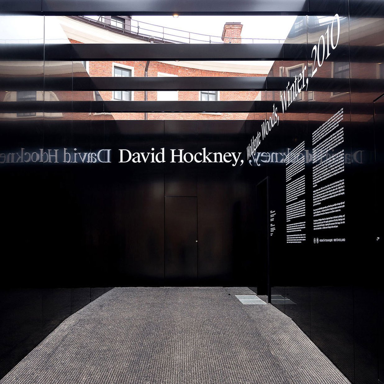
Suisse Neue is our vision of an Egyptienne for the here and now. It may be described as a seriffed variant of Suisse Int’l, and indeed Suisse Neue follows the same construction as the Grotesk, with compact extenders, a wide s, and shoulders that flow into the stems. On the other hand, it exhibits a visible stroke contrast and has a double-storey g – much like Suisse Works, albeit with vertical stress. The combination of Grotesk proportions and bracketed serifs makes it a hybrid with peculiar qualities, a novelty which, however, has precedents in Swiss type history. The loose spacing gives the slab serif a typewriter-like feel without being monospaced, and its square dots add to this matter-of-fact impression. Its horizontality is amplified by the long flat exit strokes in f, r, y. The fact that these letters do without any terminals identifies Suisse Neue as a typeface of the present time. There are three weights plus italics.

