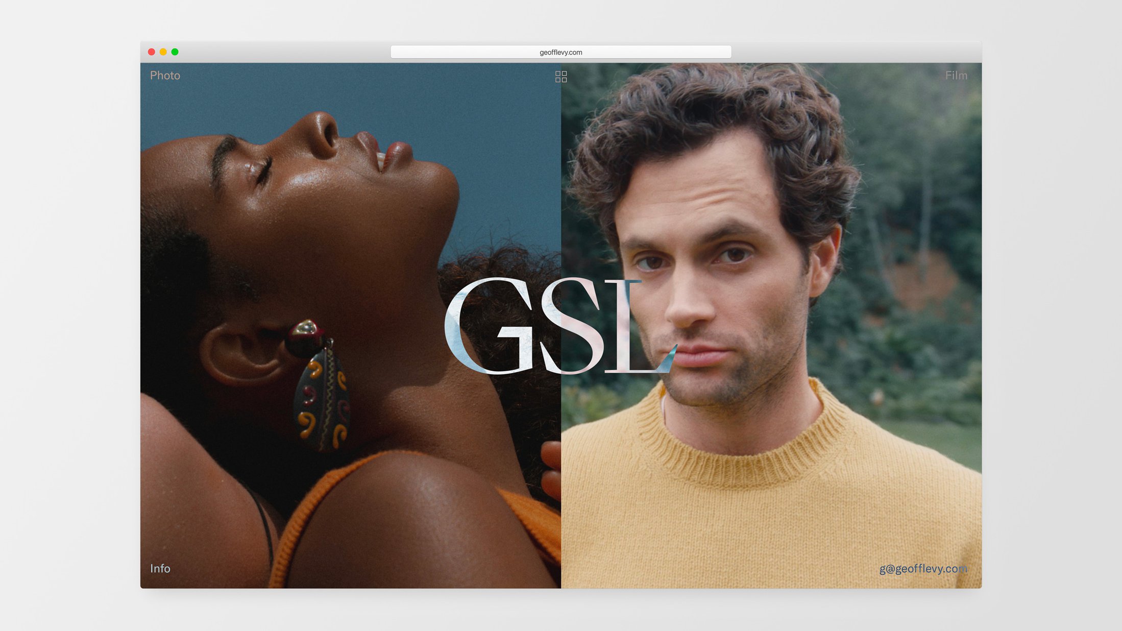
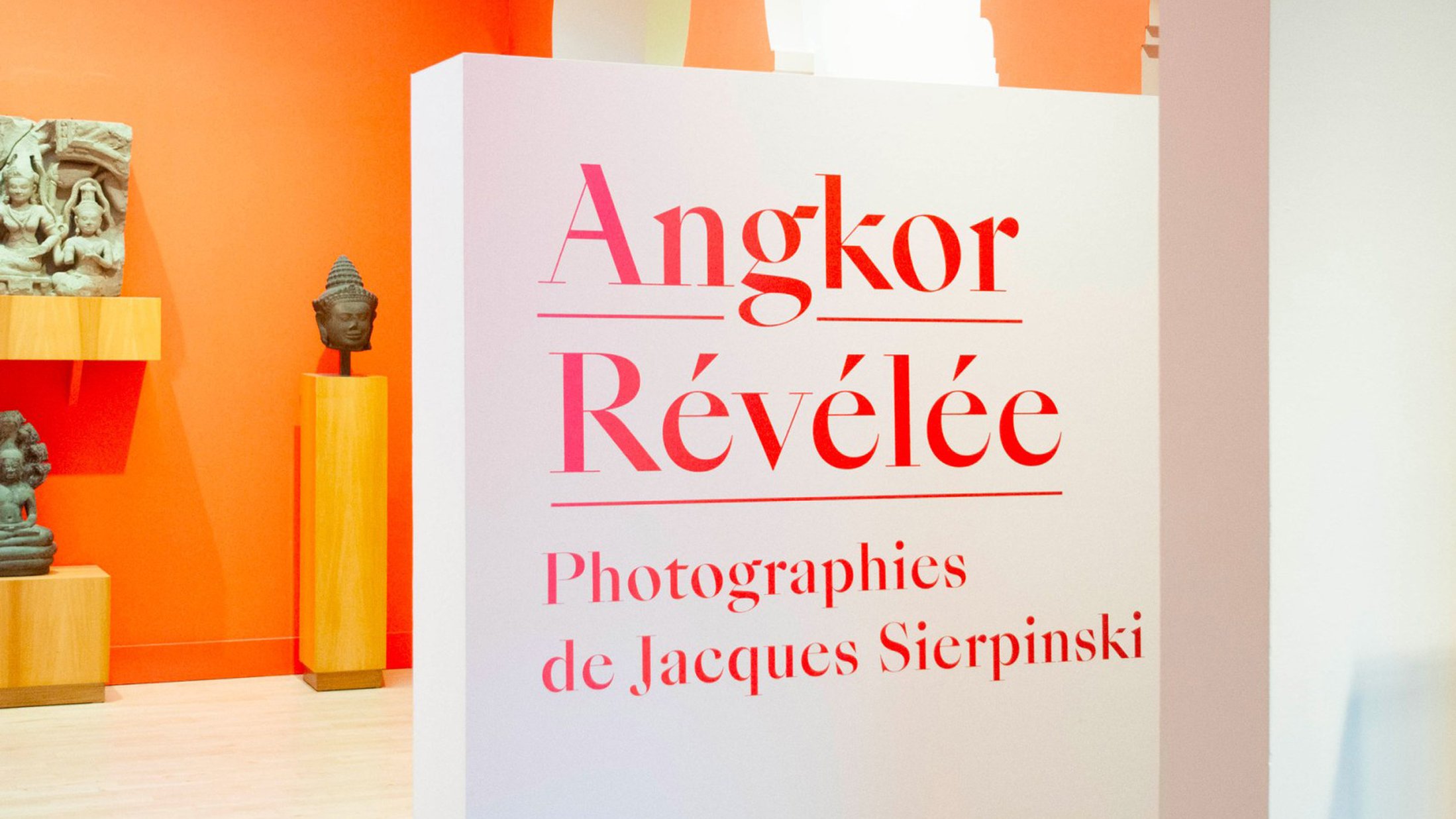
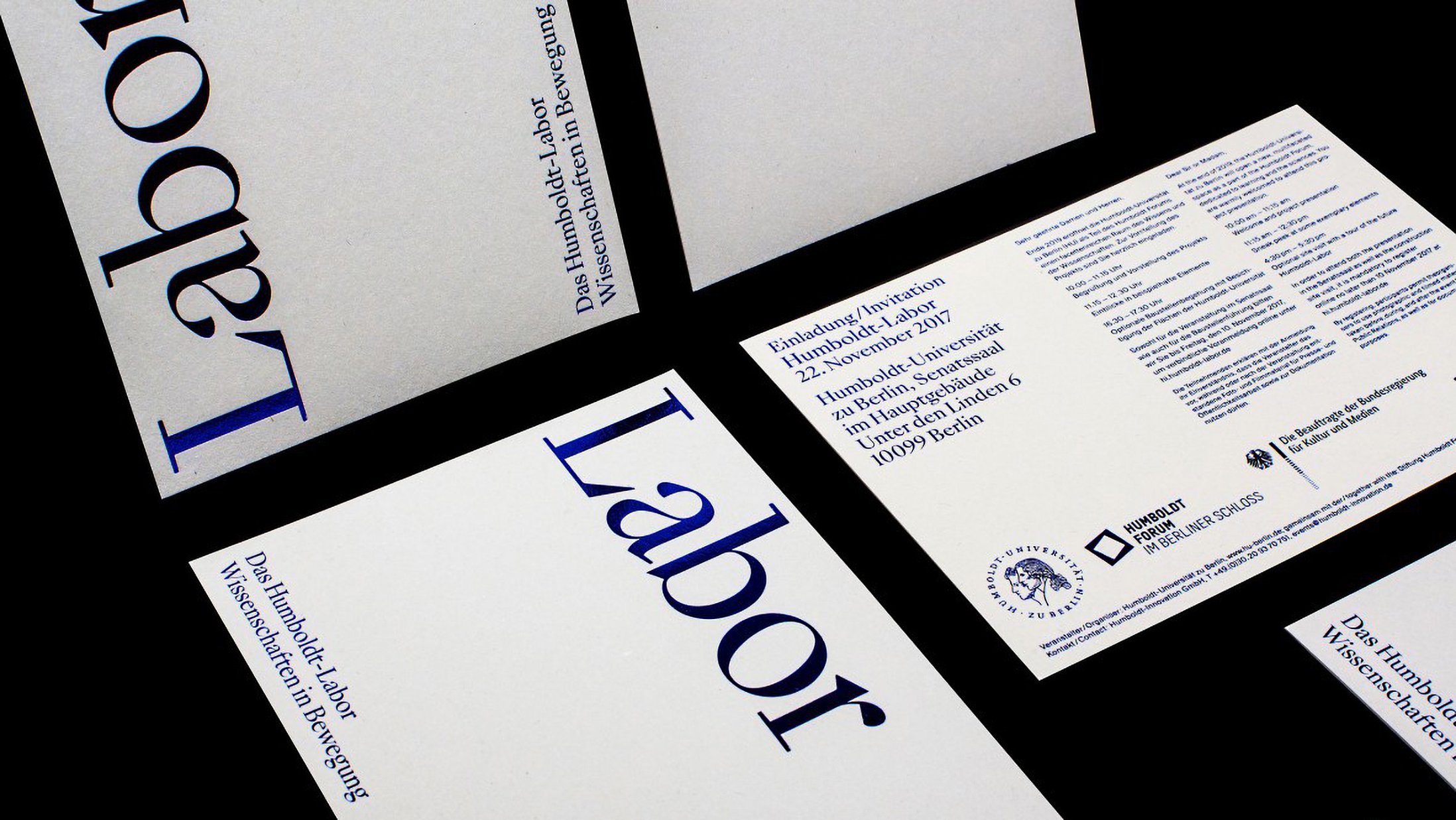
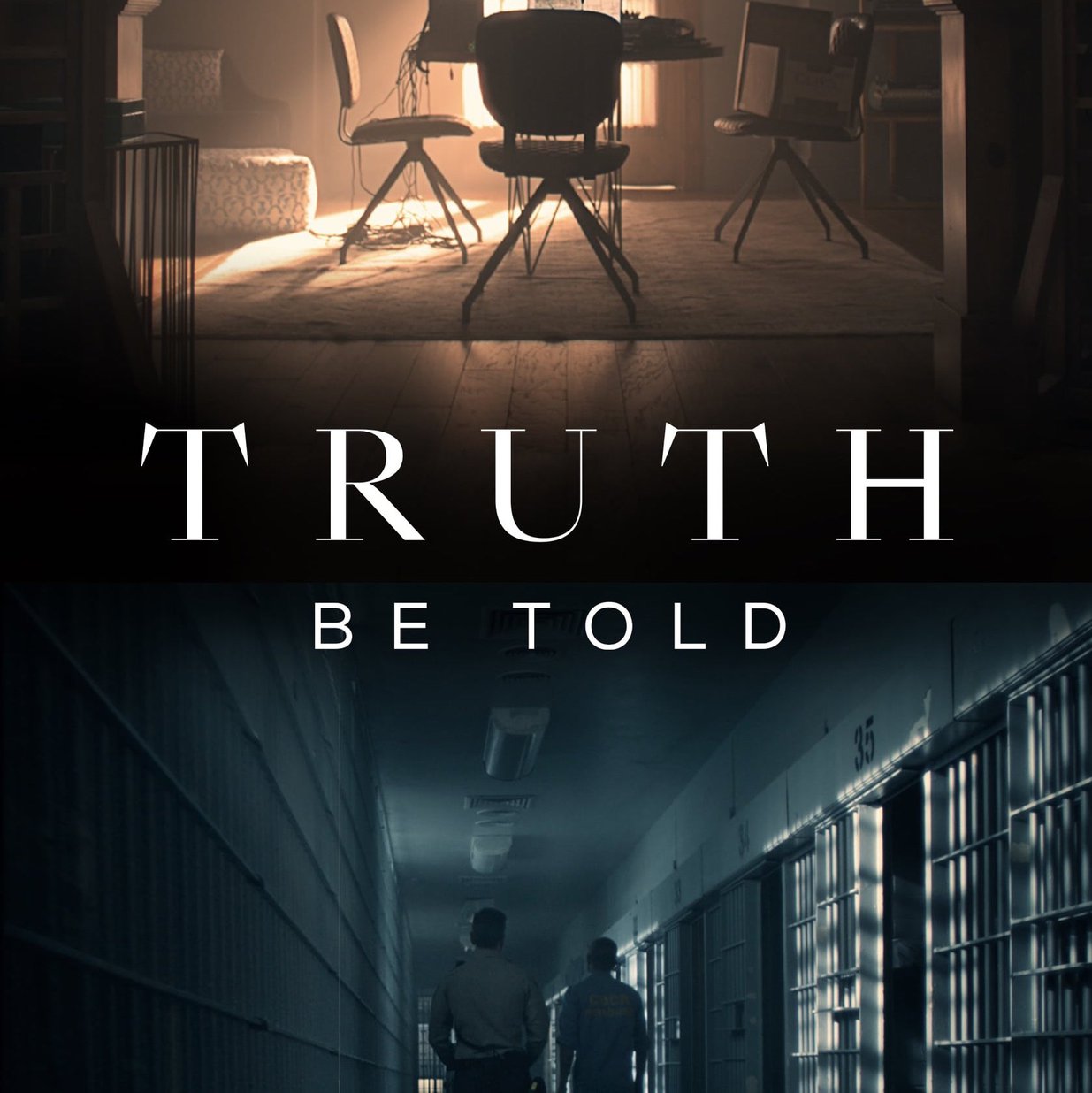
Art Direction: Swiss Typefaces
Typeface Design: Ian Party / Swiss Typefaces
Cyrillic development: Ilya Ruderman & Yury Ostromentsky / CSTM Fonts
Font Engineering: Christoph Koeberlin
ABOUT SANGBLEU

The SangBleu Family

The SangBleu Family

SangBleu Republic vs. SangBleu Versailles

SangBleu Kingdom vs SangBleu Sunrise

SangBleu Empire Bold Italic


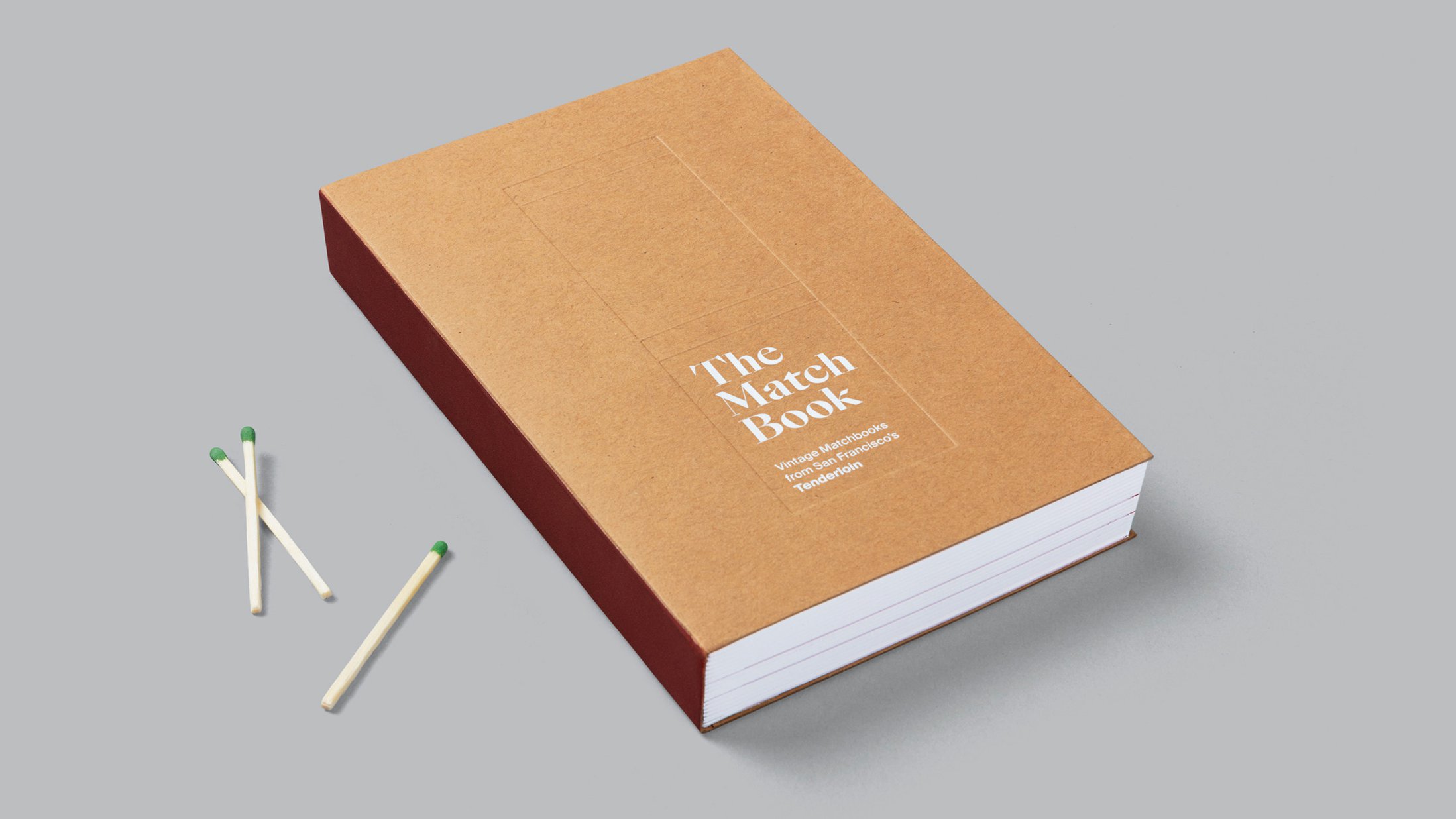
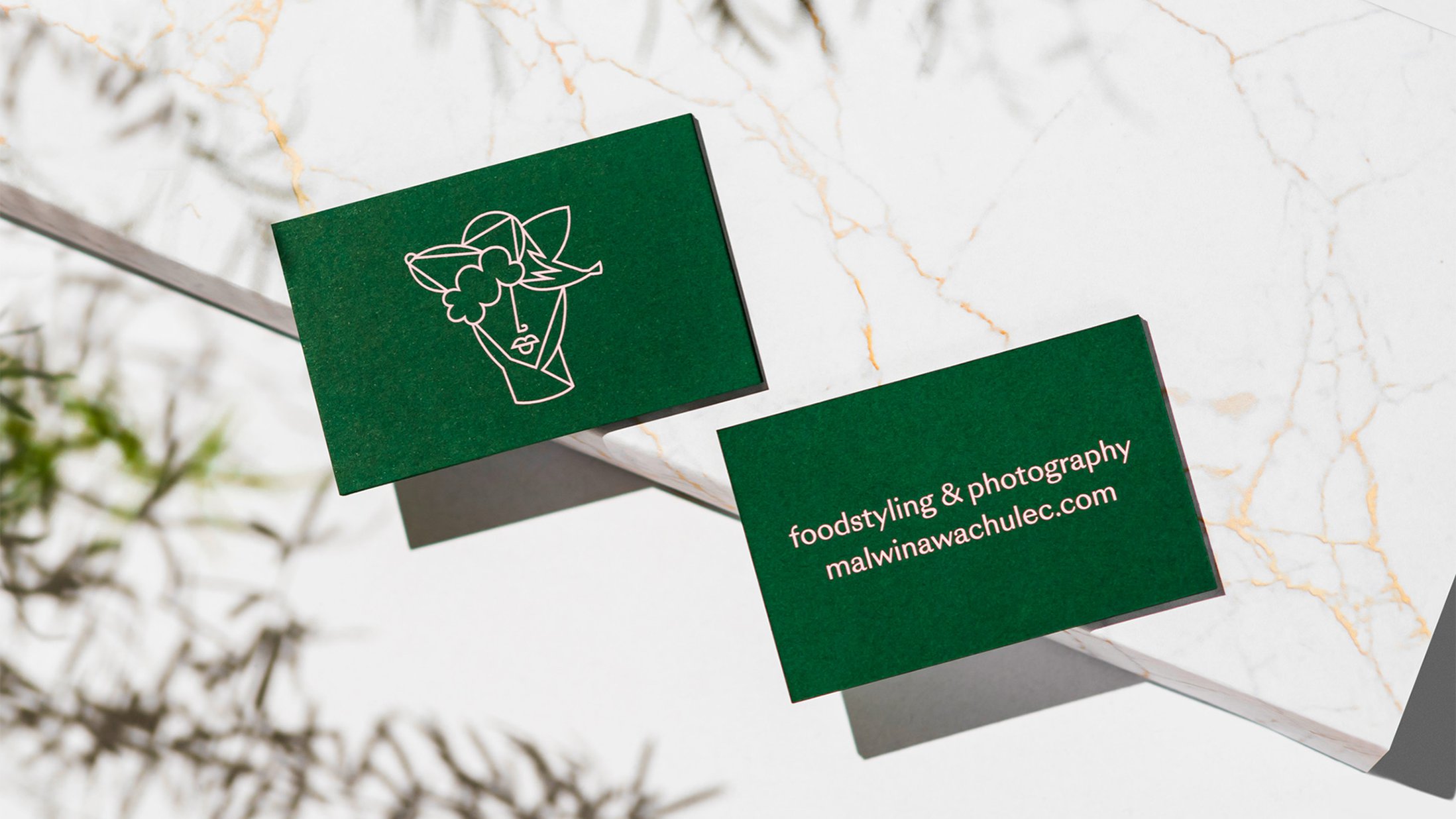
It is with great pride that we present the all-new SangBleu typeface. SangBleu has helped to lay the foundations of the Swiss Typefaces library, and was met with enthusiasm by designers from all over the world. The new SangBleu typeface is set to write the next chapter in this success story, once again raising the bar for comprehensive typographic solutions. Guided by our vision of future graphic and editorial design, we have developed SangBleu into an elaborate supercollection of unprecedented structure and versatility.
The new SangBleu supersedes our previous typeface of the same name, which, together with Romain, has been discontinued. It is not an update, but a completely new design, consisting of five full-featured collections: Empire, Kingdom, Republic, Versailles, and Sunrise. Each one comes in four or five weights, all of which are accompanied by matching italics. At 45 styles in total, it is our most ambitious release so far. The typeface’s setup doesn’t follow the conventional patterns deduced from typeface classification (Serif/Sans/Slab) or font production techniques (with intermediate styles that are neither fish nor fowl). The collections don’t represent an obvious linear progression of optical sizes (like Display/Text/Caption) either – although some styles lend themselves more to being used at a certain size than others. Instead, each member offers a distinctive voice that can serve a dedicated purpose, and meet a stylistic preference.
There is little point in discussing SangBleu in terms of categories like oldstyle, transitional, modern etc. While the design inevitably was informed by history, stylistic purity or authenticity were of no concern. SangBleu appropriates the best from the past and transforms it into an effective tool set for the aesthetic and technical environment of our day and age. All five collections are romans, in one way or another. What they have in common is not so much the skeleton or dressing, but a shared spirit. Each member is related to another and benefits from cross-pollination, yet hardly any characteristic is present in all. The collections can be used separately – simply pick the style that suits your taste the best, for the task at hand. In more sophisticated projects, feel free to expand the palette and combine two or more SangBleu collections. Thanks to their consanguinity, they will perfectly complement each other. One for all, all for one!
SangBleu Empire
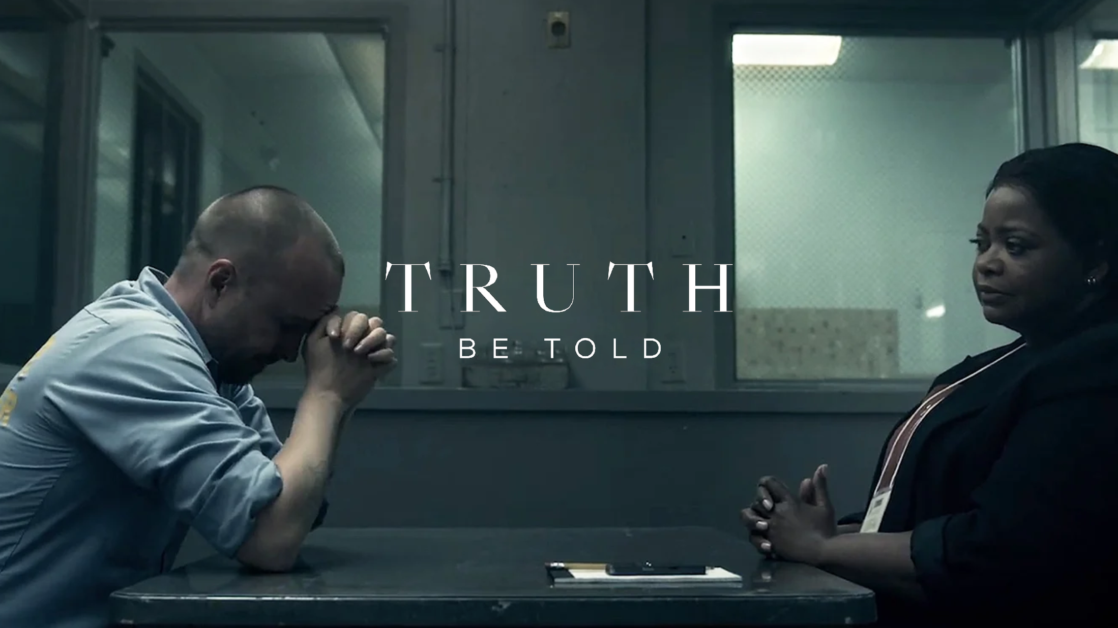
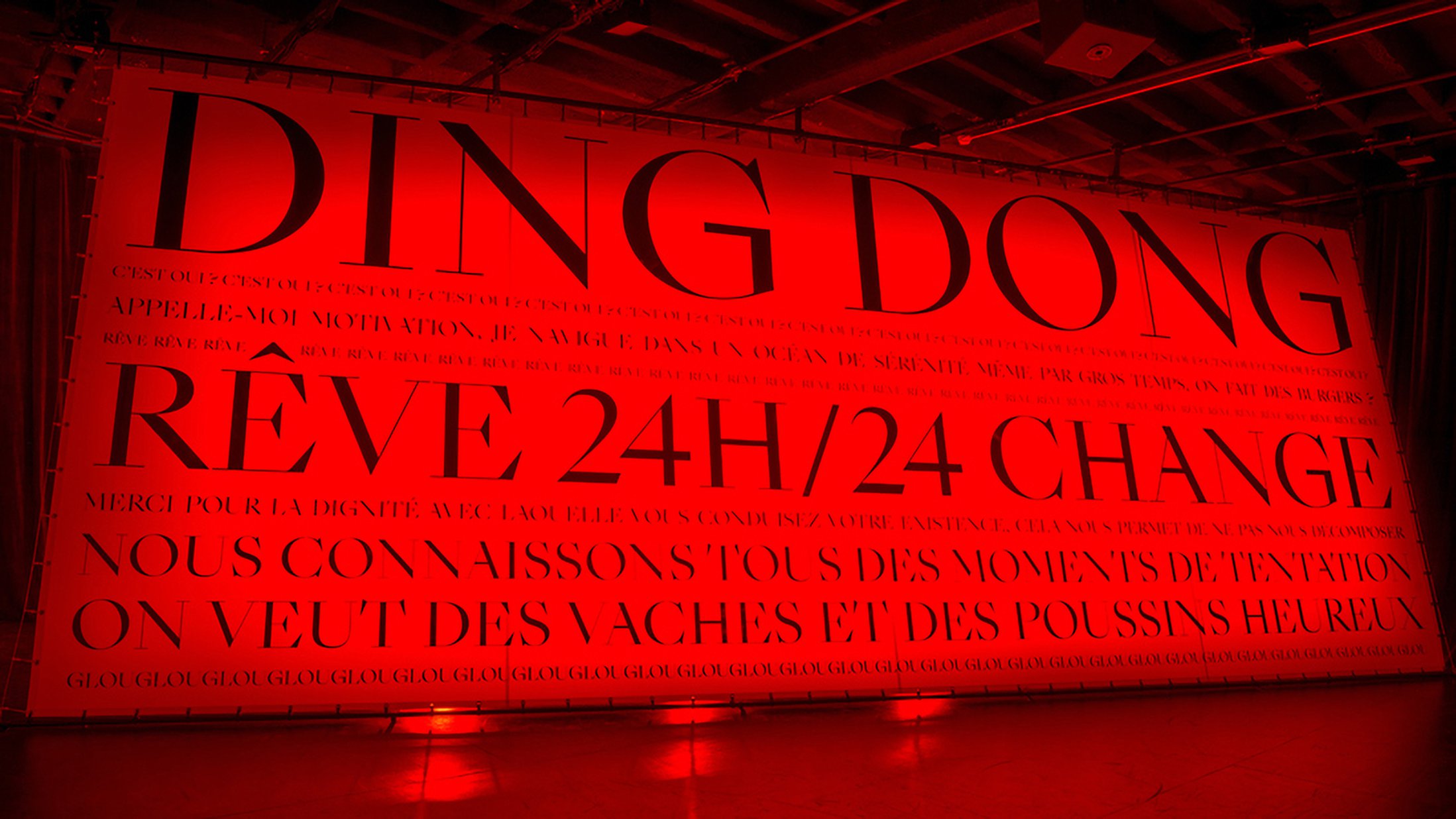
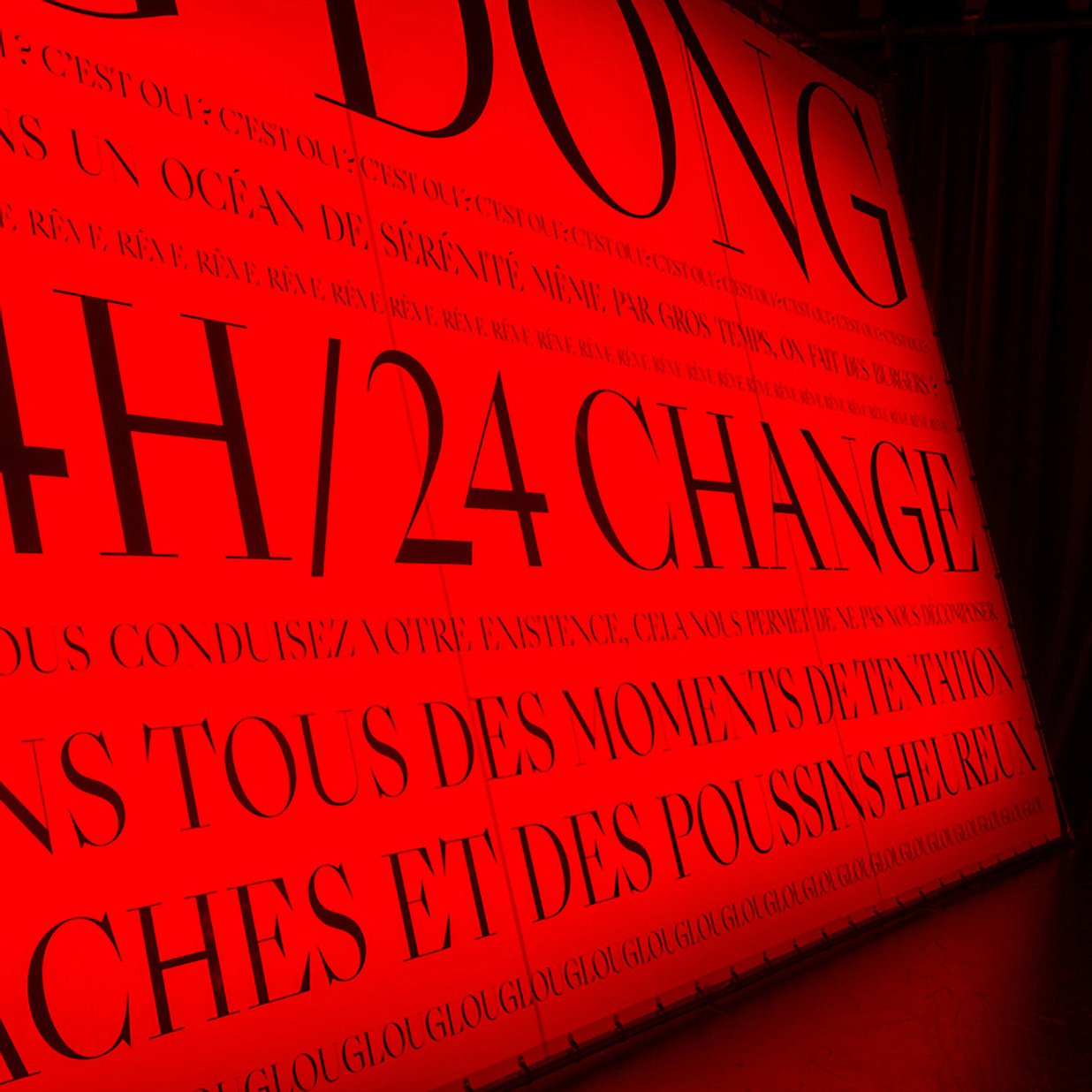
In SangBleu Empire, most serifs are lineal, like in a Didot. The high contrast increases across the four weights. The thick parts grow bolder and bolder, but the hairlines remain razor-thin. Empire ranges at the display end of the typeface: It has the Napoleon syndrome – Empire loves to be big. Also, it is the only SangBleu member to be endowed with Black styles. There, its thick & thin delicacy is taken to the max. Fat curvy letters like the grinning ‘e’ or the spiraling italic ‘w’ may evoke the Caslon burlesques as conceived in NYC’s design studios of the 1970s. But then you encounter the bare kinks and cuts – the crude bar in ‘G’, devoid of any smooth transition, the leg of ‘K’ that has been synthesized into a pure rhomboid, the ‘Q’ that trades the expectable voluptuous tail in for a shockingly plain needle, the italic ‘z’ – and you’ll realize this diva is headed for the future. Some of this attitude is also to be found in our TheW typeface, which may be regarded as a distant cousin.
SangBleu Kingdom
SangBleu Kingdom stands between Empire and Republic, in terms of shaping, contrast amount, and application range. Base serifs are sturdier and bracketed. Pointy triangles not only appear at the x-height, marking the entry strokes of ‘imnpr’, but also terminate the ascenders of ‘bdhkl’. While less tantalizing than Empire, it still comes with royal flavour, most notably in the accelerated tops of ‘f’ and ‘r’, the unseriffed legs of ‘KRk’, or the dramatically inclined diagonals in the italic ‘AVW’. At the same time, Kingdom is connected to the other branches of the typeface, too. Together with Versailles, it is the only family to feature an ‘o’ with a vertical contrast axis. Kingdom likewise forms a pair with Sunrise: Both collections come with Light and Air styles, continuing the legacy of the first SangBleu incarnation. These slender members – ultralight but not monolinear – demand a certain size to thrive, while the other weights work fine down to medium-sized text.
SangBleu Republic
With its modest contrast, more economical horizontal proportions and larger serifs, SangBleu Republic is designed for unobtrusive text and continuous reading. At first glance Republic may look like the odd one out. It is the only collection in the typeface not to flaunt the striking crescent shapes in ‘bdpq’. In letters like ‘m’, the arcs don’t flow smoothly into the stems, but form an angle. Furthermore, ‘c’ and ‘e’ here lose the provocative underbite. The collection still shares much of the design DNA, and goes well with the others, e.g. as a demure text companion to Empire or Kingdom. It’s more than a loyal minion, though: Pronounced triangular top serifs, the proud ear of ‘g’, and inherited eccentricities like the asymmetrical center of ‘W/w’ make sure that Republic isn’t expressionless. Within the greater Swiss Typefaces library, it’s a neighbor of Suisse Works, the seriffed member of the utilitarian Suisse typeface (and in fact its earlier working title was SangBleu Works).
SangBleu Versailles
SangBleu Versailles could be described as an alternative Republic – a softer, rounder sibling, with wider capitals (see e.g. ‘P’ or ‘S’) and a gracefully curved leg for ‘R’, returning to the crescent-shaped bowls for ‘bdpq’. It caters to a similar set of applications, but is distinguished by flatter, less spikey top serifs, and introduces lachrymal terminals for ‘acfry’ (but not ‘g’ or ‘s’). Most other glyphs are virtually identical in both collections – a kindredship that is particularly evident in the italics. The difference in rhythm and feel is nevertheless immense. Just like with Republic, the four-weight span of Versailles includes a Book, indicating that these two collections are made with text sizes in mind. A notch bolder than the Regular, this weight can be employed to finetune the typographic color.
SangBleu Sunrise
SangBleu Sunrise stands out as the only member without serifs. It is far from being a grotesque, though, and is better characterized as serifless roman. And even that is not quite accurate: With the wedge endings in ‘CGSs’, Sunrise sometimes is just as seriffed as the other collections. Looking at the mellow Century-like ‘a’ and the rounded transition in ‘g’, it seems derivative of Versailles. Then again, traits like the stylized ‘Q’ tail can only be found back in Empire. Details like the straight-stemmed ‘M’ with high vertex or the vertically cut flags of ‘f’ and ‘r’ suggest close ties to Kingdom. With the latter, it also shares the weight range including Light and Air styles. Sunrise doesn’t have a single seriffed counterpart, but several. Stripped to the bone, it embodies the essence of the SangBleu concept.
