
.
Article written by Florian Hardwig
.
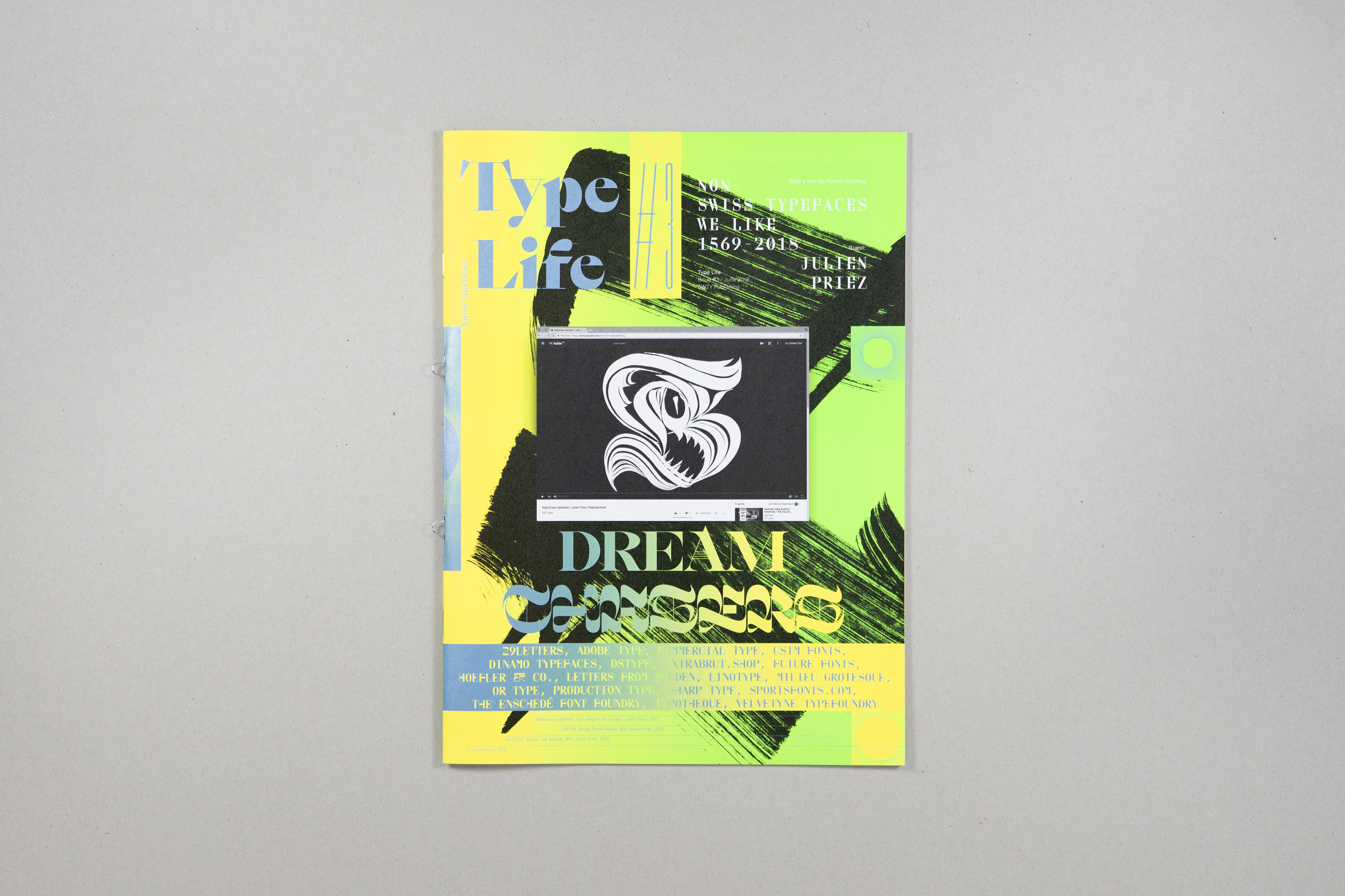
In the third issue of Type Life, Swiss Typefaces take a look beyond their own work and celebrate contemporary type made by others. The Swiss design studio compiled a selection of their favorite typefaces, licensed the fonts and used them to design a magazine. The resulting specimen of “Non-Swiss Typefaces We Like 1569–2018” comes with a text by Florian Hardwig (Fonts In Use) and is visually enriched with works by lettering artist Julien Priez (boogypaper).
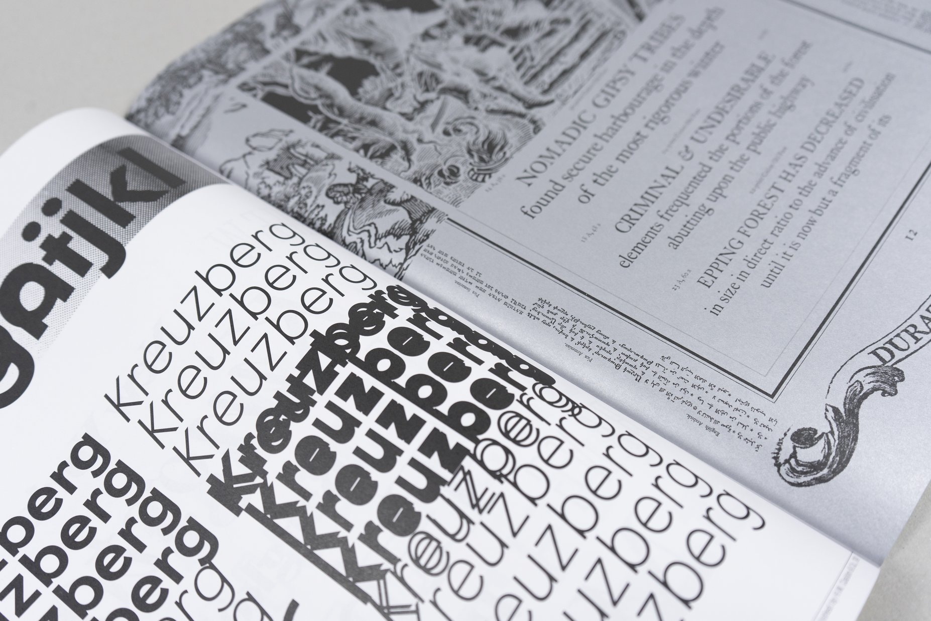
Type Life 3 showcases 19 fonts from 19 international foundries: 29Letters, Adobe Type, Commercial Type, CSTM Fonts, Dinamo Typefaces, DSType, Extrabrut.Shop, Future Fonts, Hoefler & Co., Letters From Sweden, Linotype, Milieu Grotesque, Or Type, Production Type, Sharp Type, Sportsfonts.com, The Enschedé Font Foundry, Typotheque, and Velvetyne Typefoundry. The selection is a representative sample for the diversity in type design and gives an illuminating overview of the current scene. While the majority of the fonts was released in the past few years, many draw inspiration from all kinds of sources from previous eras. There is blackletter, script, slab serif, sans serif, and more. This – a stress on newness, historical references, and a vast stylistic plurality – reflects three major trends in today’s typography, as Florian Hardwig points out in his introduction. Other recurring themes that he identifies as being symptomatic for 2018 include highly conceptual projects and a quest for extreme aesthetics. At the same time there are functional fonts designed to solve specific problems. Just like the fonts, the type designers who created them have diverse backgrounds, in terms of geography, or how they entered the field. The represented distribution models range from traditional licensing to subscriptions, free and open-sourced fonts, as well as experimental or even unfinished releases.
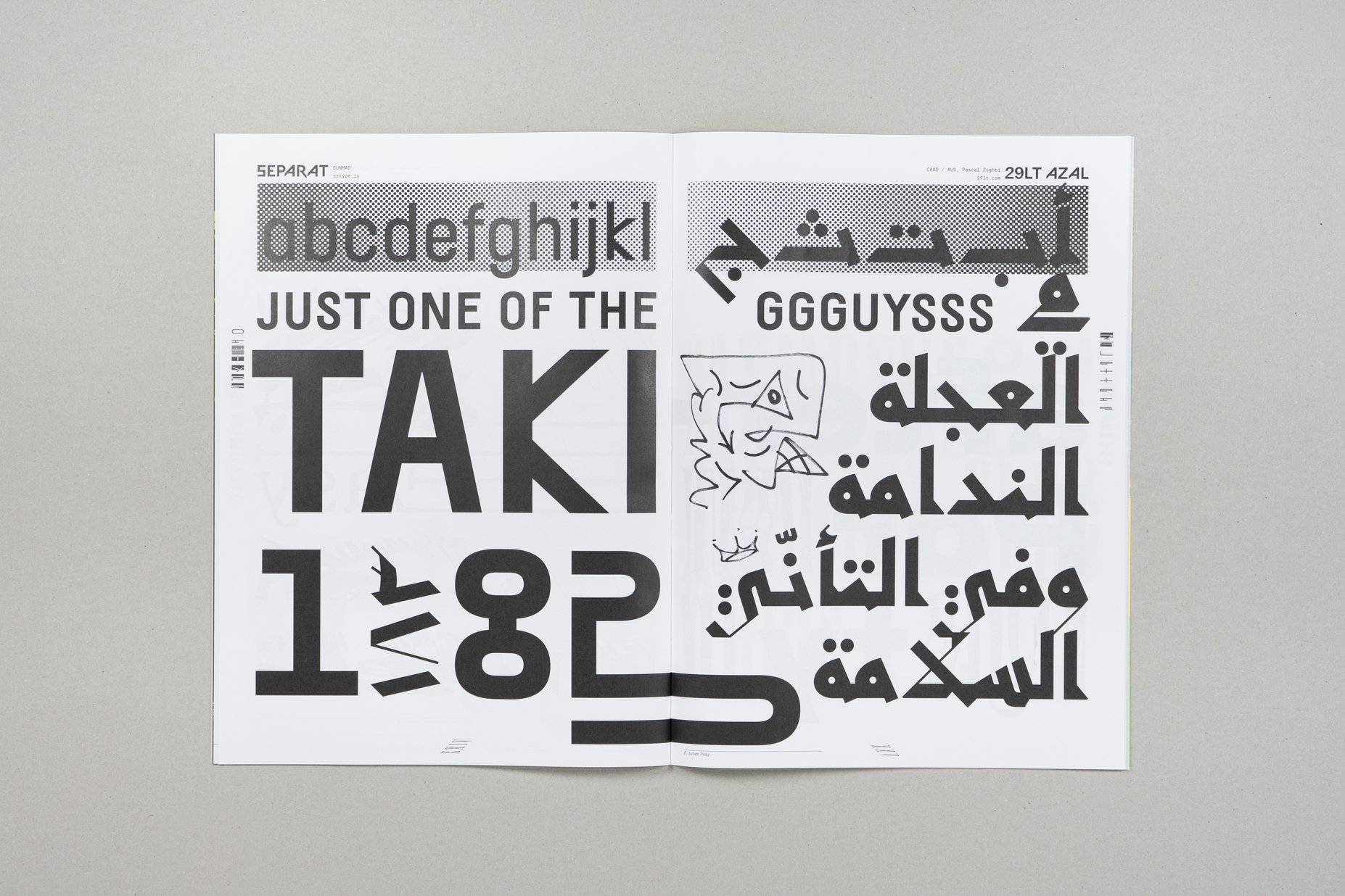
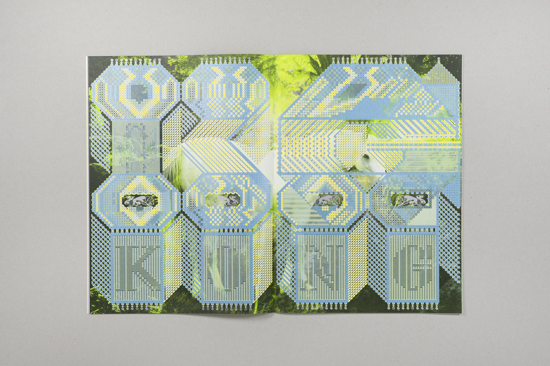
Each issue of Type Life features a guest contributor. This time it’s the up-and-coming French lettering artist Julien Priez (@boogypaper). A graduate of École Estienne, Paris, he’s a member of the international collective High on Type, best known for organizing the annual festival All Eyes on Type. Priez gives workshops at various schools and is an instructor at the prestigious TypeParis program. His work oscillates between the analog and the digital. Alphabets are first calligraphed, then cut in wood, and eventually digitized. Priez is just as comfortable painting meter-high letters with a triple brush on a wood fence as he is animating ornate pixel letters with kaleidoscopic patterns. Type Life #3 shows a range of his repertoire, starting with a still from his animated Nightmare Alphabet and two of his in-progress fonts Boogy Roma and Boogy Link on the cover. Mandinor Gothic is used to render the word “KING” on top of a kinetic gesture. The next page answers with “KONG”, in letterforms that pay homage to Jean Midolle’s Alphabet Lapidaire Monstre from 1835. With such historical references and the stunning stylistic versatility, Priez’ work is a perfect fit for the content of this issue.

CREDITS
Concept, art direction, photography & graphic design: Swiss Typefaces
Patterns: Letraset
Handwriting & calligraphy (guest): Julien Priez
Text: Florian Hardwig
Print: CRICprint, Marly, Switzerland
Paper paper: Blocker 80g/m2
ISBN:
40 pages, 23.3 cm x 32 cm