Text by Dan Reynolds
Raskal is a visual statement. There’s no denying that it looks direct. Its design digitally translates and transforms handwriting and hand lettering’s most exciting elements. Although it has a lot in common with “script fonts,” Raskal’s relationship to handwriting or formal script styles is not as close as what you see in revival typefaces or ones based on a famous calligrapher’s oeuvre. The trip Raskal took between its initial concept and the final product was not straightforward. Emmanuel Rey could have arrived at many different kinds of type designs instead. Below, I (Dan Reynolds) highlight some aspects of the process because they are indicative of how Swiss Typefaces undertakes all its projects. While Raskal doesn’t look like its other typefaces, the way it came about illustrates how the foundry works.
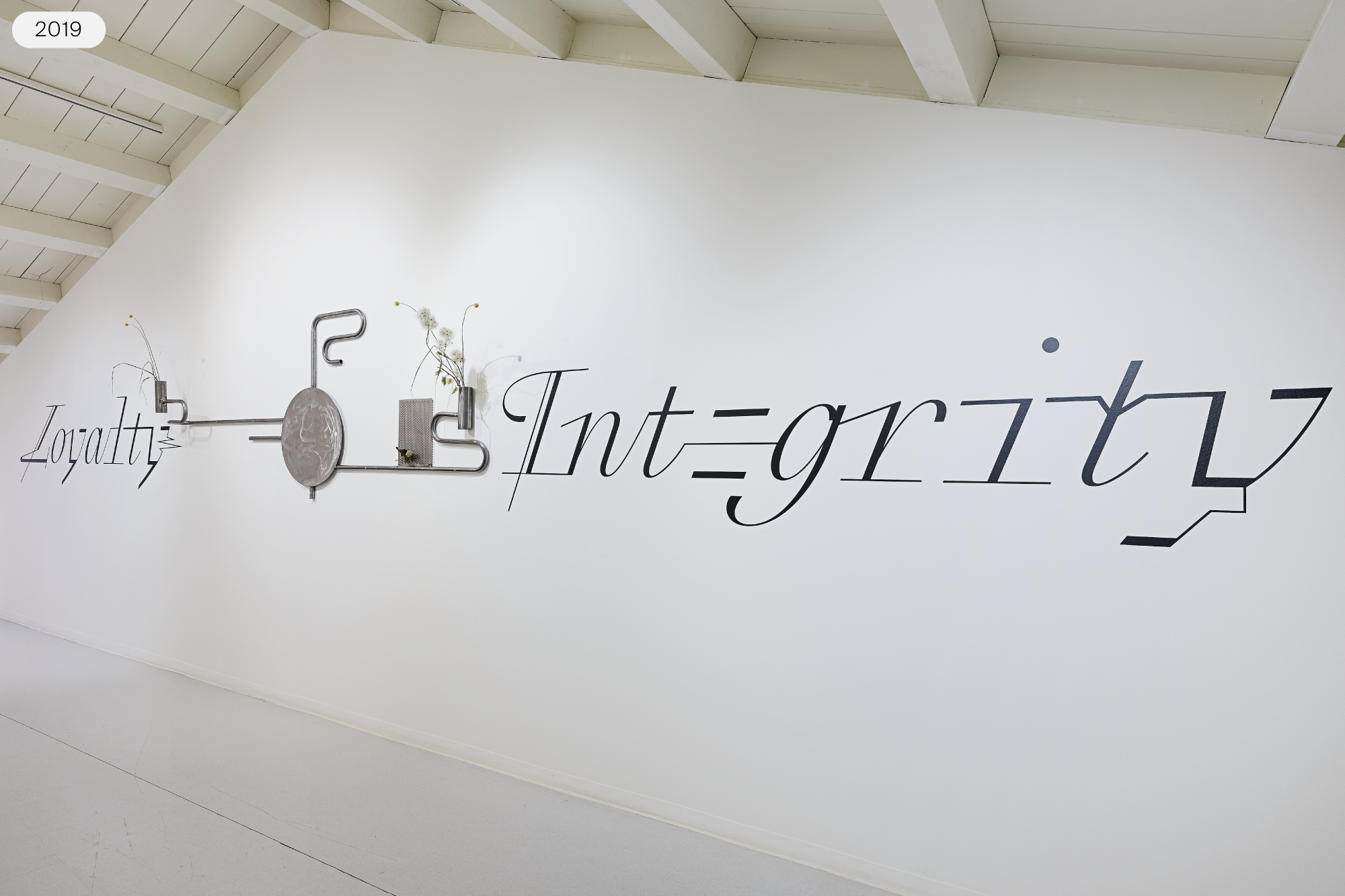
Loyalty and Integrity, Emmanuel Rey, Simon Paccaud & Jean Angelats / Atelier J&J, Morgane Erpen, metallic structure, tape and plants from the exhibition CHALLENGER by Simon Paccaud at Ferme de la Chapelle, Geneva, 07.09-13.09.2019. Photo © Nicolas Delaroche Archives Modernes.
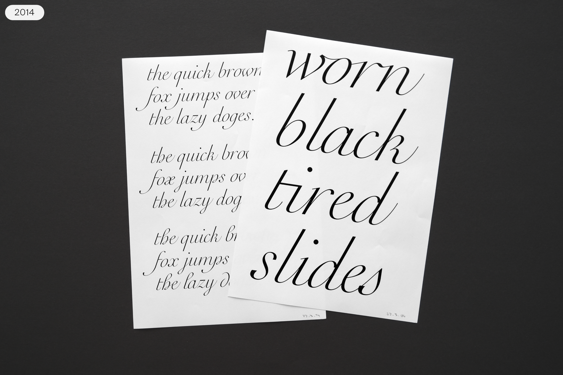
Raskal is a digital typeface. By saying this, I don’t mean to state the obvious. Of course, the font is a digital file for use with digital applications. Instead, what I mean is that the font’s design process was primarily a digital one. For many years, all its design and form-finding experiments were drawn digitally without resorting to sketches made by hand. Which might sound an aberration for a typeface inspired by calligraphy. However, very late in its development, Rey began making quick sketches on paper to help determine how some of its final glyphs might best look.
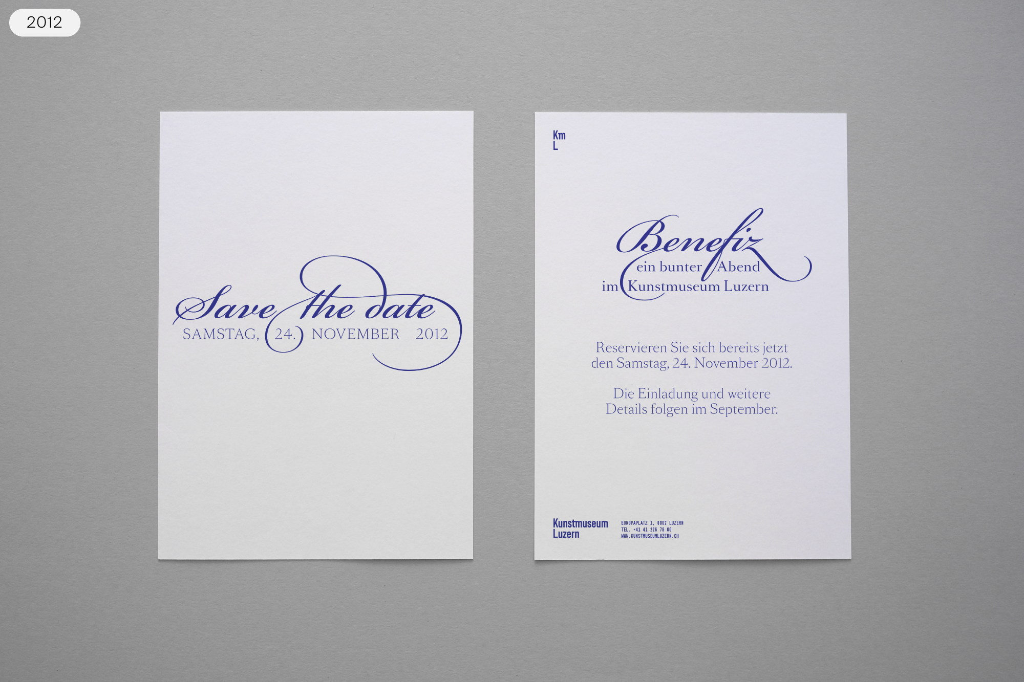
Invitation card for a donors’ event at the Kunstmuseum Luzern in 2012, using Bickham Script Pro from Adobe and SangBleu OG from Swiss Typefaces.
In 2012, Rey took the first steps toward what eventually led him into the concept of the Raskal typeface. He had designed an exclusive typographic system for the new visual identity of the Kunstmuseum Luzern, and it came time to design an invitation for a gala. Script fonts often function as shorthand for formality, and he had to use one, even though the museum’s corporate design system he had developed didn’t dictate any option. Swiss Typefaces also did not have a script font in its library. In the end, Rey used Bickham Script Pro, a digital font that attempts to present text in the style of 18th-century English writing masters. It does this through its letterforms’ general appearance and by having many contextual alternates. However, relying on a computer to render the elegance of roundhand-style calligraphy is more like historical reenactment than actual history (one can, after all, still write invitations out by hand). To prepare for the next time that a brief called for a script font, Rey wanted to have something to suggest that wasn’t anachronistic.
Raskal started as a script-style extension and accompaniment to the original SangBleu OG typeface. For a while, the design had two weights, one of which featured heavy strokes and a lot of contrast. The idea was to create new styles to add to the SangBleu family, with unexpected appearances and feelings. While going about this, he tested ideas that offered formal complements to the existing SangBleu OG fonts rather than what designers typically expect font families to contain.
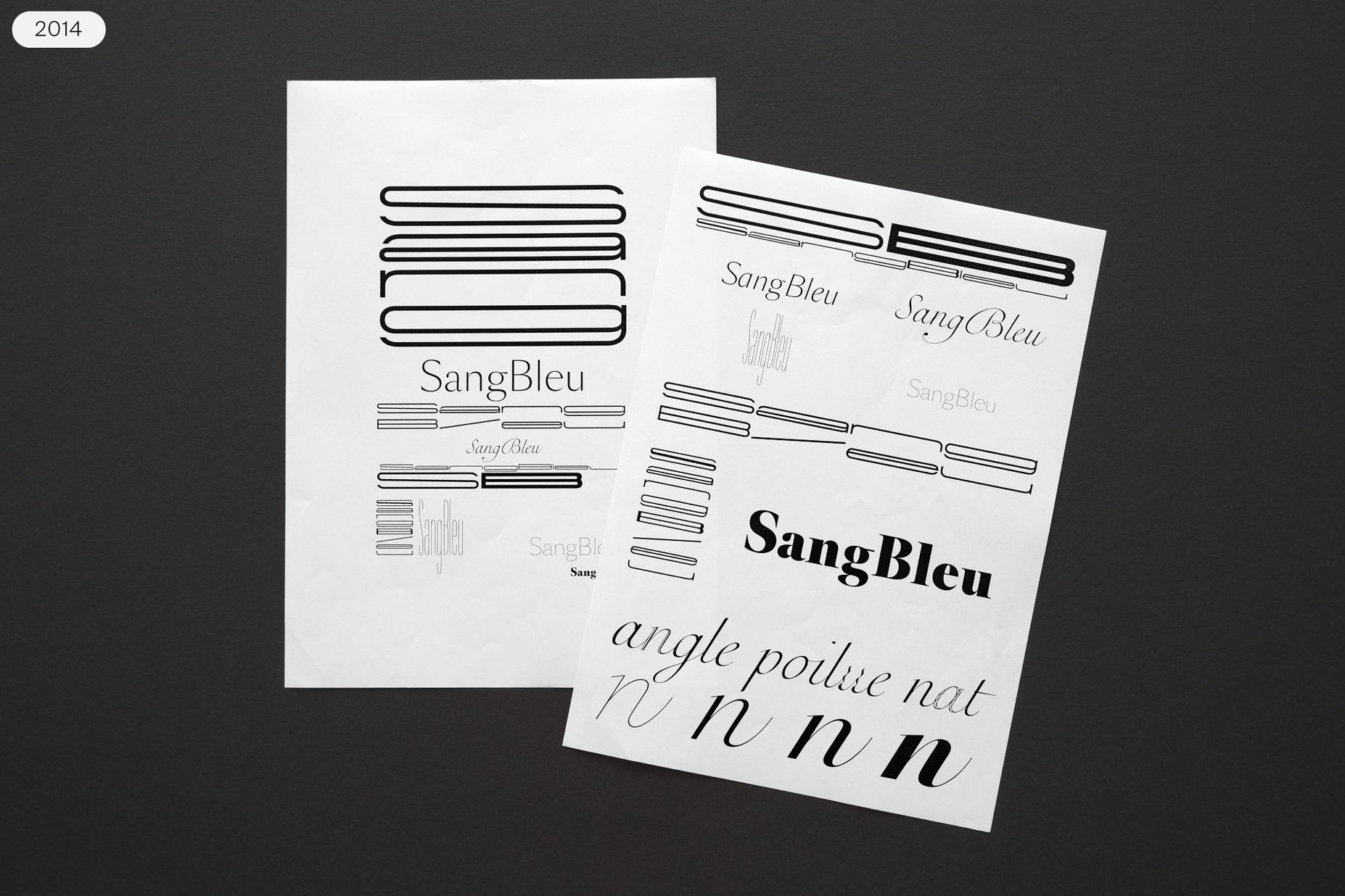
Very first research decks for a new style to match with the existing SangBleu OG typeface. In addition to the script which led to Raskal, we can see some attempts for an ultrawide typeface to contrast with the existing SangBleu OG Condensed.
Left page shows an early digitalization in a Pangram repeated 3 times, with different letters variations (“d”, “g”, “h”, “p”, “s”, “w”, “y” for example).
Early research stages explored two different extreme weights, Light and Bold.
On this page, we can see the first attempts to add more contemporary shapes into the script.
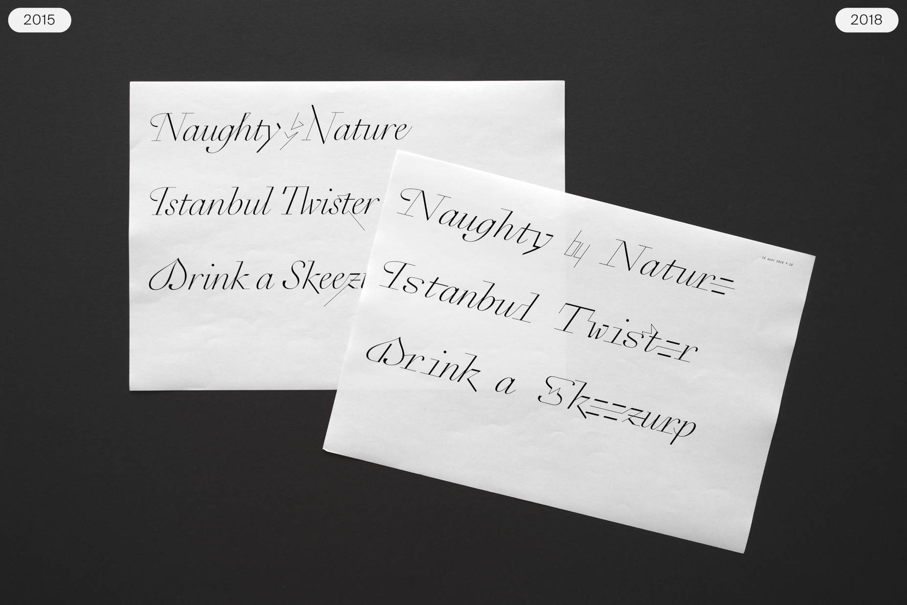
Difference between the 2015 stage of the development containing some unusual graphical intervention on the characters, and the 2018 version with a much more assumed intention in the design.
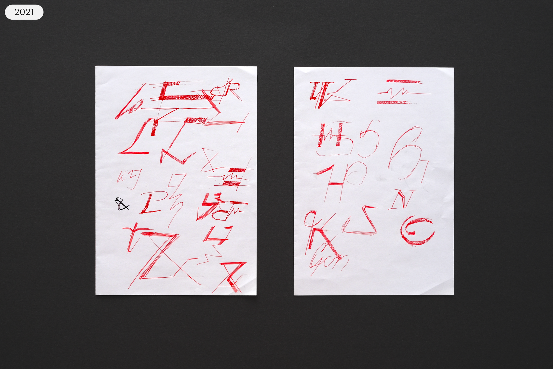
Late sketching phase to determine the final form of some shapes.
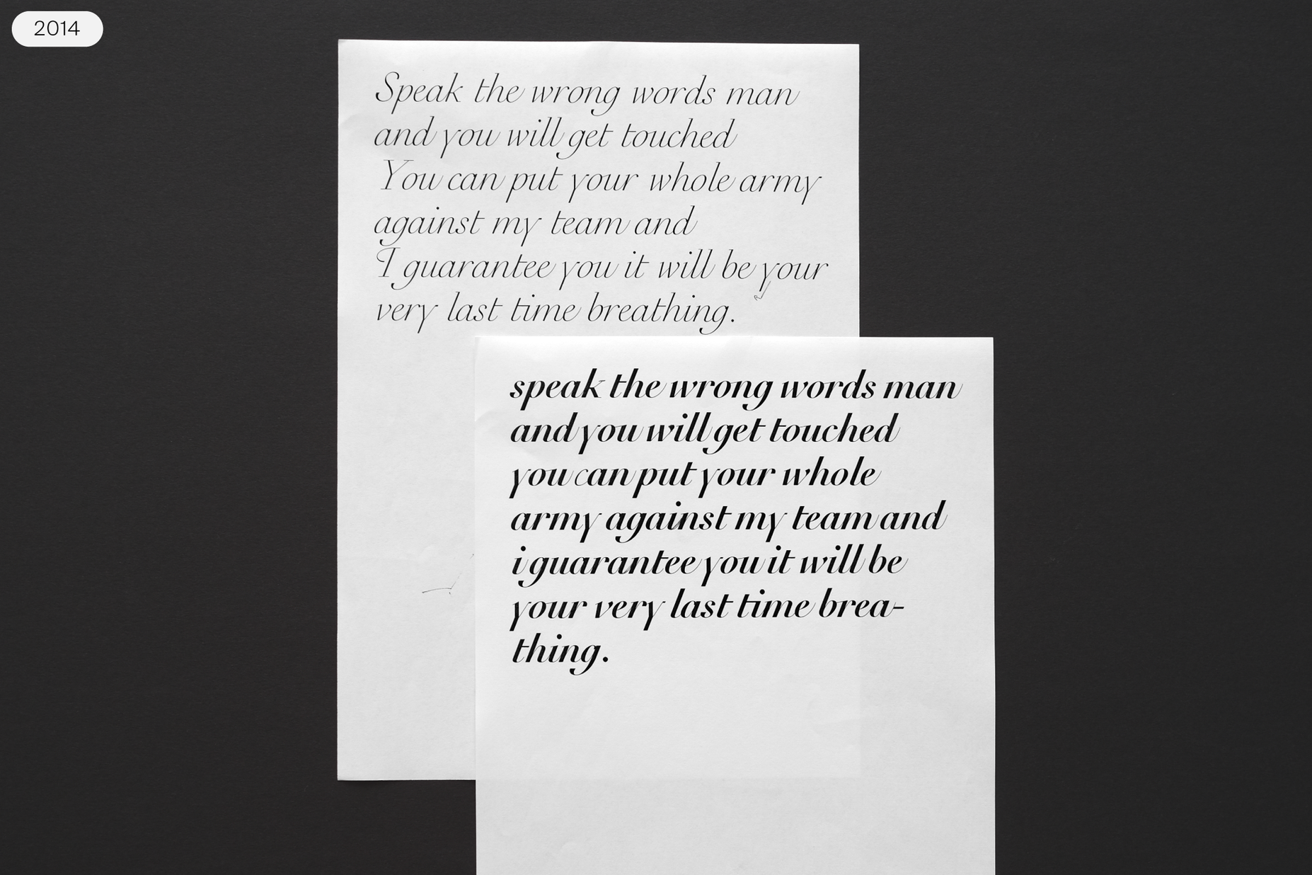
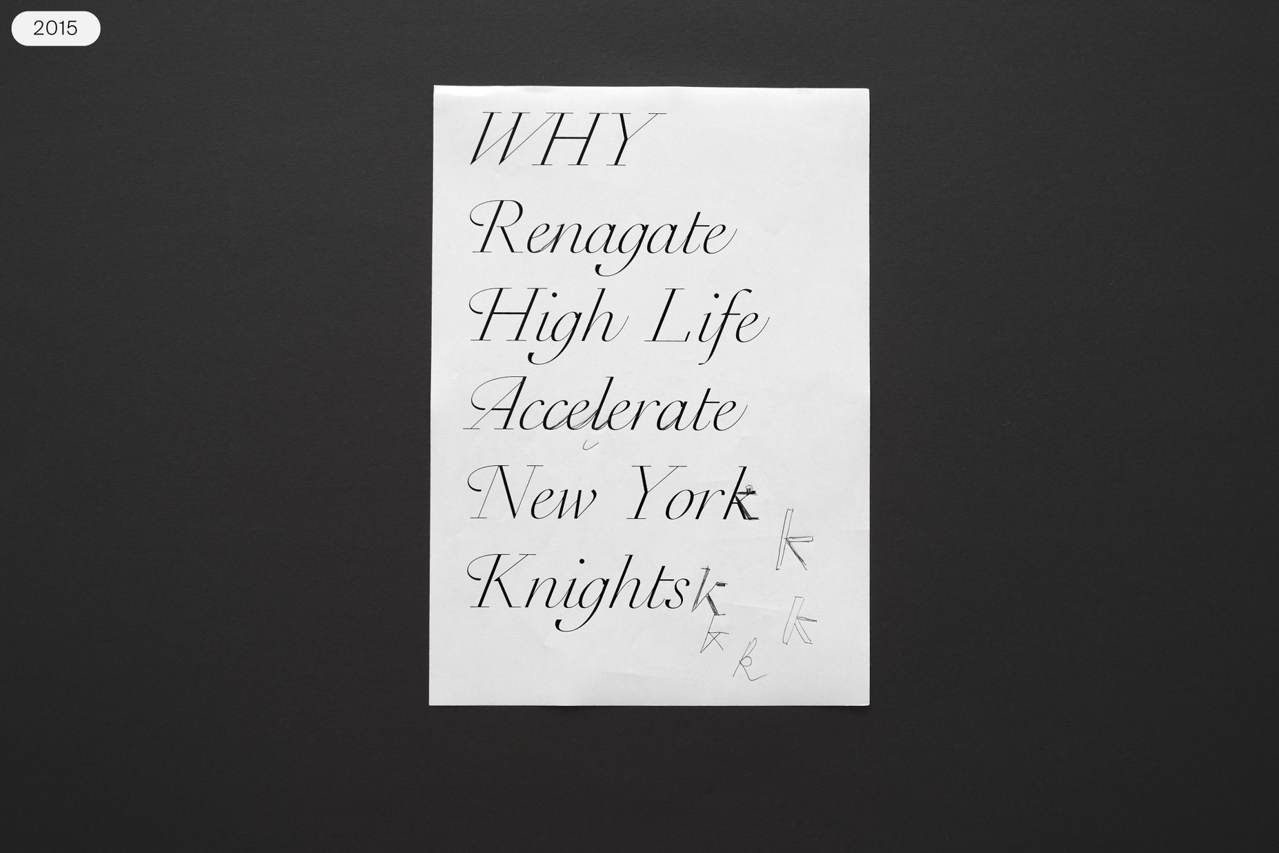
The slideshow above shows some of the first digital steps Rey undertook to make Raskal. Although those initial tests show a lot of different potential directions the typeface could have taken, all of them were still very close to calligraphy and mimicked what we often expect from script fonts. Like all Swiss Typefaces products, using the in-progress design in real applications was part of Raskal’s development process. And it is not just that Raskal’s design was used in e.g., Type Life and TTTISM before it was finished. Using the typeface in real projects helped Rey finish the design.
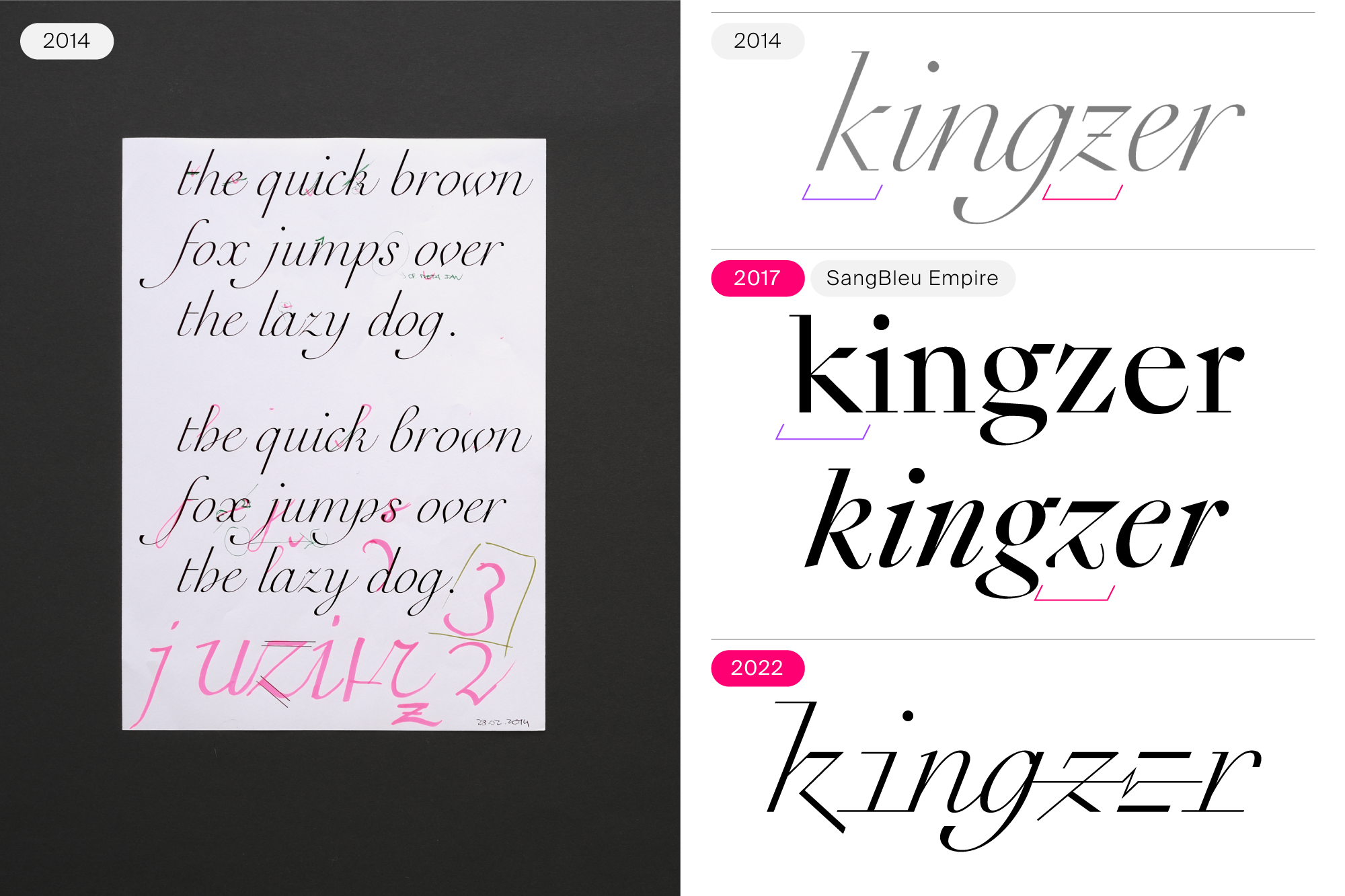
Raskal at two earlier stages of its development. Left: Six lines of text were set with a not-yet-monospace font in Swiss Typefaces’ Type Life #2 magazine. Right: The line in TypeLife #1v2 is appears monospaced. Raskal is not actually a monospaced typeface. However, most of its glyphs do have the same width.
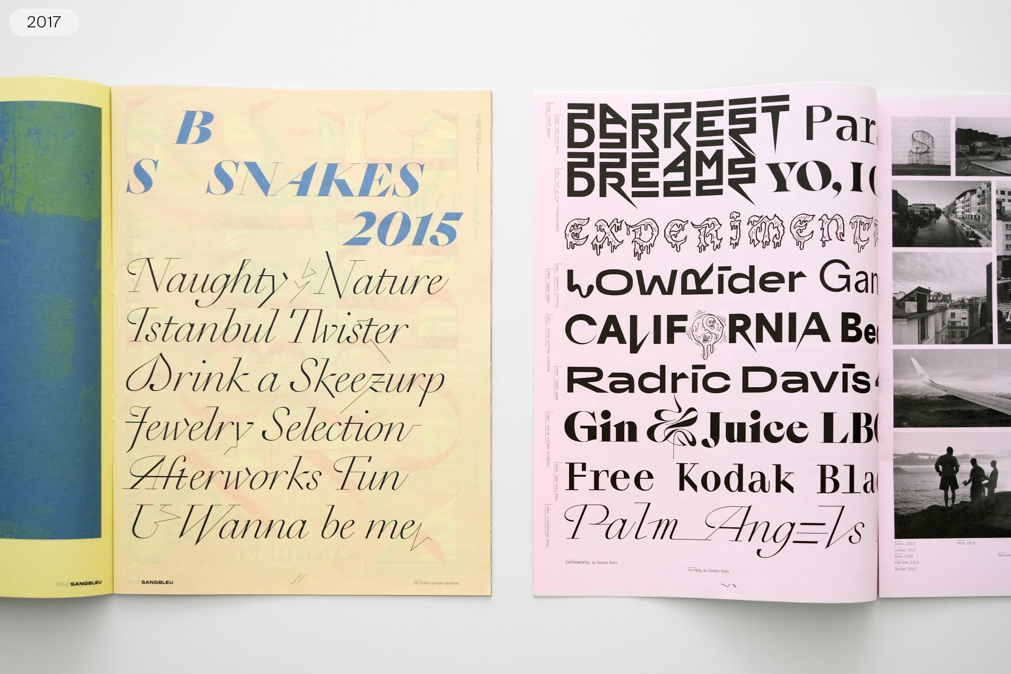
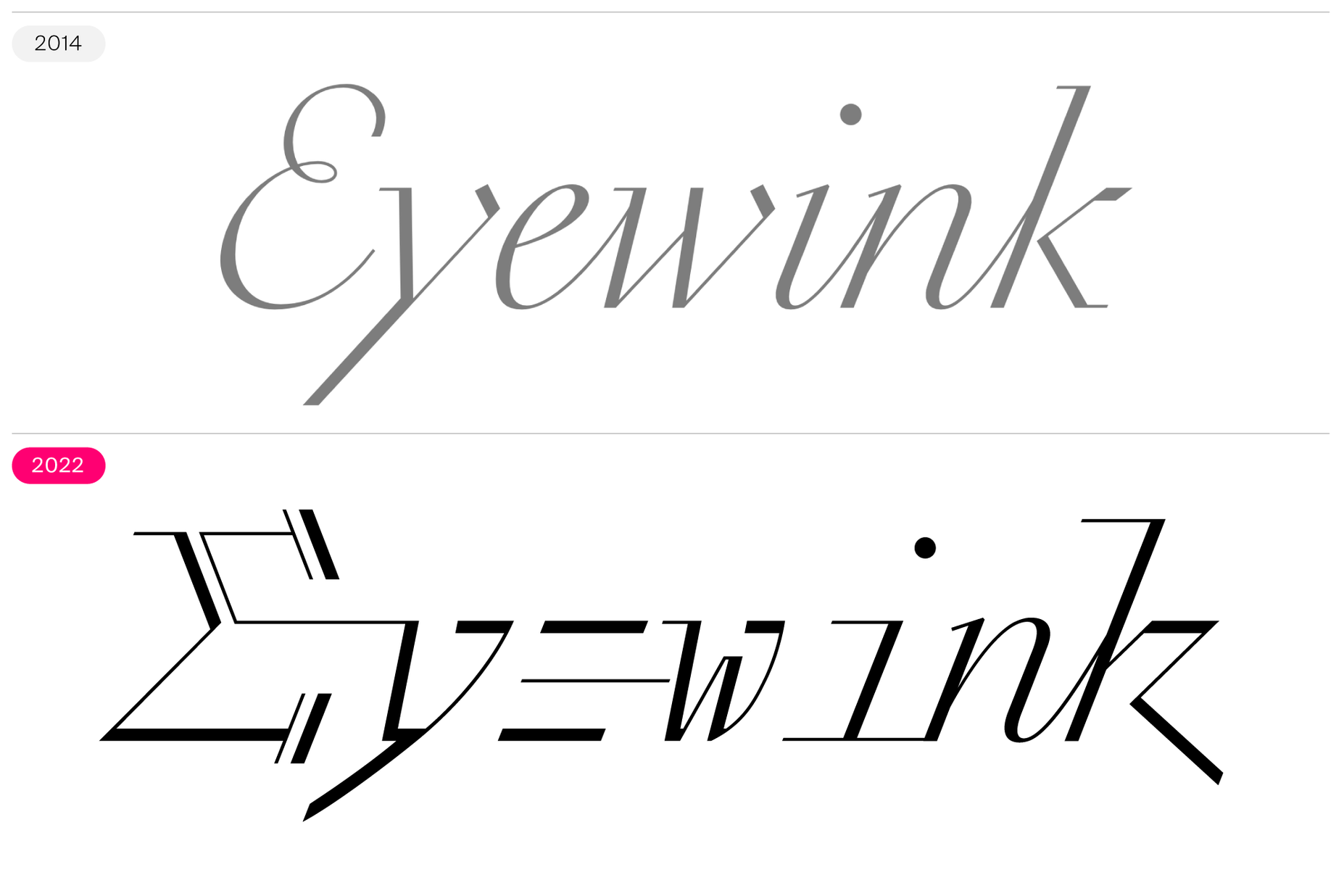
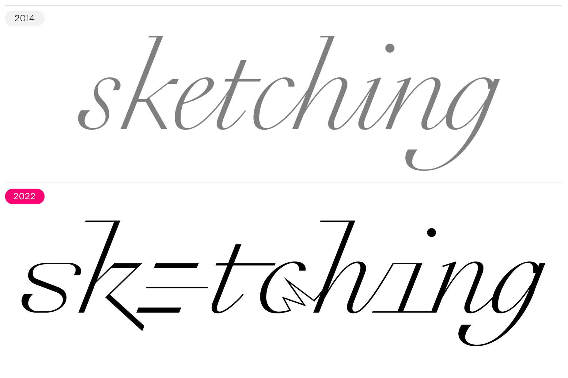
Swiss Typefaces’ Type Life #2, published in 2017, was about SangBleu (the typeface) and Sang Bleu (the brand). The magazine included a page printed in an earlier version of Raskal’s design. As you can see above, many of the letterforms still looked like traditional script-style fonts. Some capital letters look historically familiar, although the alternate forms and ligatures already had a decidedly 21st-century vibe. At that time, SB Snakes – the typeface’s working name – was not monospaced yet. However, by the time Type Life #1v2 was published in 2018, the typeface’s design had become virtually monospaced. By 2018, it also had fewer traditional letter shapes. That is clear even when looking at the single line from Type Life #1v2 above. The “e” had taken the form consisting of three horizontal strokes only.
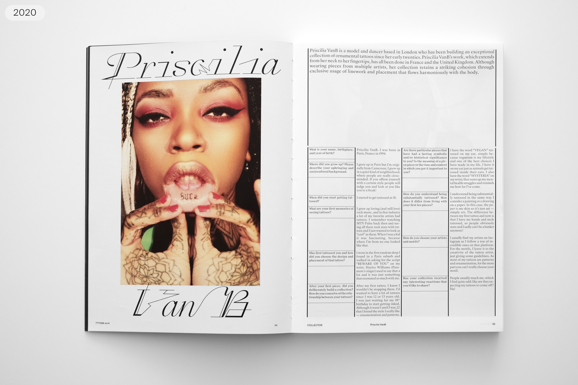
Work-in-progress’ version of Raskal used in TTTISM magazine #4, published by Sang Bleu.
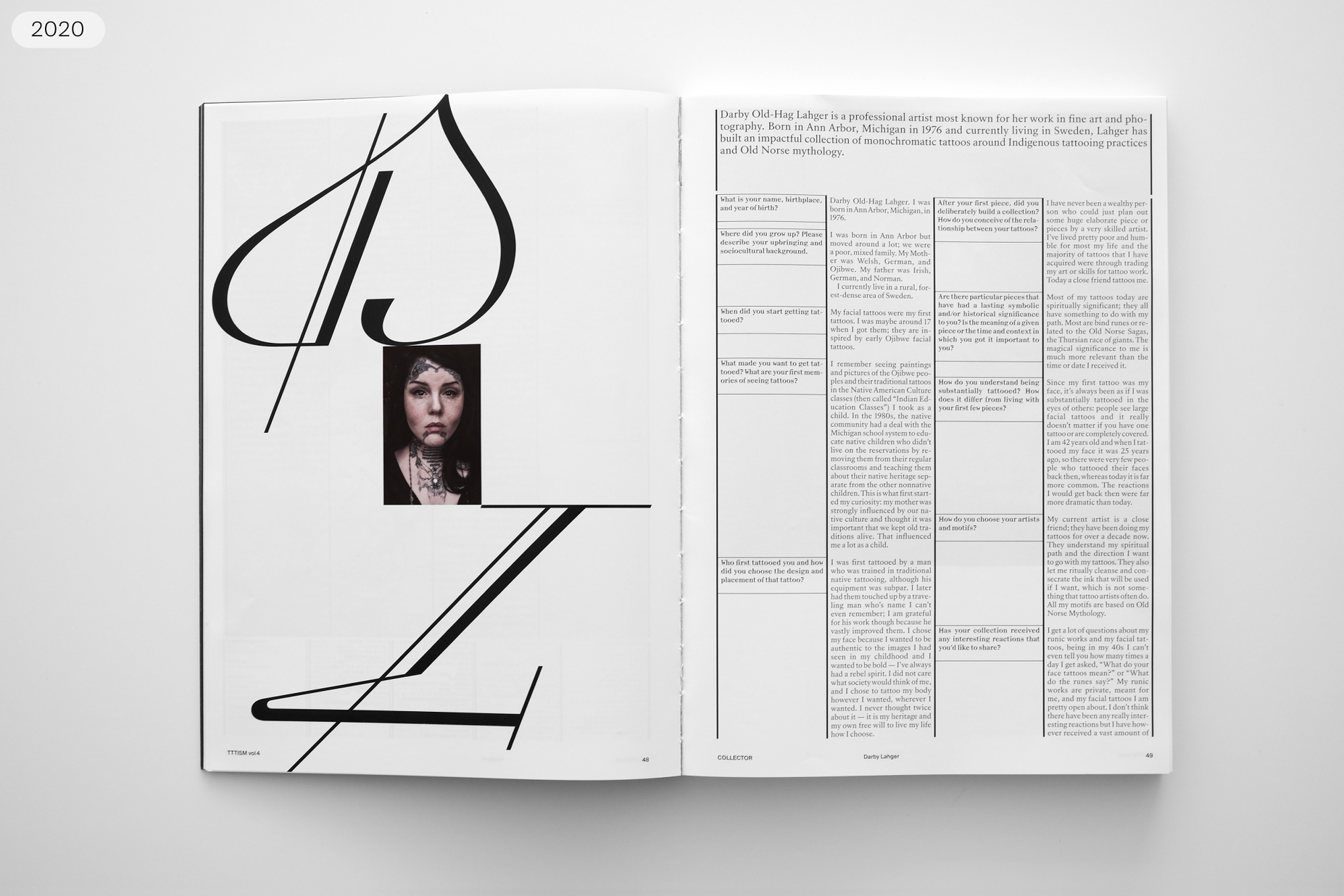
Work-in-progress’ version of Raskal used in TTTISM magazine #4, published by Sang Bleu.
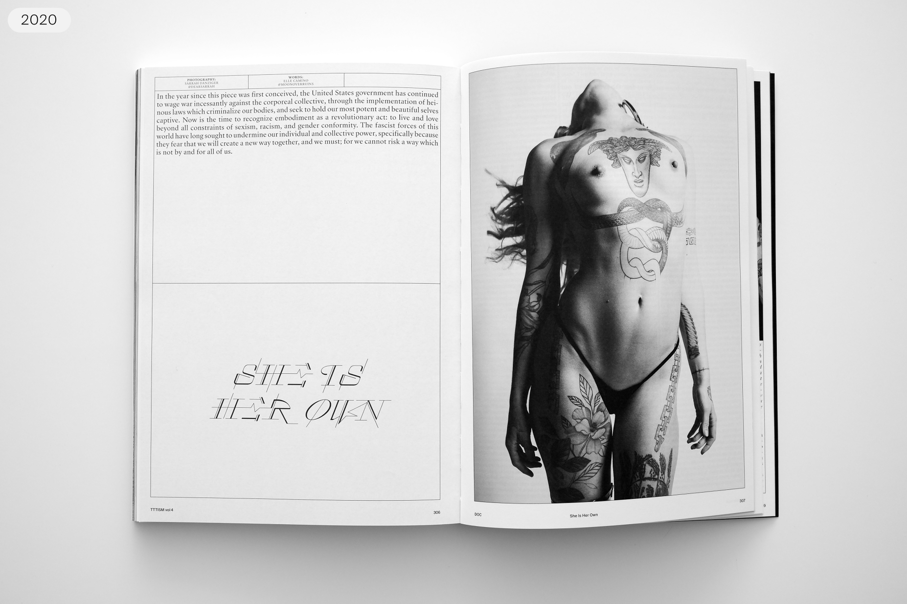
Work-in-progress’ version of Raskal used in TTTISM magazine #4, published by Sang Bleu.
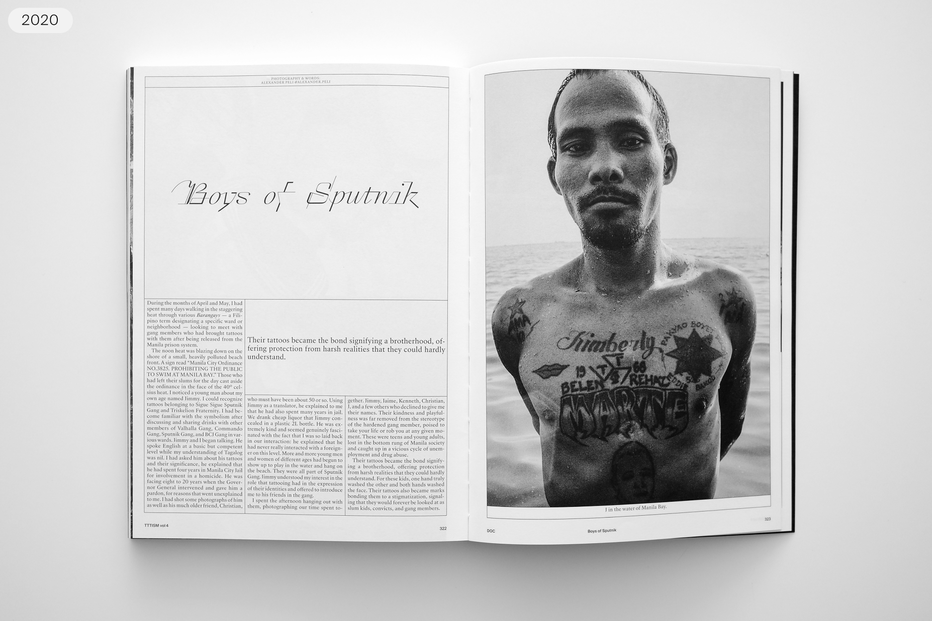
Work-in-progress’ version of Raskal used in TTTISM magazine #4, published by Sang Bleu.
Seeing how letterforms come together into words in a real-life setting is the best method for illustrating which parts still need improvement. TTTISM magazine — under creative direction and published by Sang Bleu, with art direction and graphic design by Hubertus Design — test-ran Raskal in its layout. Looking at the text in its editorial design, Rey could see the things in Raskal that he still needed to fix. While upgrading Raskal for use in TTTISM, Rey became determined to make it work in all-caps settings, after seeing it used like that in the magazine’s design. It is generally a rule of thumb that text should not be set with script fonts in uppercase only. Most script designs only included capital letters optimized to come before lowercase letters. Yet, there are script fonts that work in all caps. With the right design choices and automatic contextual substitution, you can make words look effective.

One determining point in Raskal’s development was Rey’s decision in 2018 to turn it into a monospace-style font. After working on the script font for four years, he felt like he wasn’t getting anywhere. That sensation forced Rey to reconsider his self-inflicted brief. Aesthetically, the challenge of turning Raskal into a typeface looking like a contemporary script was far from resolved. He was even getting feedback that suggested he should abandon his initial desires and finish the typeface as a simple digital reinterpretation of a historical writing style. But that was not satisfying at all.
To force himself toward new and refreshing visual perspectives and to think outside of the box, Rey applied a tactic he had often been pleased to offer students in workshops if they were ever stuck in a creative rut while working on a piece of design. He told himself to add an irrational parameter to the brief, a challenge that seems impossible to solve, something that doesn’t even make sense if you try to define it with words. For Raskal, that was “to make a script font monospace” and channel handwriting’s freedom into small boxes with identical widths. While the final typeface is not completely monopaced, the monospace-style was a way to integrate the mechanical aspect of typography into calligraphy. That brought a new language to the typeface since each letter would have to occupy the same spacing box. Lowercase letters like “e”, “i”, “l”, and “s” needed new solutions to fill in their own space without breaking the flow of the script – which is the most important visual aspect of this type of design.
Comparison between the early proportional sketches and the late monospace-style design of the retail font.
Comparison between the early proportional sketches and the late monospace-style design of the retail font.
The inclusion of the three-storey lowercase “e”, which appears as a natural solution when designed on the computer, gave the new and definitive direction Raskal would finally take. Released from any classical design expectation and totally free of agreed type design or calligraphic rules, Raskal was born again.
A standard “e” shape, shown in grey in the above illustration, can only offer unsatisfying solutions for a monospace-style script typeface. You can see the three-story “e” form we built into the final font in black.
A standard “c” shape, shown in grey in the above illustration, can only offer unsatisfying solutions for a monospace-style script typeface. You can see the form we built into the final font in black. That “c” uses an added zig zag to fill in empty space.
Let’s take a detour for a moment. The first Porsche 911 was released in the 1960s. Porsche continued to develop the car, but the car’s name did not change. While Porsche did introduce higher model numbers several decades later, it still marketed those cars with the Porsche 911 name. Brand names may stay the same, but the expectations for how they will behave change over time. What we judge as being new and innovative today is not the same as what our forebears from 1989 or 1963 would have considered innovative. That is true for cars and for music as well. Today, people make new typefaces because brands, fashion, and trends need different things than were wanted decades or centuries ago. Swiss Typefaces’ fonts have a strong connection with today’s aesthetic needs.
Raskal is a typeface that channels lettering as an activity to allow people to create lettering pieces of their own just by using a font.

SangBleu OG was a contemporary design inspired by the most exclusive letterforms in history – the Romain du Roi, or King’s Roman, commissioned by Louis XIV in the late 17th century. SangBleu took its cues from the Bignon Commission’s models and the types cut by Grandjean. Both celebrate the marriage of geometric rationality and elegance. They also celebrate the joining of science and craftsmanship. Not interested in mimicking history, Swiss Typefaces processed those ideas into something more synthetic and radical and thus more modern.
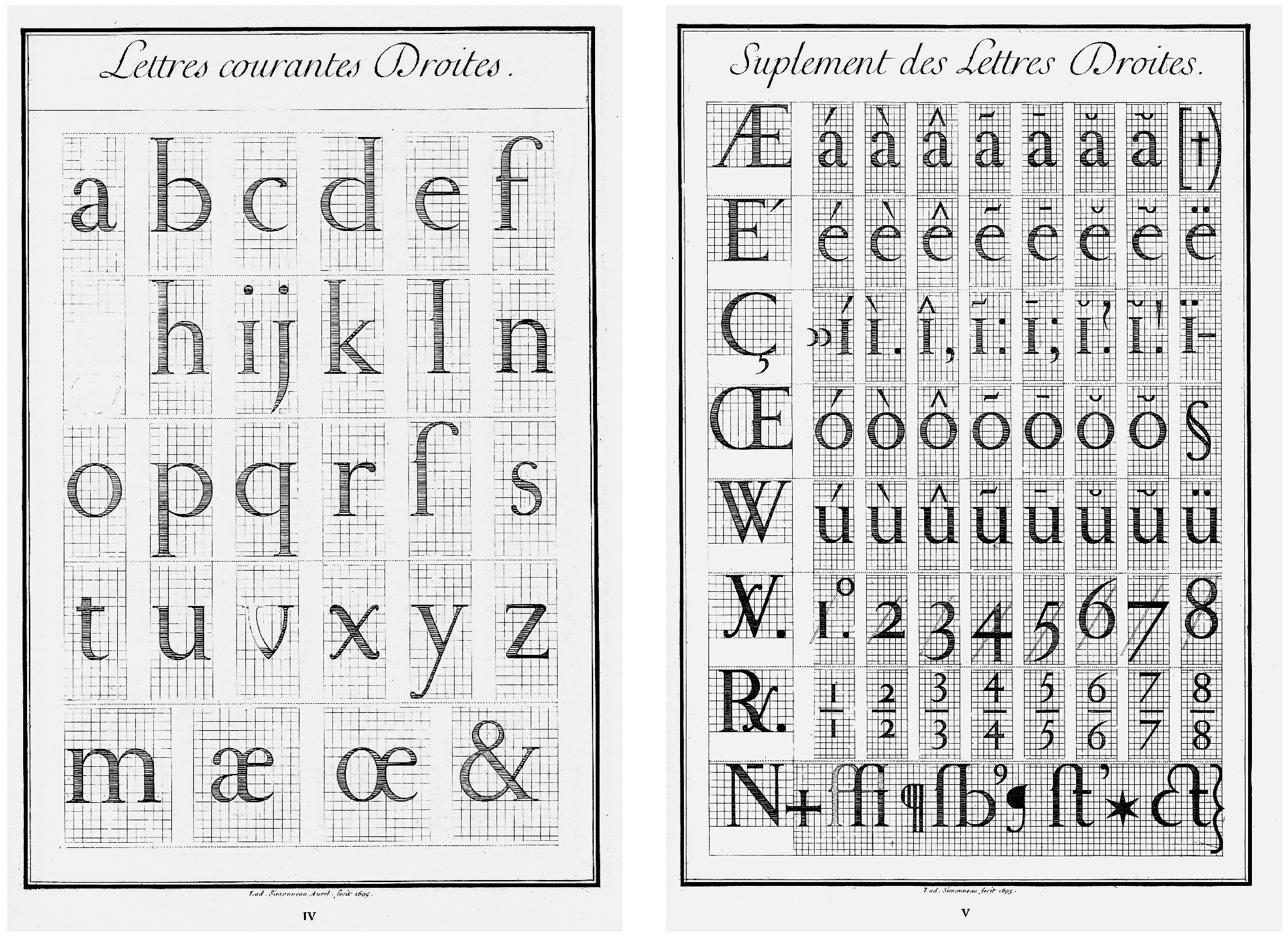
Two of Louis Simonneau’s copperplates showing the Romain du Roi design,1695.
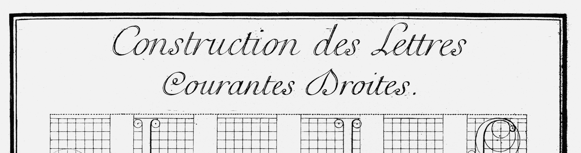
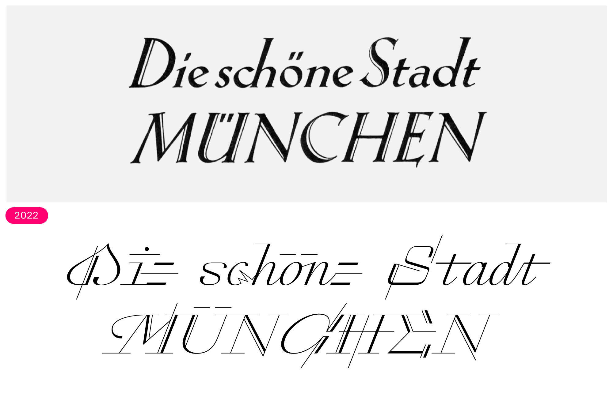
Let’s talk about those Romain du Roi models. A series of four engraved plates dated to 1695 articulates the “design idea” behind it. Each plate shows five or six rows of letterforms, with every letter superimposed on a grid. Most roman uppercase letters, for instance, are on an 8 × 8 grid. As Robin Kinross described in his book, Modern typography, that grid was more helpful in illustrating the process behind the Commission’s new ideas on letterform design than it was for the traditional type makers of the time. “Even in its simpler form and in the largest sizes,” Kinross wrote, “this system could not be of much practical use in cutting punches. […] The plates were important rather as theoretical demonstrations: suggestions of what might happen if letterforms were designed according to rational principles, and with less regard for what were by then established conventions.” Unlike 1695, today anyone can reduce a large drawing down to a small size, or enlarge handwritten text to the size of a billboard.
Each of those 1695 Bignon’s Commission models plates has a two-line title at the top, and the letterforms those titles are engraved in look very different from the Romain du Roi itself. They show clean, wide letters that connect, like in a script. And those letters were Rey’s starting point in the long process leading to Raskal. Surely, those plates’ script-style letters were inspired by the work of writing masters who had worked, or were working, in France at the time. Although Nicolas Jarry’s calligraphy, for instance, predates the Romain du Roi plates by about a half-century, the script we are discussing here is very similar to the letterforms he used in his work.
A close-up of the top of the Romain du Roi Courantes Droites copperplate.
Early preview compared to the current version of Raskal.
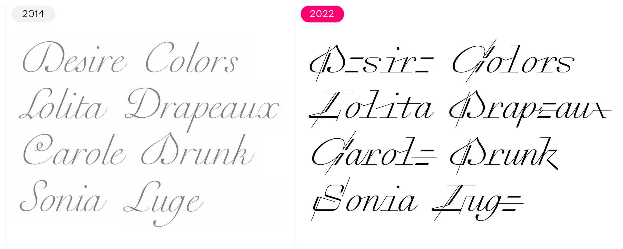
The script capital letters “D” appears on two Romain du Roi plates, with different forms each time. The shape for “D” on the Courantes Droites plate may be the most direct historical anchor retained in the final Raskal design. You can see an early digital interpretation of that “D” on the word "Drunk" of the image above. The Romain du Roi plates’ titling script reveals a few more novel idiosyncrasies.
Rey also consulted historical calligraphic models, one of which directly inspired the “ru” ligature on the left on the word “Drunk” again. Although that did not make it into the final font, Raskal includes contemporary-looking ligatures that reinterpret those joins, like the “Lu” combination on the word “Luge” on the right. Some Raskal letterforms retain the design’s initial appearance, which you can see in the “a”, “g”, “n”, “o”, “p”, “r”, and “u”. Raskal’s character set mixes traditional forms like those with expressive digital shapes.
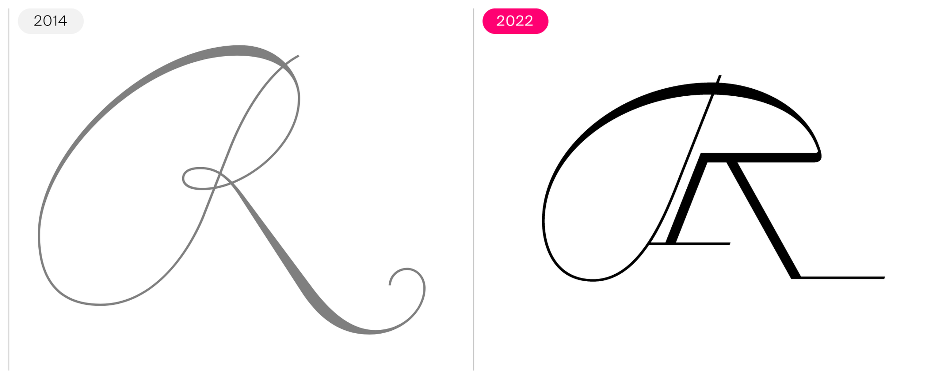
Classical early digital drawing of a calligraphed “R” and its final version in Raskal.
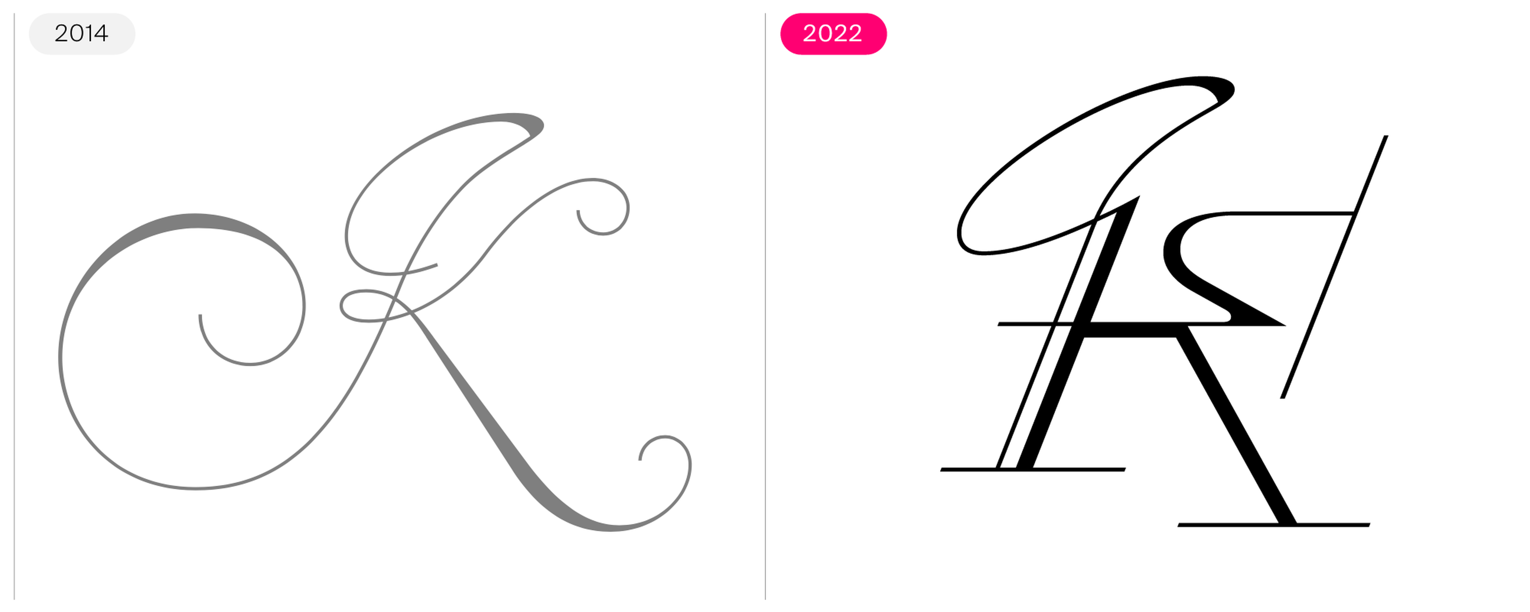
Classical early digital drawing of a calligraphed “K” and its final version in Raskal.
Over time and through the addition of abstraction, Raskal’s design broke away from 17th-century cursive models. You can witness that transformation through the images above, which compare an “R” and a “K” from the beginning of Raskal’s design process with letters from the final font. While both letterforms are still wide and feature similar stroke movements on their left-hand sides, the final designs differ on their right. Those halves of the “R” and “K” no longer look as if their forms came from fluid pen strokes.
Raskal’s early design influenced the updated SangBleu family, released in 2017.
A sketch on top of a lowercase “z ”, shown above, helps highlight how the final typeface’s letterforms would capture the feeling of movement rather than simply replicating pre-existing shapes. True to the research and development purpose of the Swiss Typefaces’ LAB, Raskal influenced other designs in the foundry catalogue. We can see this if we look at the most recent version of the SangBleu typeface from 2017. Its development started at the same time as Raskal’s. While early versions of Raskal’s “z” and “k” made their way into SangBleu, that specific “k” form did not remain in Raskal. Rey dropped it from the final version.
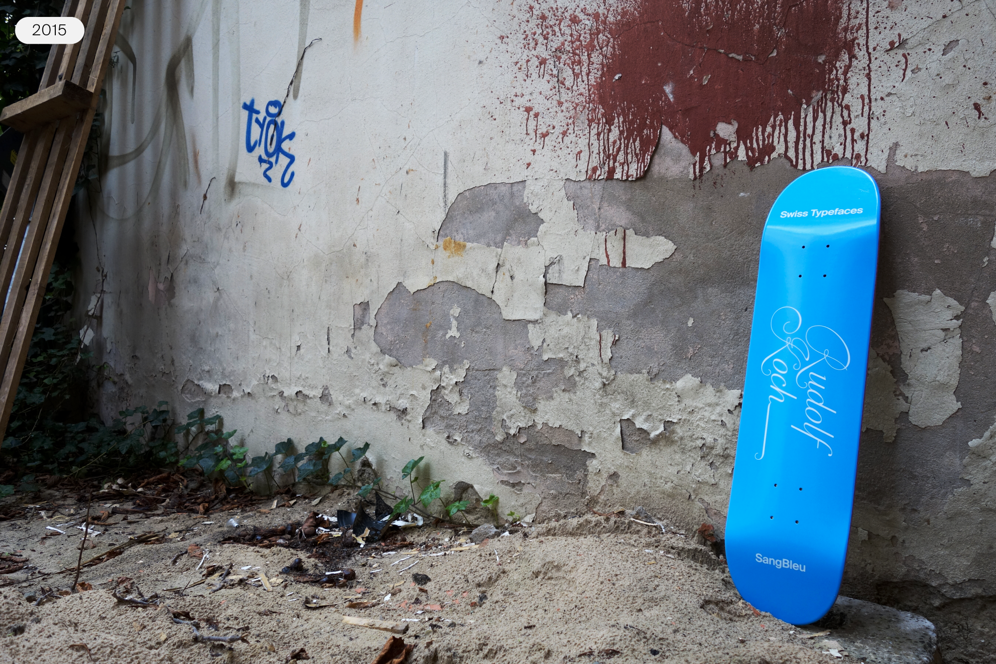
Limited edition Swiss Typefaces’ Rudolf Koch skateboard, Berlin, 2015.
In 2015, Swiss Typefaces used an early version of Raskal, when it still looked more like a traditional script font, on the design of a skateboard from a series edited at the occasion of an event in Berlin. Each of that series’s four skateboards was named after a figure in type’s history. The Rudolf Koch design featured an early Raskal version (still labelled as a variant of SangBleu on the board). Koch was an influential calligrapher and type designer in early-20th-century Germany. While he never made a typeface based on 17th-century French script styles, designs made in the near-century since his death sometimes rhyme with elements from his work.
Although it is not a direct antecedent of Raskal, the capitals from the largest size of a 1920s Rudolf Koch typeface present a similar contrast pattern. In Koch-Kursiv (the italics for Koch-Antiqua), those uppercase letters have additional hairlines that stand alongside the letters’ dominant strokes. While the placement of these complementary hairlines looks organic in Koch-Kurisv, their positions in Raskal feel more mechanical.

By this point in the article, you might be asking yourself why the typeface is called Raskal Oner Write. Sure, the letters in the word look good when set with the typeface. But this design is personal for Rey, who began using the word “Raskal” as a tagging name in Neuchâtel more than 25 years ago. It quickly became a nickname for him. Since the typeface represents his ideas about letters so well, it is the right one to be signed by his street name. The second word “Oner” is pronounced like the number one, not like “owner”. Of course, “Write” is there because graffiti is written on a wall or other surface. Write is the font’s style name. The words “Raskal Oner” might be all you see in font menus.
Calligraphic styles have inspired new type designs for a long time, and calligraphers are recognized as masters of their art. Graffiti is illegal, and its authors can be punished with heavy sentences for vandalism. For many of us, there are no similarities between the two activities. But graffiti and calligraphy share the same writing methods. Both record the free movement of the body. In graffiti, the writer can record the physical movement of their whole body more easily than a calligrapher writing on a sheet of paper, as graffiti canvases are typically larger in scale. In Raskal, he did recall hand movement, the absence of rules, and the energy and the freedom you can feel when you find yourself in front of a blank canvas – like highway noise barriers, or the immaculately slick metal surface of a train parked in its yard or underground tunnel layup. These experiences help explain the lettering aspect of Raskal’s design and its urge for originality. The font’s contextual-alternate letter combinations and how those glyphs join with each other do not sample traditional calligraphic or typographic styles.
Raskal at Haxo – a ghost station in the Paris Métro.
The way Raskal looks – and how it works as a product – can remind us of another element of the Hip-Hop culture: the necessity to come forward with your own style, an extension of your persona. Nobody should be able to reproduce any part of it without being called a « biter » or being crossed and confronted in the streets. Similar to the imperatives you can find in branding, you will need to have your own voice or hand style, impactful and recognizable at first sight. Both share the same objective: to be noticed and to be unique.
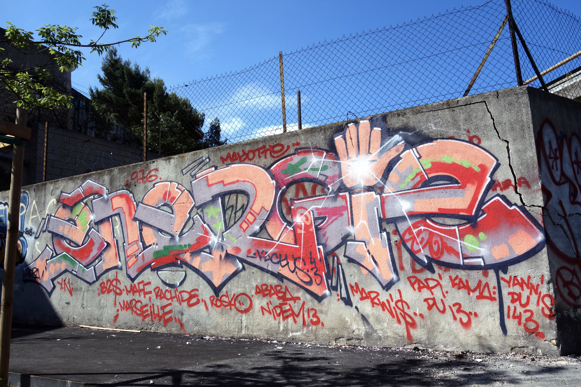
ENERGIE by Kactus43, St-Mauront, Marseille.
Raskal uses contextual alternates to create the appearance of ligatures in text, often combining three or more letters. The graffiti piece “ENERGIE”, show above, includes a three-letter ligature (N-R-G). The letters also join in ways that are not typographic – it is difficult to imagine the out-stroke of an “R” flowing into the crossbar of a “G” in any existing typeface!

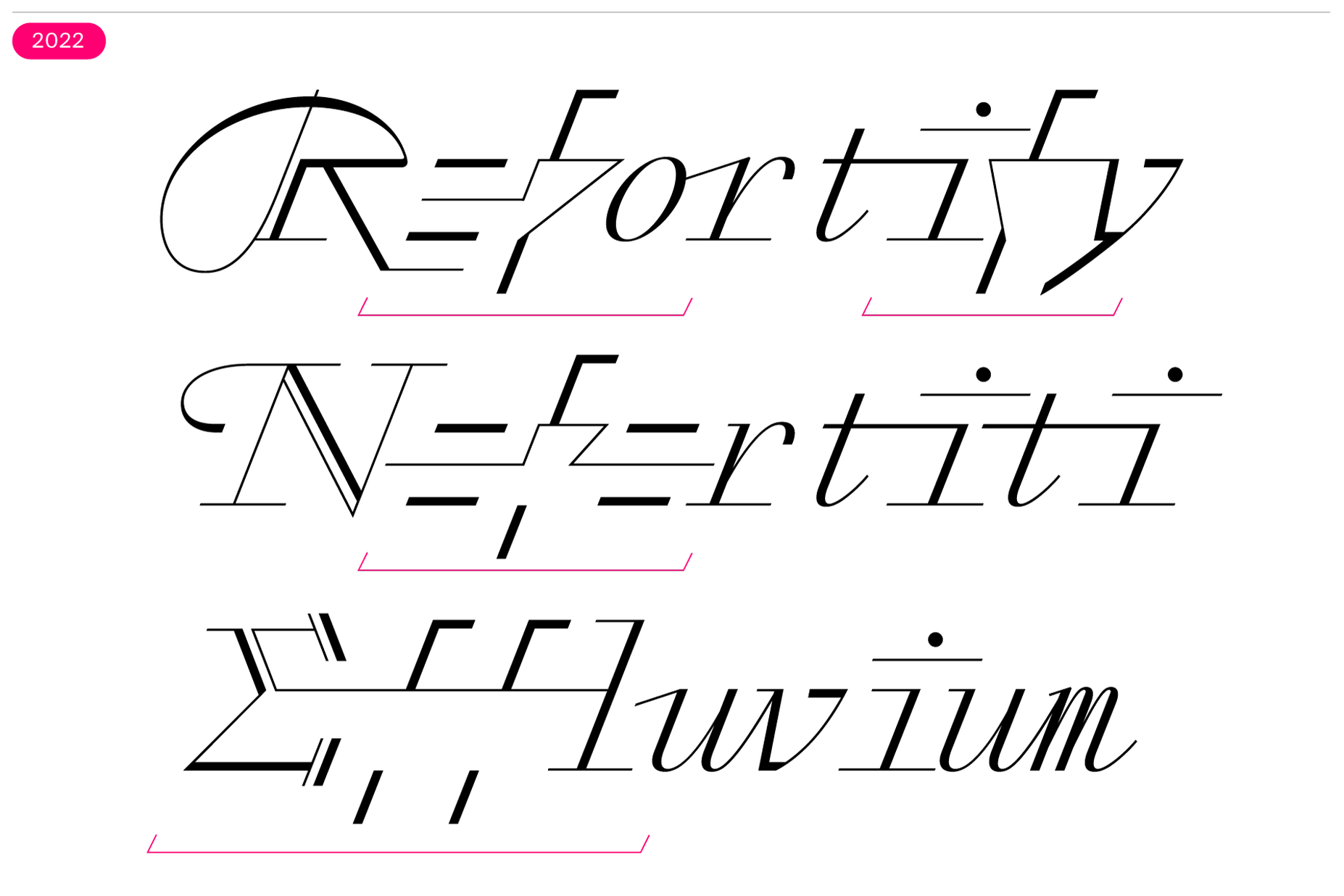
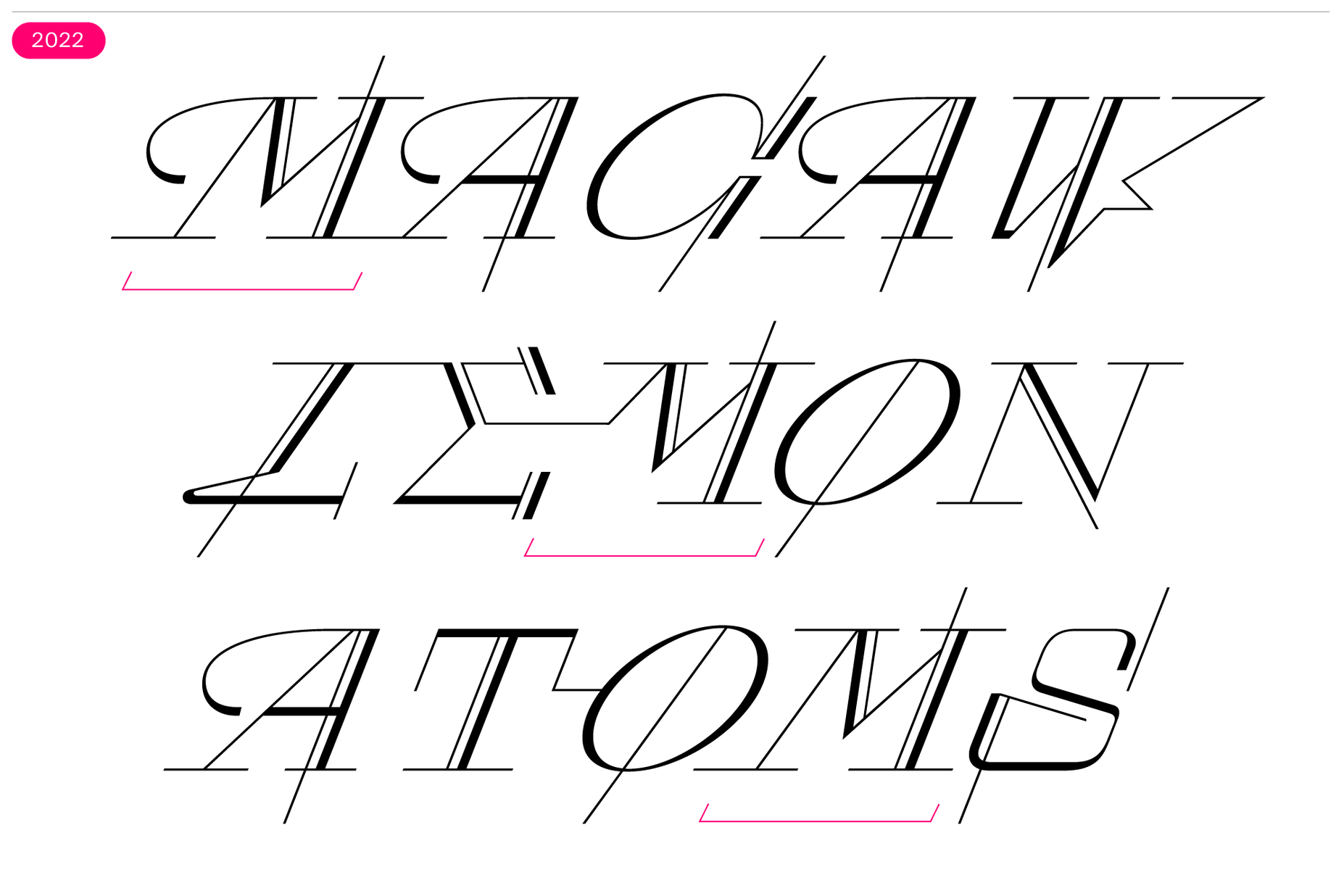
Font technology is an integral part of the research and development for all Swiss Typefaces projects. While some are more unique than others, they all require a set of specific adjustments to the workflow in service of the overarching design vision. Font technology specialist Benedikt Bramböck joined the project in 2020 after Rey had already spent years working on Raskal. Next to ultimately mastering the font file, Bramböck organized its production workflow and set the collaborative strategy that allowed Rey to further refine his design. Much of the existing design solutions revolved around letter pairs and triplets. To rationalise which combinations require which letter shapes, Rey kept an elaborate spreadsheet. Bramböck knew that a visual overview of the font’s glyphs would be even more streamlined than only relying on glyph names and extensions, so together with Rey he placed them all into groups based on their formal similarities. This structure also allowed to find potentially missing alternative shapes and other inconsistencies.
In general, when two mismatching glyphs appear next to each other, there are two common ways to resolve them: change one or more glyphs contextually, or replace a sequence of letters with a dedicated drawing of them. Raskal makes heavy use of the former solution. It includes a system of rules which replaces letter shapes with their ideal form depending on their immediate (or close) vicinity. Those “ideals” are defined in advance and saved within the font’s contextual alternates feature. In a way Raskal’s replacing logic shares similarities with a choose-your-own-adventure-story. When typing a word certain letter combinations trigger specific alternative shapes. Each replacement opens the door to a reduced amount of further options of where to go next. Some substitutions will come into use more often, some will only be reached if the previous glyphs follow a certain pattern, others will result in dead ends.
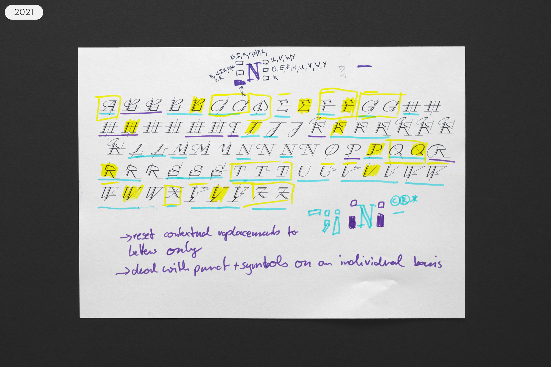
Photograph of a test sheet from Raskal’s development. Here, you can see various versions for the font’s capital letters.
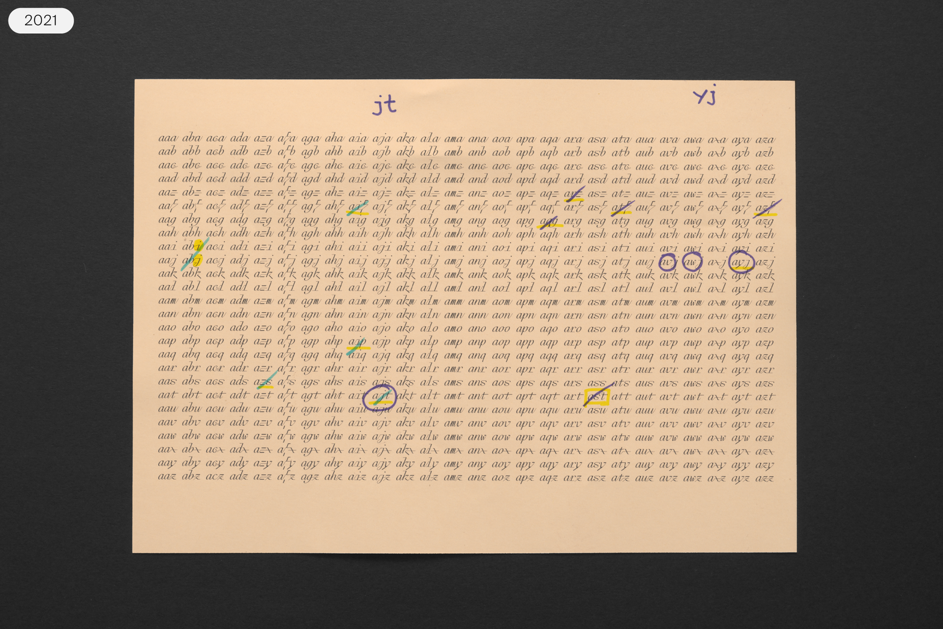
Test sheet listing dozens of three-letter combinations that start with the letter “a”.
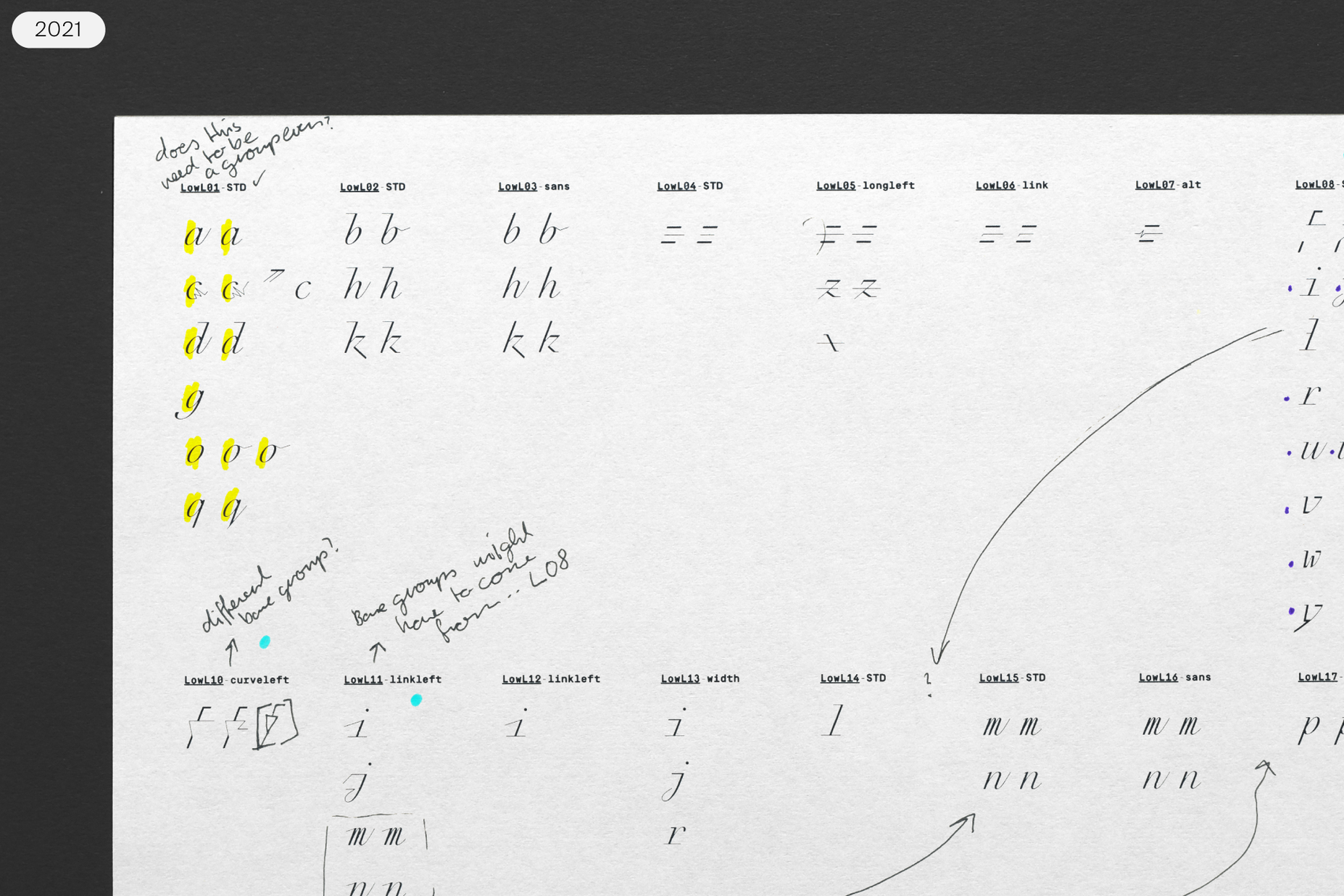
Close-up of a test sheet showing classes of Raskal’s lowercase letters.
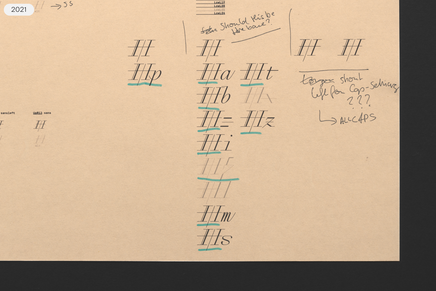
Close-up of a test sheet illustrating how the “H” combines with various lowercase letters.
With the basic functionality settled, Rey and Bramböck looked at lists of three-glyph letter combinations in trios of uppercase letters, uppercase-lowercase-lowercase trios, and trios of lowercase letters. Analyzing abstract character combinations meant looking at a dizzying amount of information, including plenty of examples not found in any language. It was a lot more efficient to work with dictionaries for multiple Latin-based languages to create wordlists for all necessary letter pairs and trios. As Rey tested, he would send Bramböck a running list of desired changes. When Bramböck implemented them into the feature code, he used the software FontGoggles to swiftly compare the old version of the font file with the new one containing the changes.
Four variants of the “f”, depending on the letters preceding and following it.
Three variants of the “M”, depending on the letters preceding and following it.
It was a conscious decision that Raskal’s glyph range comes without any ligatures. All substitutions happen inside the contextual alternates feature. While the visual result can be the same in both approaches, the second one is superior for Raskal. It makes the underlying code and the final font a lot more flexible, especially when considering characters with diacritics or any unforeseen combinations. It also leads to a lower number of glyphs in the font, keeping the file size down. At the same time it also makes Raskal very user-friendly. Contextual alternates (or calt for short) is an OpenType feature that is activated by default in many applications and environments. In other situations it is very easy to activate one feature to get the ideal look. The typeface’s appearance in text is fully programmed. All the contextual substitutions happen automatically. The user doesn’t have to think about them, but simply benefits from their implementation.
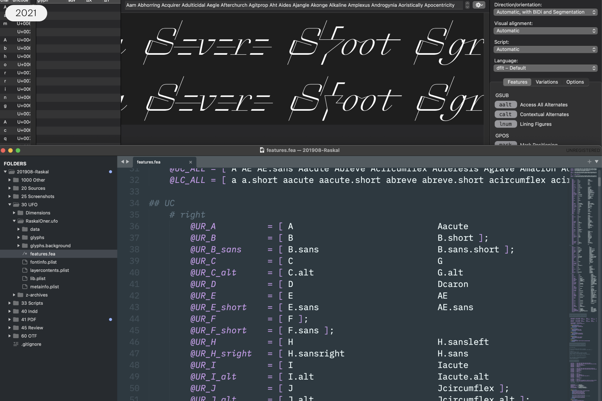
OpenType feature code is written in a text editor. FontGoggles (on top) previews any changes immediately and makes it possible to compare the current working copy to a previous iteration.
Raskal’s glyph widths are strictly unitized, giving it the appearance of a monospaced typeface. All lowercase letters are equally wide; “w” has the same horizontal space available as an “i.” The uppercase shares a common width too, but those letters are generally twice as wide as the lowercase. There are a few glyphs that deviate from this rule, but their widths correspond to the underlying unit system too. Because the typeface is unitized, there is no need for kerning in Raskal. Any glyph combinations that would not look right without kerning are solved in the font by contextual substitutions instead.

Looking at scripts’ forms on the page, we can see and describe the things that make them visually interesting. We can wonder how and why they came about. When we see something that has been written, we assess the traces made by the movements of the writer’s body and pen. Despite improvements to tablet computing, the way a person picks up a pen and interacts with a sheet of paper is still not a process for which digitization has delivered a direct analog. While many tools enable suitable digital reproductions of real handwriting, the use of a digital font whose design mimics scripts of virtually any kind is something of a contradiction. When it comes to the very nature of their shapes, we can easily argue that handwritten texts were not meant to be reproduced digitally.
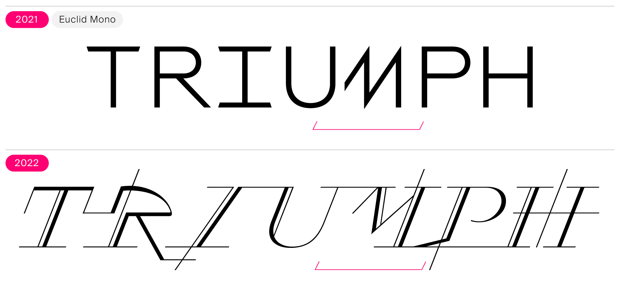
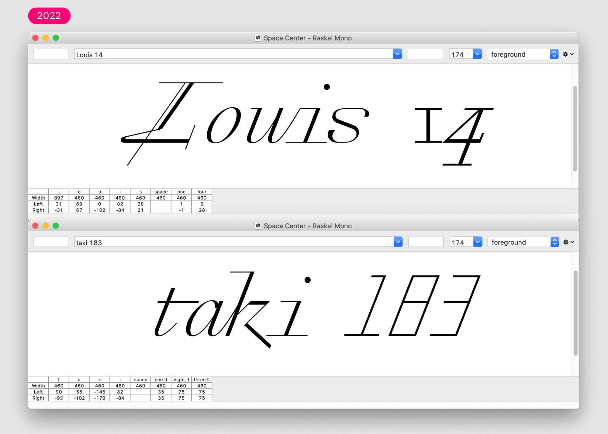
Euclid Mono, another font from the LAB, already provided the unique solution for Raskal Oner Write’s truncated “M” contextual substitution.
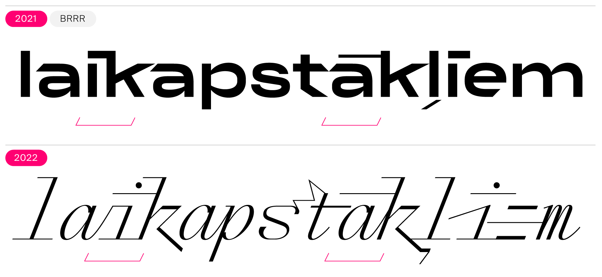
In BRRR, also from the LAB, we can see previous design experimentations around dots/diacritics playing with glyphs to their left and right.
You could say that Swiss Typefaces makes products comprised of design combined with technology and an additional factor. That third factor varies from project to project. In Raskal, the factor combined with type design and font technology is a new understanding of digital lettering.

Norwegian, Igbo, Slovak, and Lativian diacritics.
Raskal’s diacritics were designed with as much care in their concept and drawings as the letters, allowing them to work just as well in script form. They connect, just as the base characters in the typeface do.
Two OpenType Stylistic Sets were added to the typeface, allowing Raskal’s users to select the appearance of the dots that come above or below the characters. That includes the dots on the “i”, “j”, and the dot-accent diacritics. In addition to having dots underlined with straight lines, which appear as the default solution, it is possible to choose a dotless form or one without the straight lines. In total, users have three different design options available.
Old Style Figures and Tabular Lining Figures are available via OpenType features.
The font contains two sets of numerals. The standard numerals are oldstyle figures. These have a classic design, leaning on the kind of numerals used in “old-style” serif typefaces. The range of oldstyle figures employs two different axes. The zero and the one have vertical forms, with two through nine drawn at an angle, like Raskal’s letters. An alternate set of numerals are the font’s lining figures. These do not look like they come from a script font at all. Instead, they stand in stark contrast to the text. Although they are slanted, their construction is stoicly geometric, and their strokes are thin monolinear lines. This set of numerals is very reminiscent of the the kind used on digital displays.
Rey has created a lettering system unique to today, even though it is influenced by historical calligraphic styles and experiences from his own past. Other people surely have the technology to make fonts like Raskal, but Raskal is not a typeface that anyone else could have designed. Rey would surely agree that if you plan to spend years working on a design, you’d better make sure it’s worth it. In light of the fast-paced rhythm of fonts releases we have experienced over the last few years, Rey did not skip ahead. A design like Raskal takes time, and he applied all the necessary work to the project. Raskal militates for passion and dedication.
This Swiss Typefaces ad in Komma, the magazine of the Fakultät für Gestaltung at the Hochschule Mannheim in Germany, was the first official use of the final Raskal typeface, early in 2022.
Gerrit Noordzij described typography as “writing with prefabricated characters.” Every typeface contains prefabricated characters; this font includes hundreds. In a typical writing process, you place a series of strokes onto a surface, one after another. When viewed together, those strokes form characters that can convey meaning. What many designers describe as “lettering” is a less-immediate process. For lettering, you can plan out the text in advance, knowing what characters will appear and the sequence they take in a word. Letters inside words may have shapes influenced by what came directly before or after them. The prefabricated characters that appear are determined by the context surrounding them. Results vary based on what you input. When designers use the Raskal typeface, the font’s OpenType features convert inputted text into digital lettering. Or, at least, the visual results Raskal gives you come pretty close to achieving this.

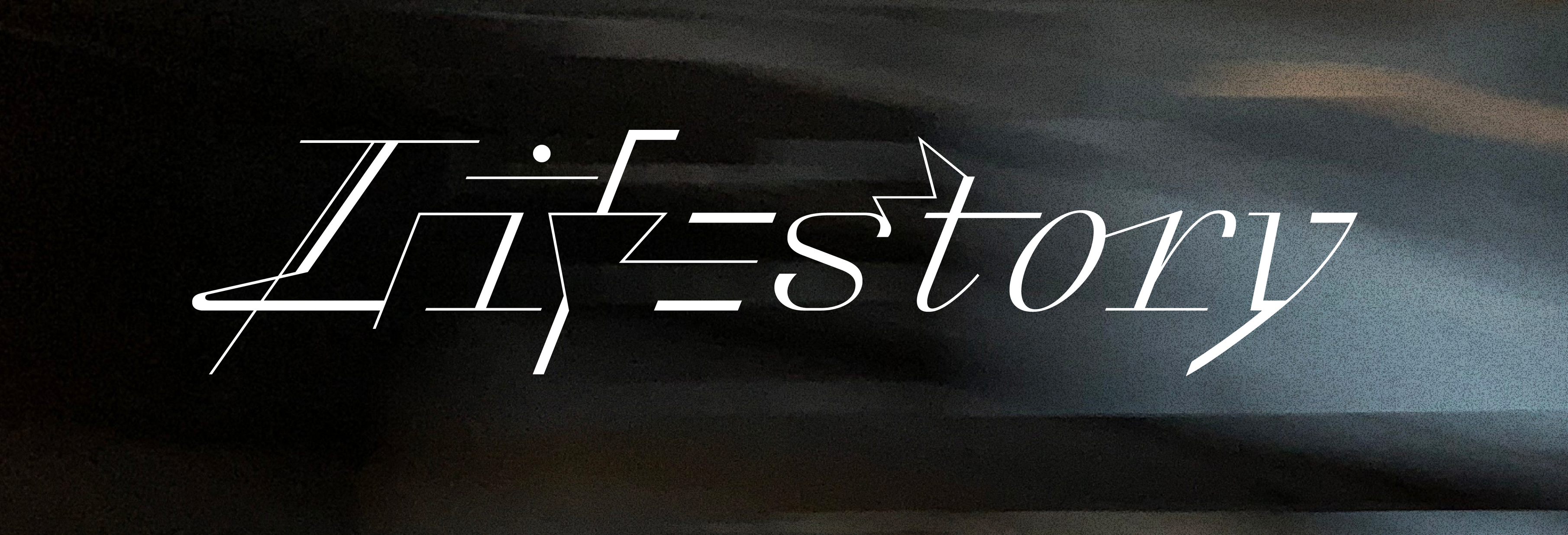
Raskal Oner Write
Art Direction: Swiss Typefaces
Design: Emmanuel Rey / Swiss Typefaces
Font Development & Technology: Benedikt Bramböck / Swiss Typefaces
Text: Dan Reynolds