The first draft of KRSNA came to life on the record cover of Geneva-based musician Grace Core released in December 2015. For the title, KRSNA, we designed a custom lettering based on our retail font NewPanam Skyline. But it’s only on the cover of Grace Core’s subsequent RMX EP, released a year later, that KRSNA found its definitive structure.
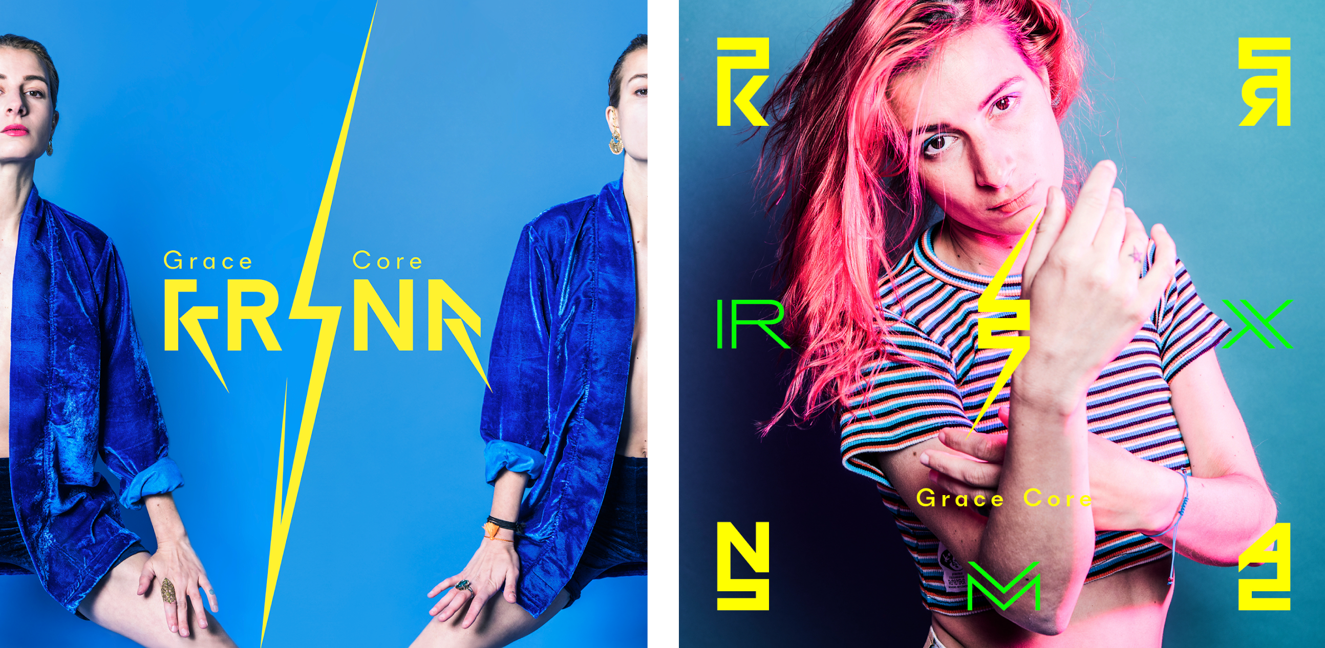
Inspired by Devanagari writing system, KRSNA was thought on a three-storey space. The letters sit at the top, center, or bottom and fill the remaining space with bars and spikes. The resulting word images of KRSNA are captivating patterns (like seen here in TypeLife#1v2) with logo-like qualities.
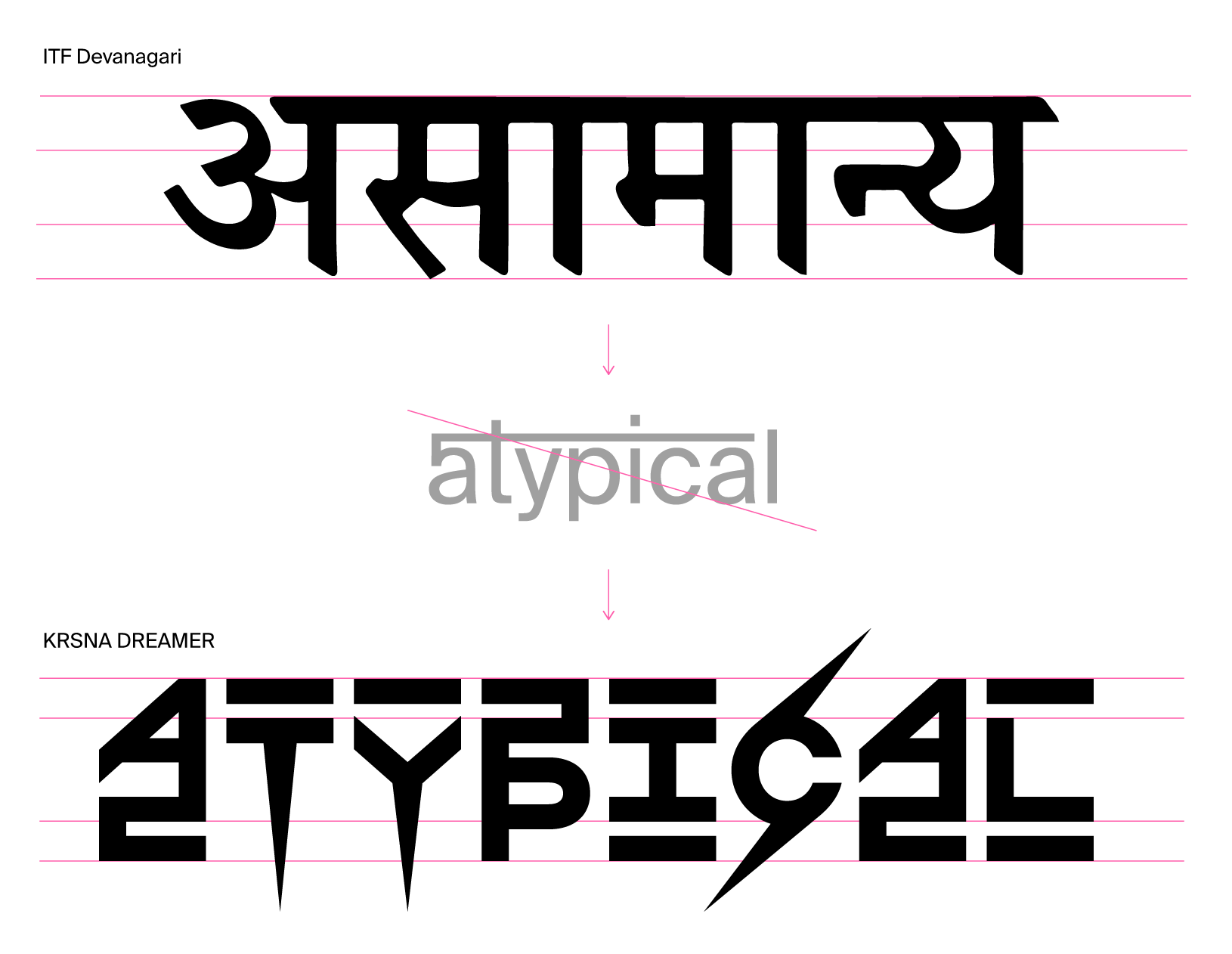
Nonetheless, sometimes the obsession for some letterforms doesn't end when the typeface has been released. It can grow and expand afterward, or even fork into a different direction. In the case of KRSNADREAMER, its full creative potential of its concept is still being extended by its designer to fully tailor letterings for specific projects.
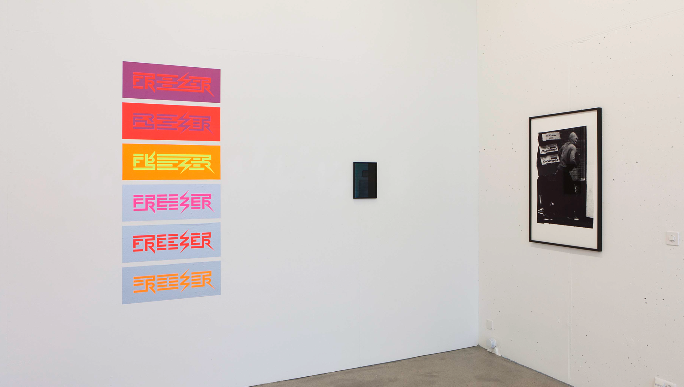
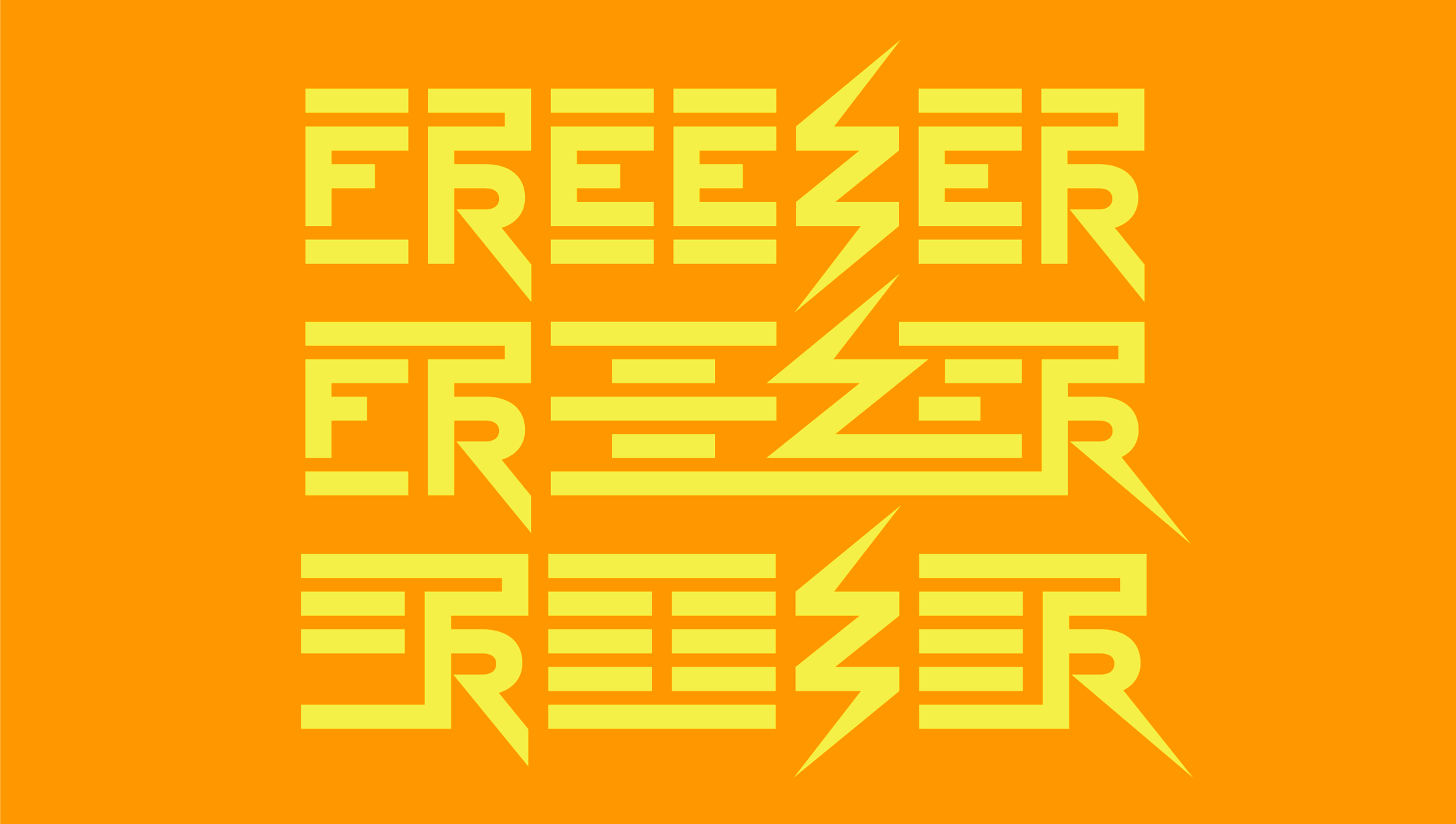
The FREEZER letterings were designed by Emmanuel Rey in six declinations and presented as artworks.
Style Samples exhibition, at Forma (Contemporary Art Gallery), Curated by Jean-Rodolphe Petter February 2019. Stickers printed by Colors Makers, Picture by Shannon Guerrico.
The FREEZER letterings were designed by Emmanuel Rey in six declinations and presented as artworks.
Style Samples exhibition, at Forma (Contemporary Art Gallery), Curated by Jean-Rodolphe Petter February 2019. Stickers printed by Colors Makers, Picture by Shannon Guerrico.
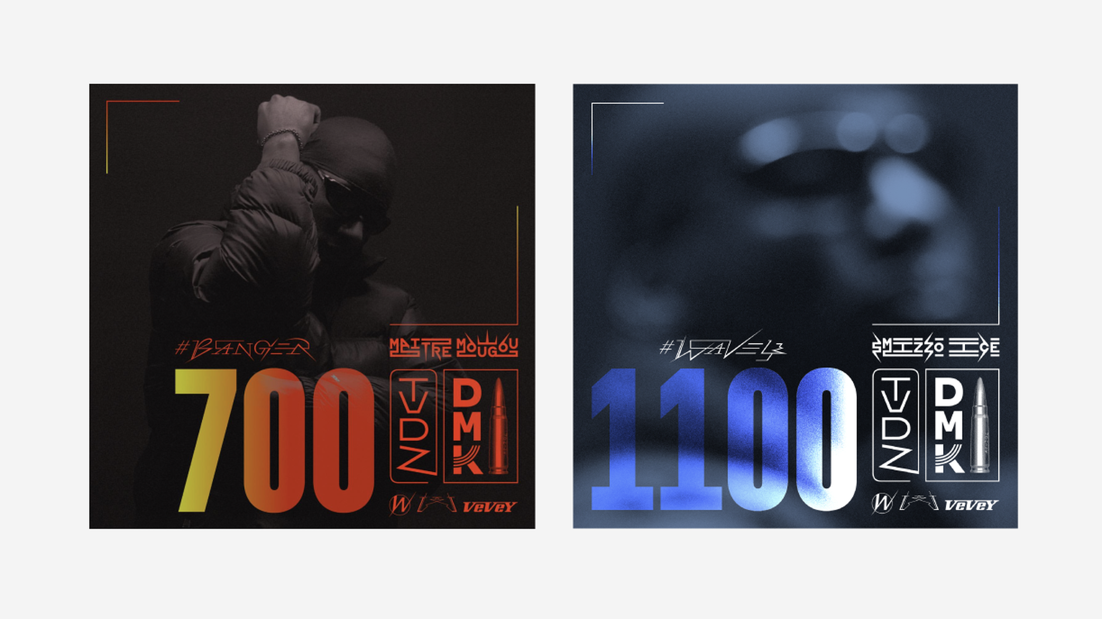
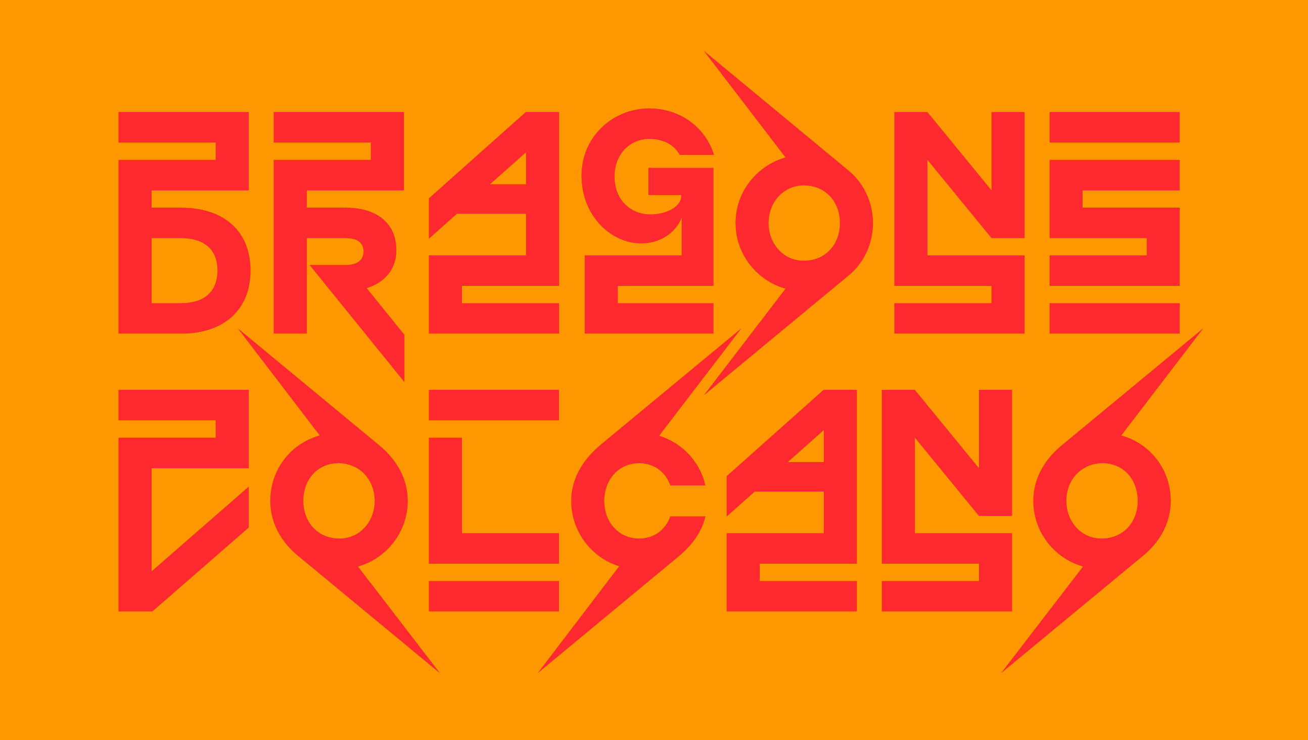
Custom letterings based on KRSNA by Emmanuel Rey for Tyler l'As' albums covers.
Photography by Treize, graphic design by Emmanuel Rey and Julien Fischer.
Related topics
