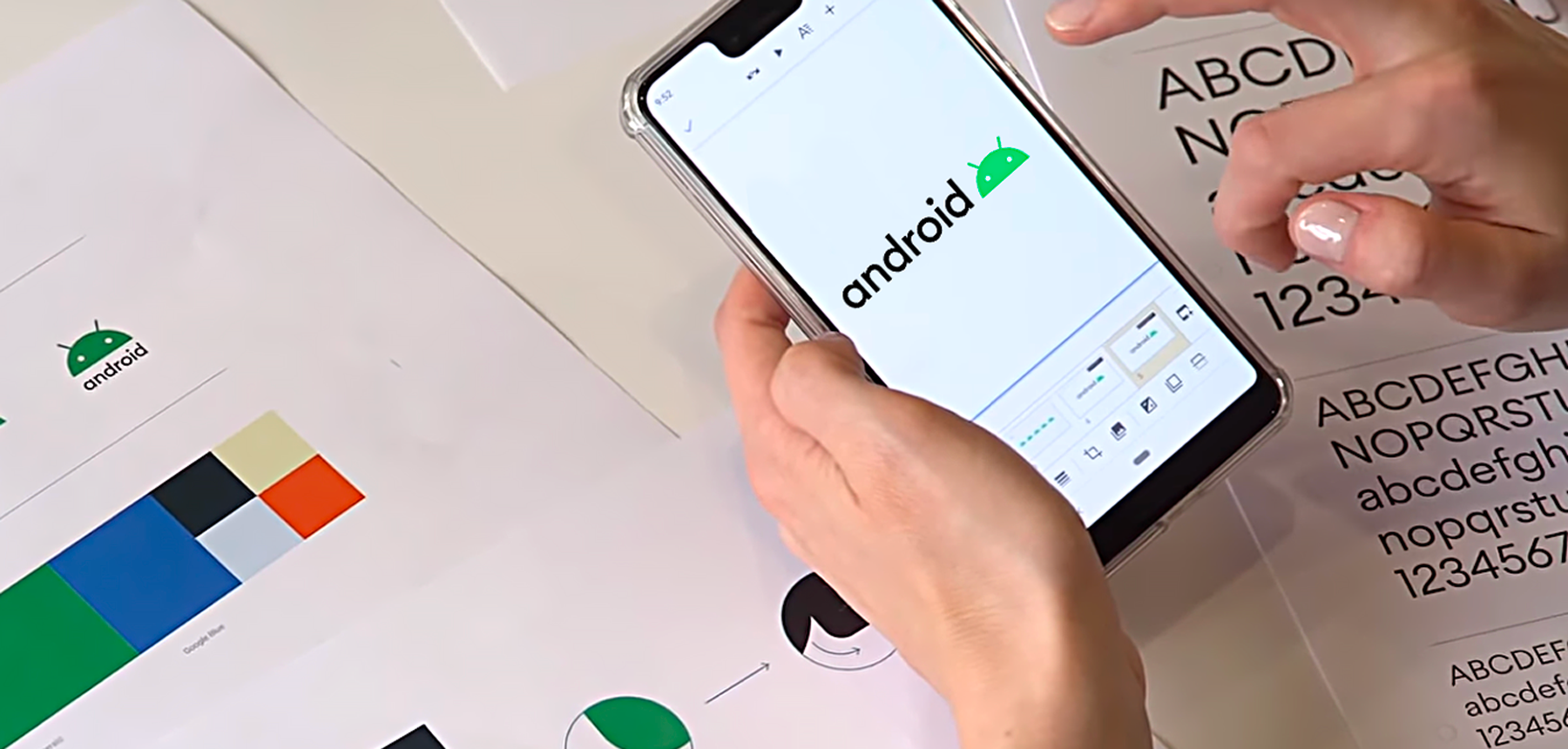
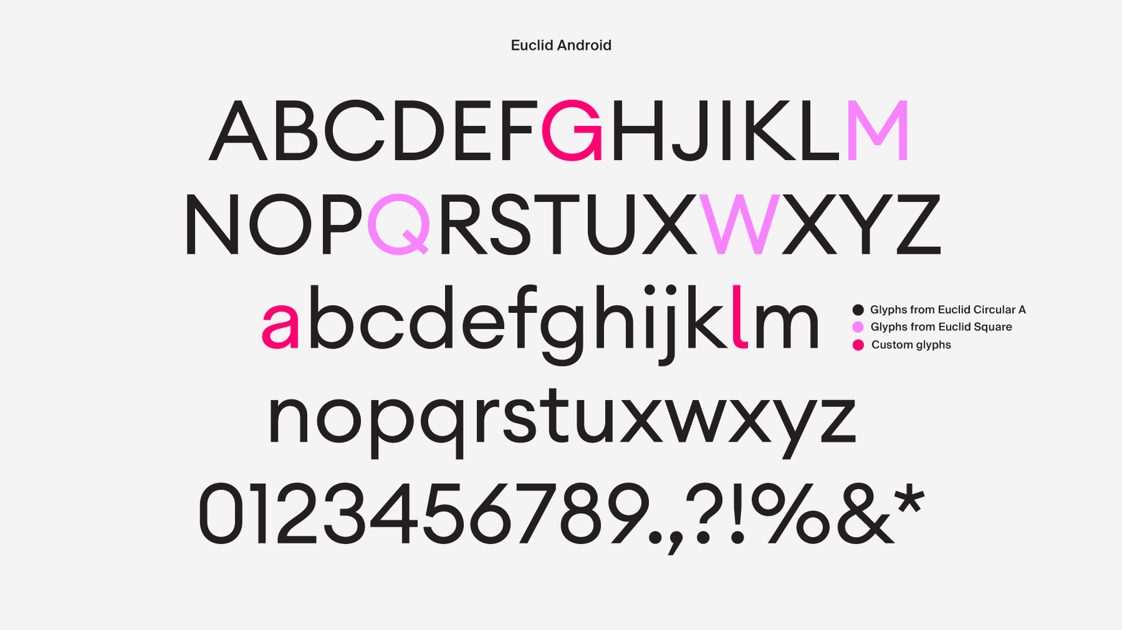
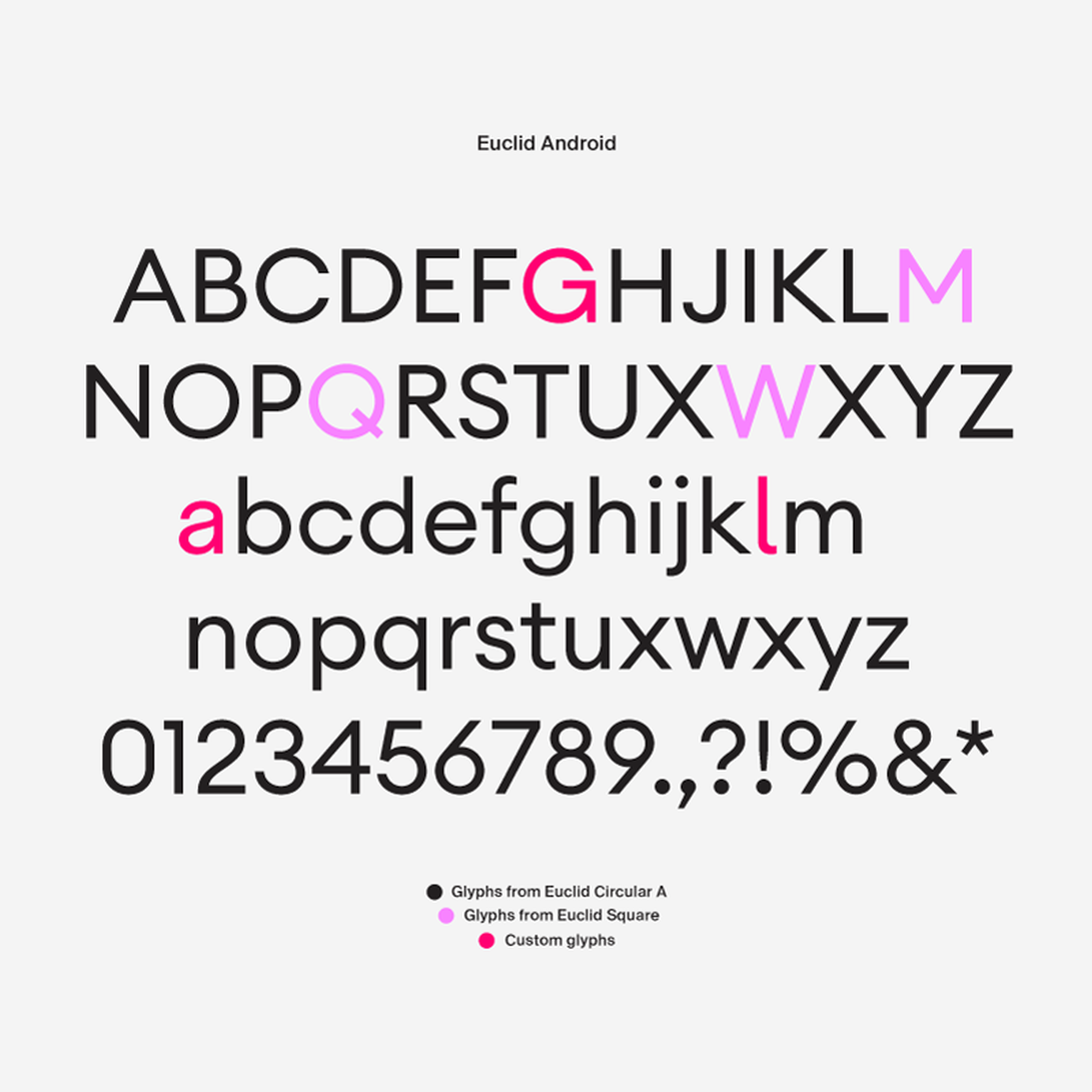
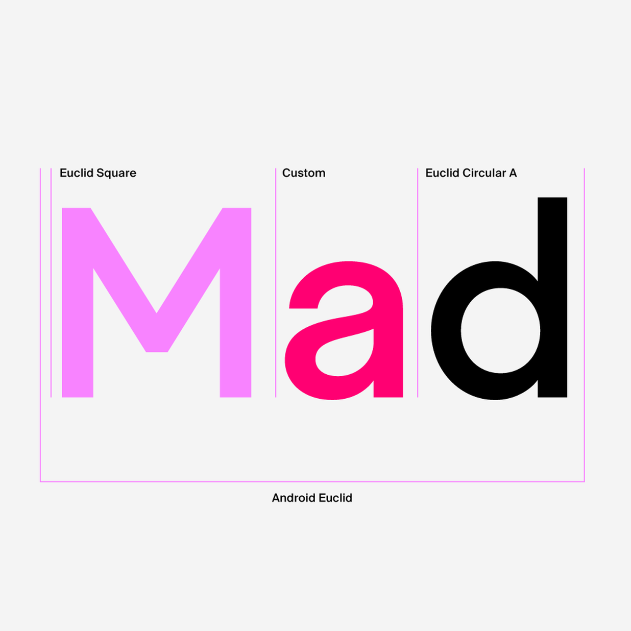
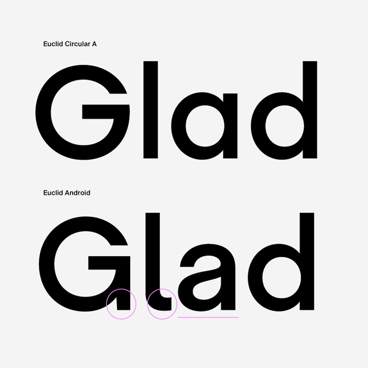
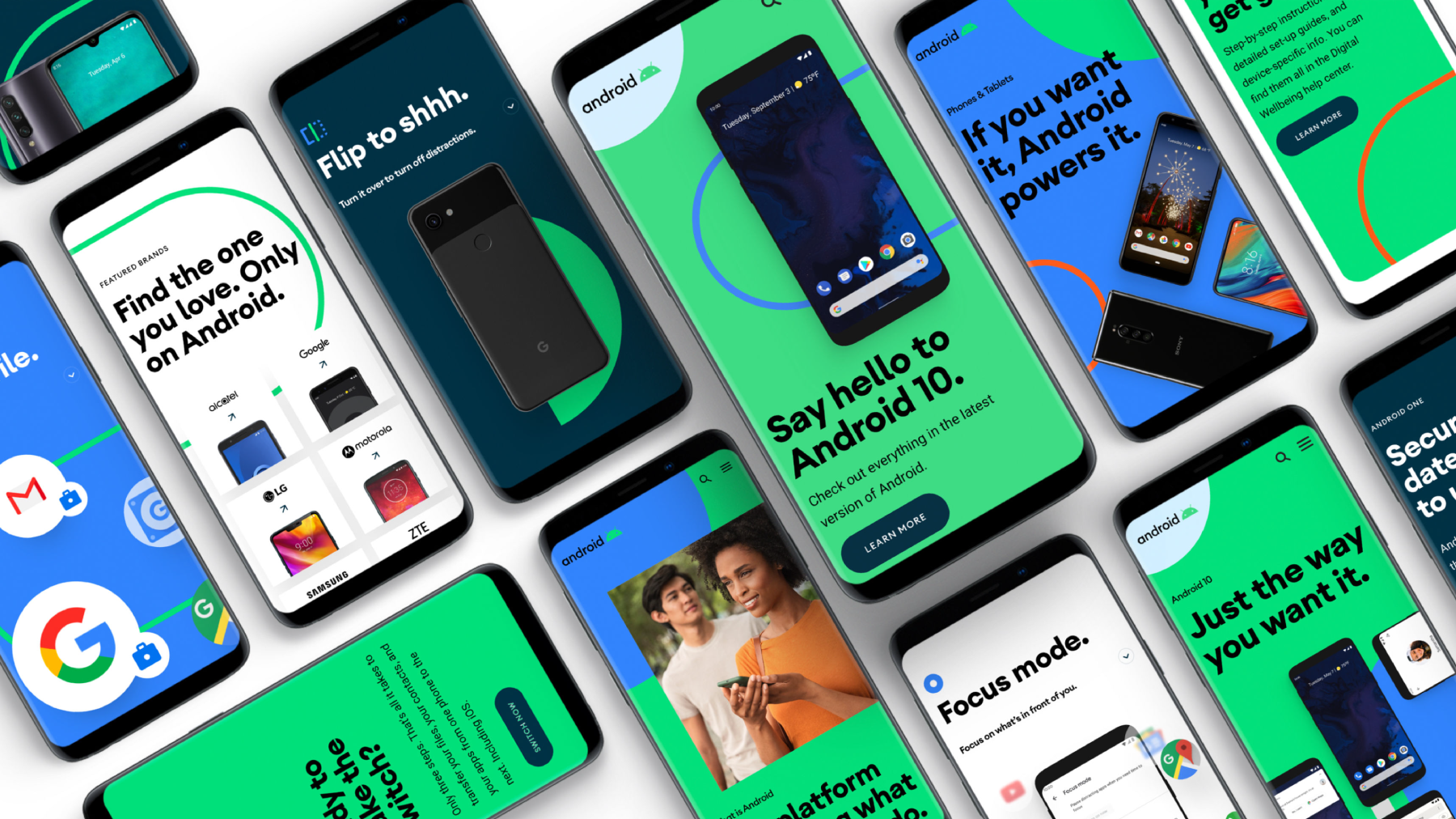
Back in 2019, Swiss Typefaces was commissioned to produce a custom font for Android based on Euclid Circular A. Our team is proud to reveal a bit more about the project. The newly designed double-storey lowercase ‘a’, the extended lowercase ‘l’ tail and the vertical spur on uppercase ‘G’ were added to give a bit more warmth to the usually very geometric Euclid. To emphasize this feeling, some characters judged too spiky were replaced by their Euclid Square’s counterparts (M, Q,W). The result is a friendlier version of Euclid, carrying Android’s values of openness while remaining contemporary and optimized for screen-reading.
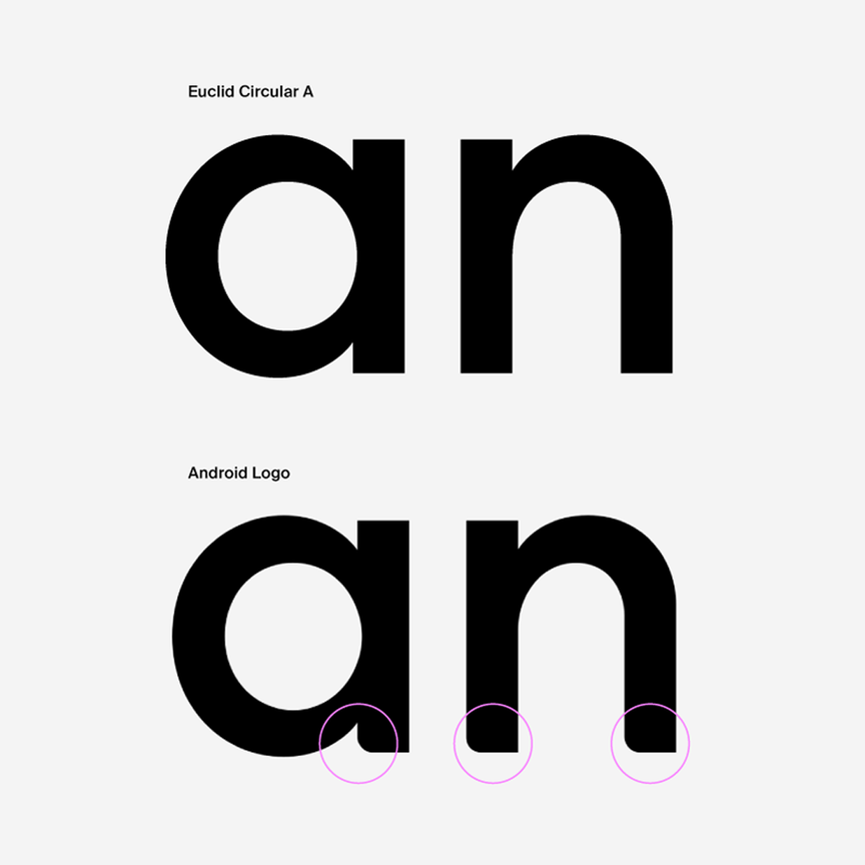
The Android logo, designed separately, is also based on our Euclid typeface. The whole project (Android’s rebranding) was directed by design agency Huge Inc.
Wording and weights

Wording and weights
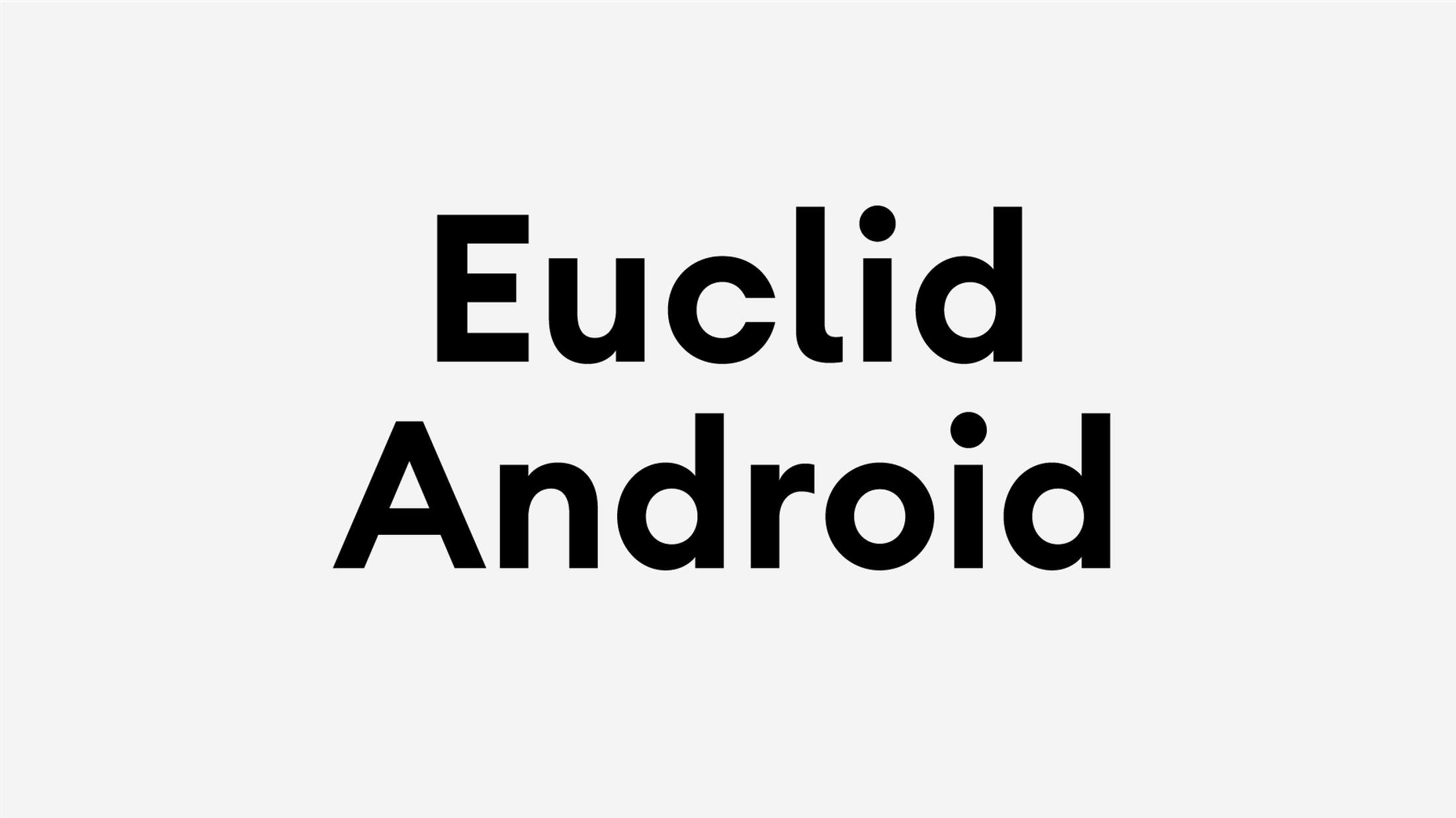
Alphabets
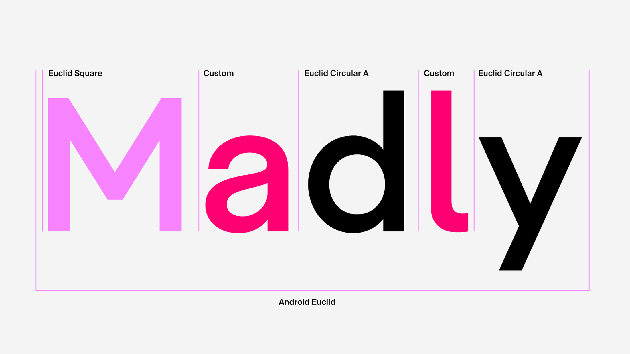
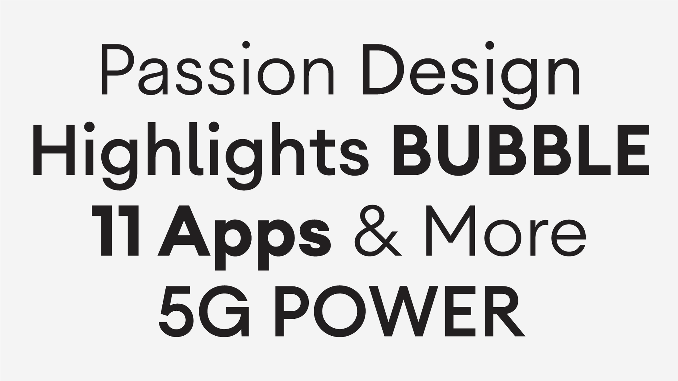
Composition
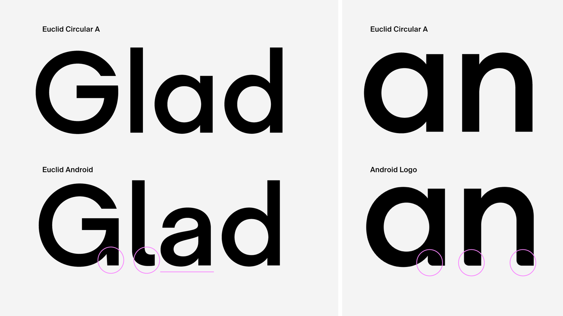
Comparison with Euclid Circular A
Alphabets
Composition
Comparison with Euclid Circular A
Comparison with Euclid Circular A
CREDITS
Project type: Custom Corporate Typeface
Based on: Euclid
Client: Google
Agency: Huge Inc.
Images from: Huge Inc., Google
Video: youtube.com/watch?v=l2UDgpLz20M&t=33s