.
Article written by Florian Hardwig
.
More than three years after the release of their first typeface monograph, Swiss Typefaces is proud to announce the launch of a new book. “Euclid – Typeface Mystery No. 1” was conceived and designed by Hubertus Design. The typographic tome of 264 pages is a feast for the eyes, built around a story that will send a chill down your spine.
For their second typeface monograph, they invited Hubertus Design to work on the concept and art direction. The Zurich-based studio was given carte blanche for a book that would showcase the many facets of Euclid, the foundry's ultimate geometric sans typeface. And Hubertus Design lived up to their name as leading voice in innovative book design. Lea Fischlin, Matthias Michel, Kerstin Landis, and Jonas Voegeli came up with an idea that transcends the expectations – including Swiss Typeface's. You might assume that a publication devoted to a typeface was one big specimen. Like the previous “SangBleu Typeface: The King, His Court, The Explorer & The Gift”, the new book is so much more. “Euclid – Typeface Mystery No. 1” is a multidisclipinary triptych, constructed from three main components that are skillfully interwoven with each other: At the heart of the book is “A Snippet of the Clear Night Sky”, a mystery novel that Matthias Michel has authored specifically for this purpose. Hubertus Design brought in Matthieu Gafsou. The Franco-Swiss artist contributed “Eerie Indeed”, a series of photographs that augment the book with a rich pictorial layer. And then there’s the Euclid Typeface, which is used to set all text. The combined outcome is just as beautiful as it’s disturbing, and a creation that is difficult to categorize.
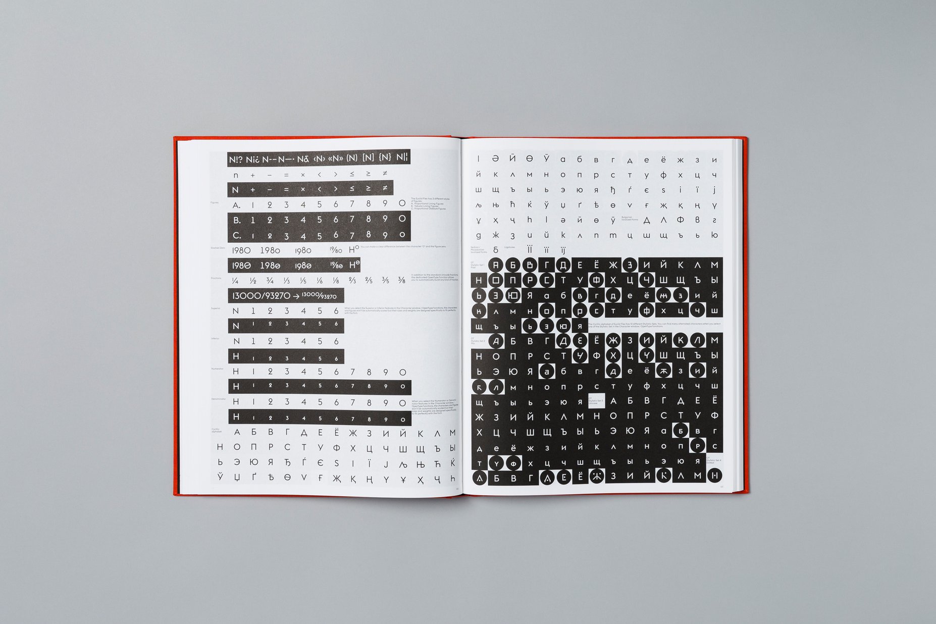
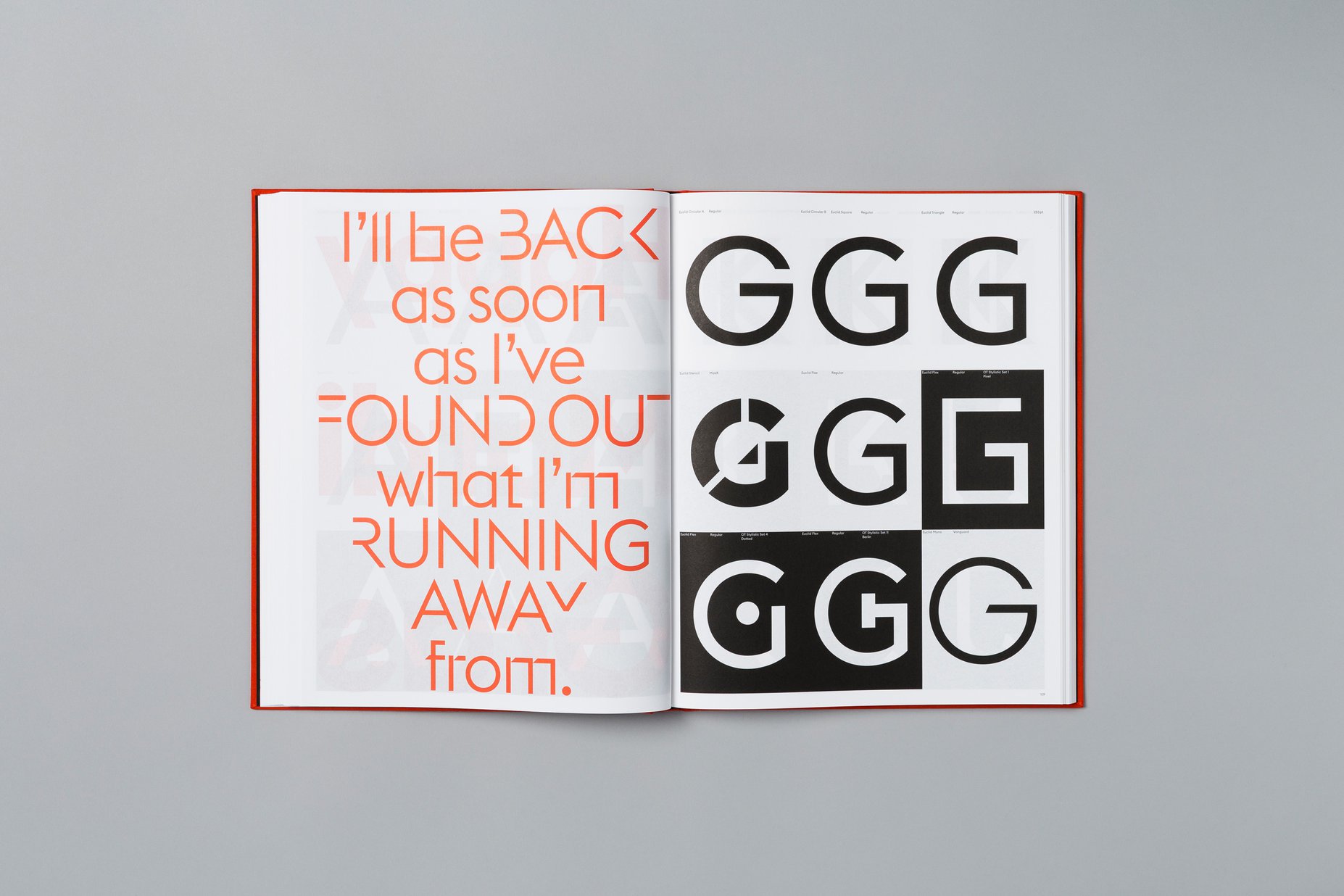
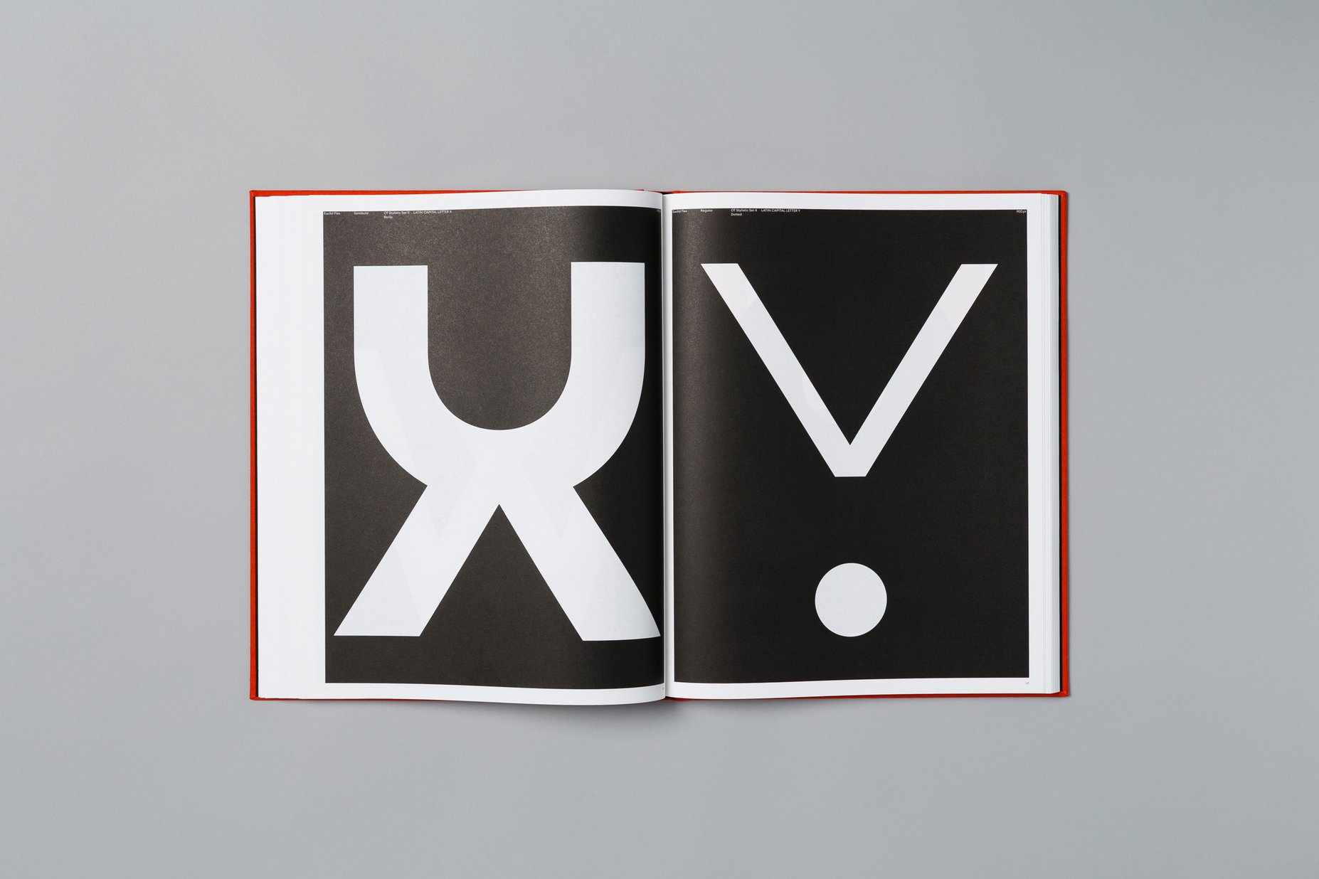
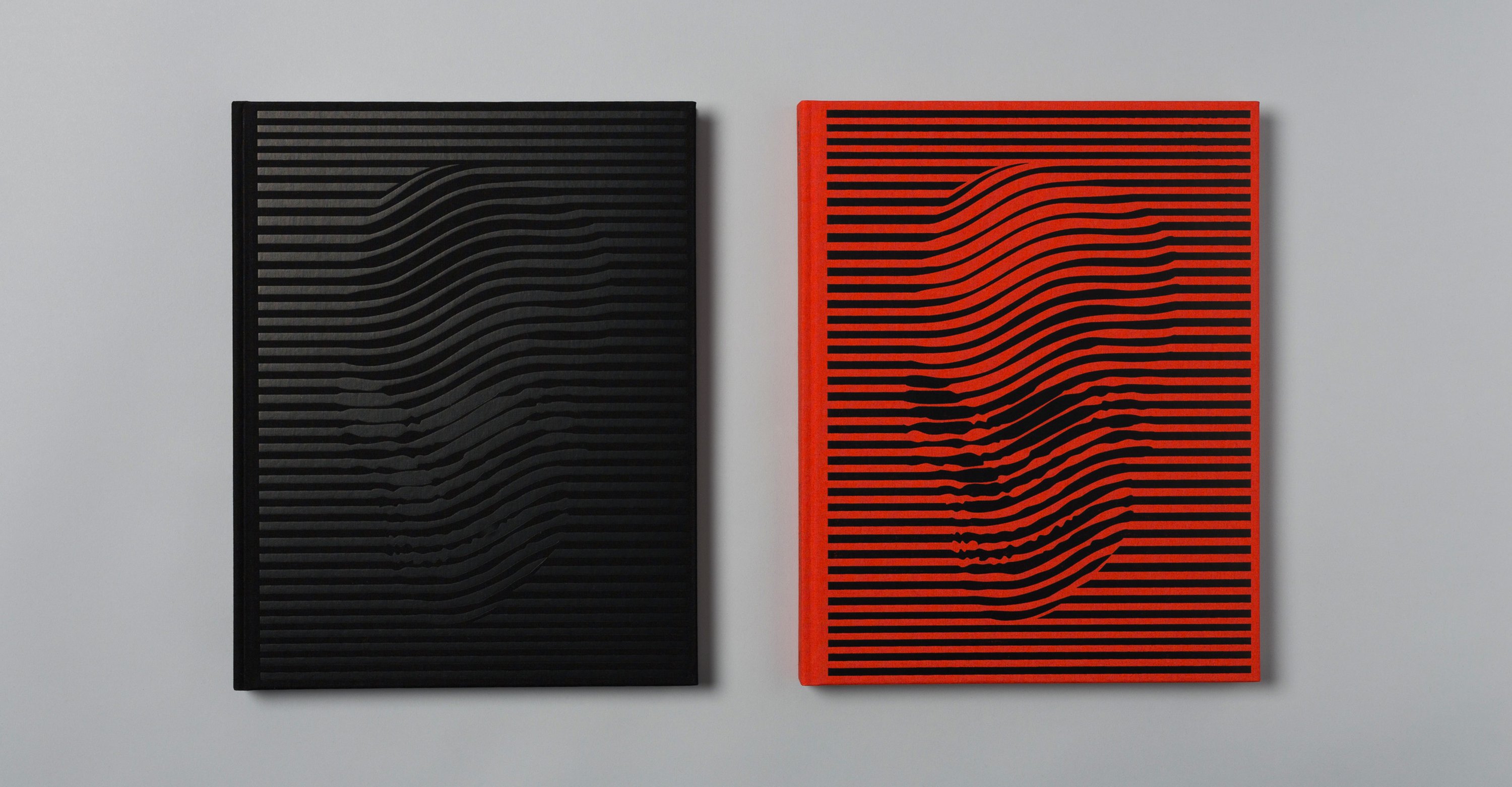
While our Euclid may have been its initial raison d’être, the book has evolved into something deeper and more enigmatic. This becomes clear right from the start: We’re greeted by the image of a death’s head, an uncanny signal that emerges from the noise of a line pattern. Embossed in black, it makes for a mighty wicked cover. The memento mori is the work of American artist Noah Scalin, master of the human skull, and internationally known as the creator of the Skull-A-Day project. On the first interior page, we encounter song lyrics – an element that is repeated throughout the book – hinting at “a terrible illness, a terrible case”. This ominous opening is followed by a matrix of glyphs spelling out the name “e-u-c-l-i-d”, apparently arranged as a nod to Adrian Frutiger’s Univers and the iconic way its coordinated system of weights and widths was presented. I – Florian Hardwig, editor of Fonts In Use – provide a text about the Euclid Typeface, including an abstract of the history of geometric letterforms and concise descriptions of each of Euclid’s seven branches.
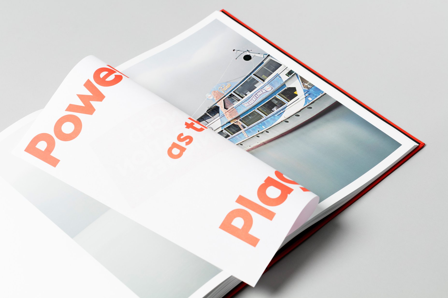
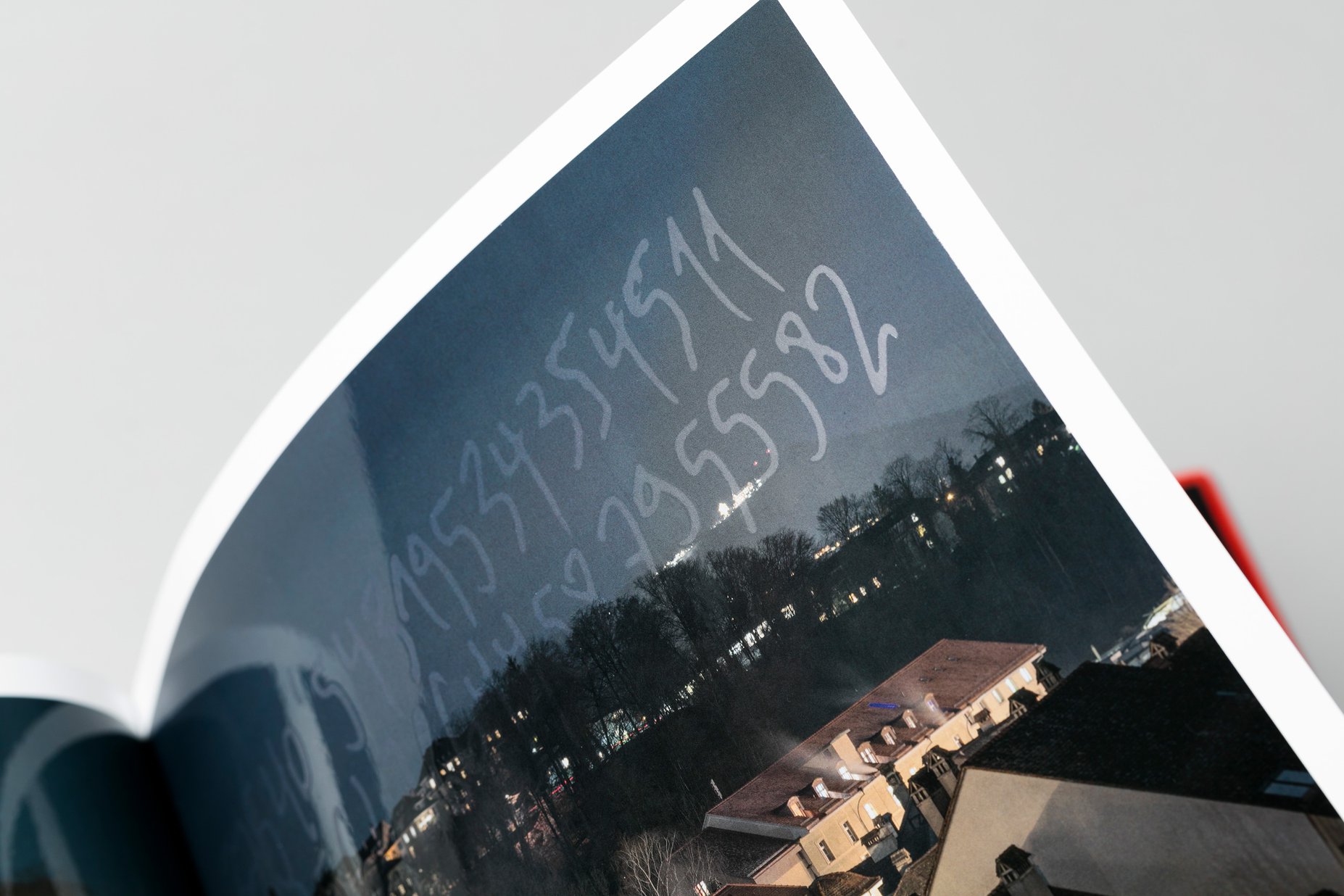
Once we’ve made our way through expedient sample settings and mouth-watering glyph bacchanalia, we’re confronted with a series of photographs. Now are these the works of Gafsou? Or is it rather true that they “were delivered by mail in an envelope of deckle-edge paper on ‘Mardi Gras’ Tuesday, February 13, 2018, along with a mysterious letter signed by a man who used the pseudonym ‘Euclid’”? The photos depict a cave, a playground, the Place de la Riponne in Lausanne, a highway intersection in Israel, an ancient country house just south of Bern … But why do all these places appear to have been abandoned? Can we believe the claim that the pictures convey information via letterforms concealed in their compositions? And how is this linked to TAIA Agent Nathalie Louise Whitewater? The forensic psychologist had investigated the ‘Typeface’ case, a series of cyber attacks involving data viruses hidden in corporate font suitcases, with the malware encoded in the outlines. Now she finds herself trapped in a ten square meter holding cell in an abandoned top secret high-security prison in the Bohemian Forest. Why did Lenny Roggensäckel, developer of the first character generator application, had to die? What’s the role of the Molijek Liberation Brigades? Who’s been chasing whom? Facing imminent death, Whitewater leaves her uncensored story as voice-memo recording on her phone. Is this the end? The book’s title suggests otherwise. To be continued …
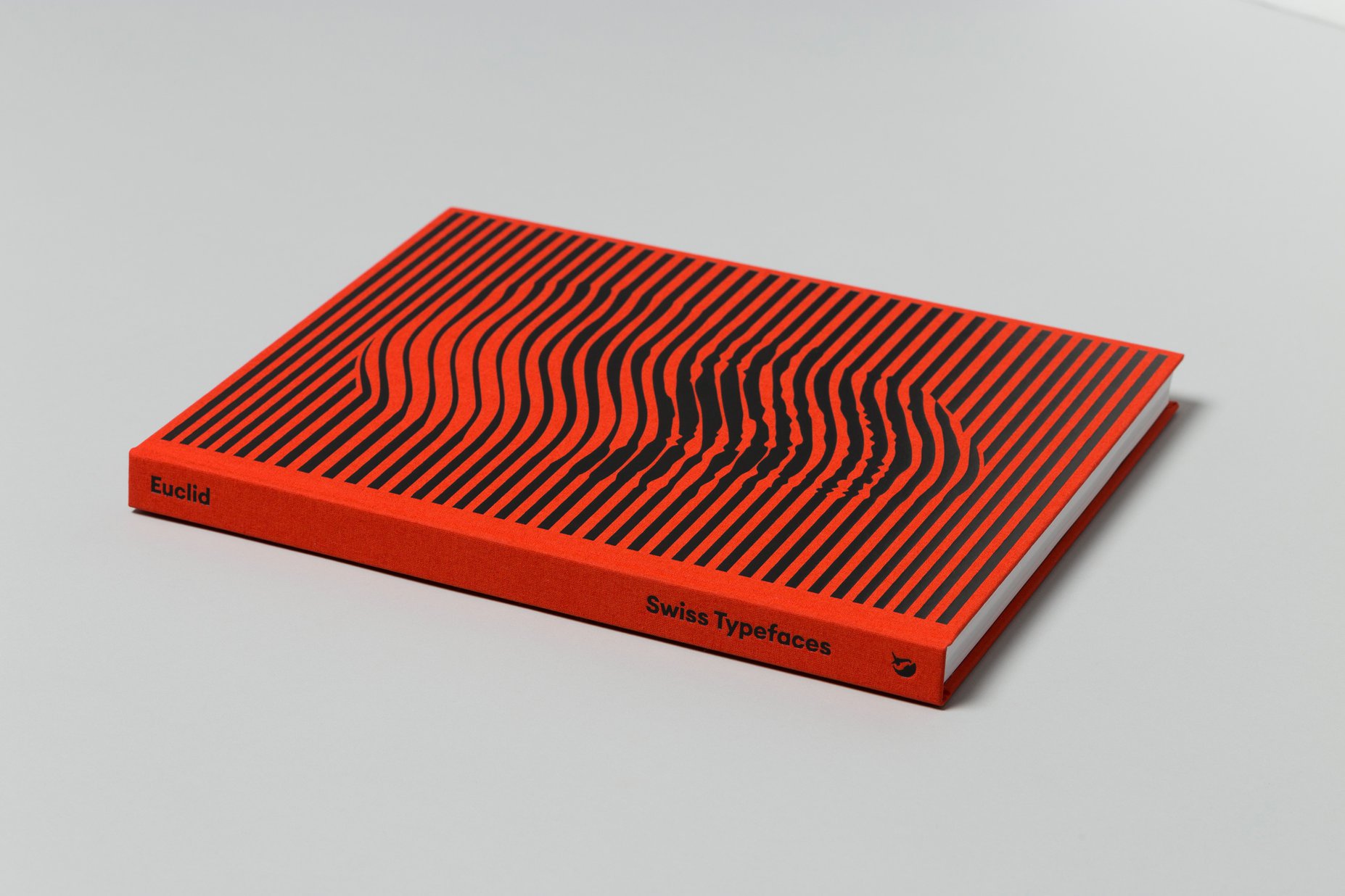
Hubertus Design arranged for a splendid production. The extraordinary experience – both visual and haptic – is initiated by the cloth cover with illustration and type blocked in black. Equally black endpapers transition over to the interior: While the text pages are printed in black on natural stock, the photographic images are reproduced in color on calendered paper. They’re additionally coated with a thick layer of superglossy spot varnish. Only the keen-eyed observer will notice that some parts have been omitted from this treatment, leaving matte areas with secret messages. Throughout the book, we find pages distinguished by yet another, thinner material. Printed in a warm red tint, they link the type specimen to the novel and vice versa, with text snippets that reference elements from Whitewater’s story, typographically staged to highlight special features of the fonts. At 24,5 × 31,5 cm, the new book has the exact same dimensions as the first one about SangBleu, making for a nicely matching pair on your shelf.
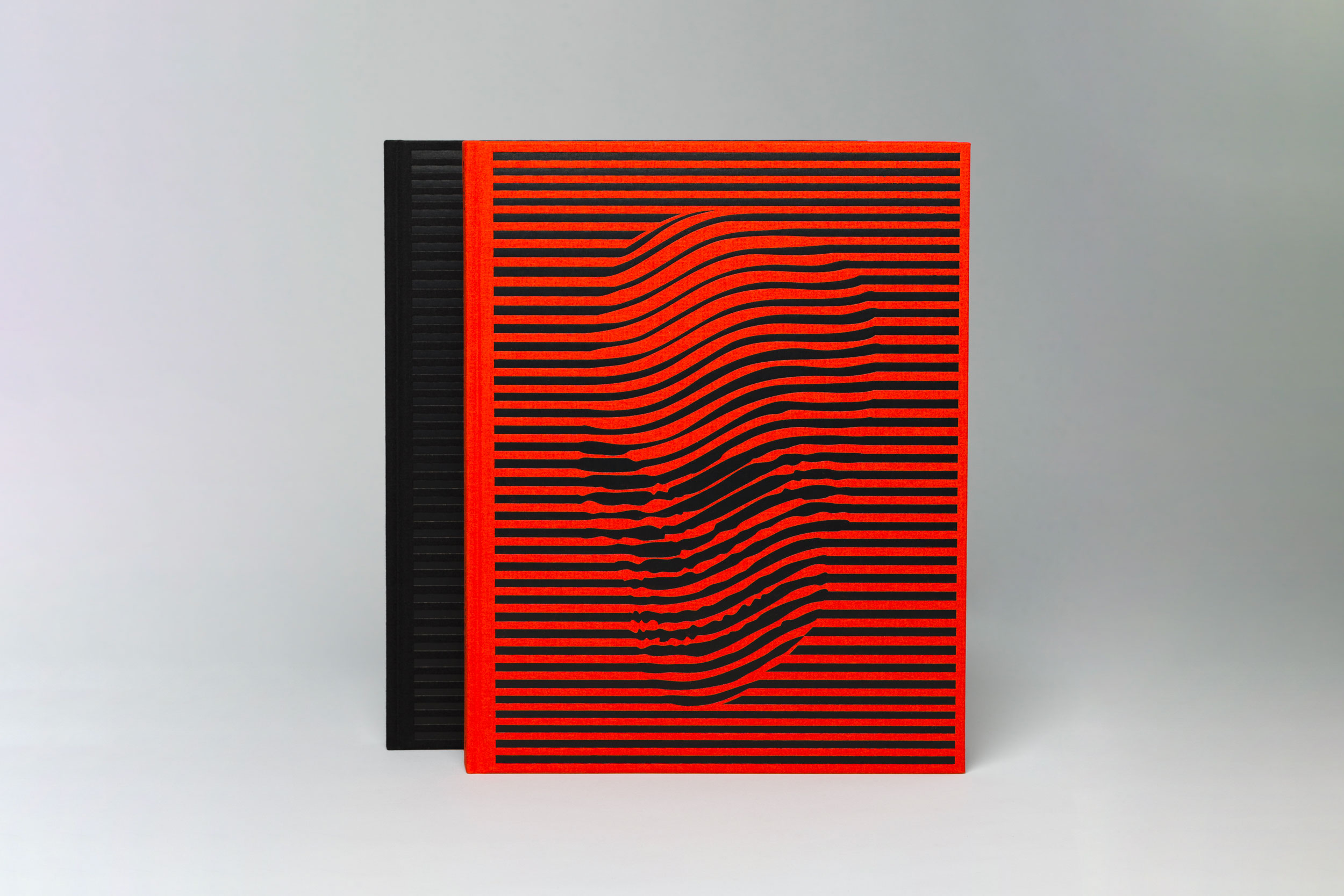
“Euclid – Typeface Mystery No. 1” has been produced in two hardback versions. The Standard Edition with a red cover can be had for 50 CHF. The Ultimate Edition is a limited run that is sold at 200 CHF. Not only is it distinguished by a special cover featuring a black-on-black version of Scalin’s skull art. It’s a bundle that includes both the book and the typeface at a bargain price: each copy of the Ultimate Edition comes with a gift card hidden somewhere inside the book. Once you’ve extracted it (surgical equipment required), it will allow you to download the complete Euclid Typeface for free. That’s 5 collections with 54 styles, to the value of 405 CHF. In other words, you’ll get the fonts for half the standard price – and the book on top!
.
Print / Binding: Musumeci S.p.a
Cover material: Cloth Balatex Imperial 4440
Paper: Munken Polar Rough/Maxi Satin/Prolight
Reproduction pictures of the book: Studio GG58
Fonts: Euclid Circular A, Euclid Circular B, Euclid Square, Euclid Triangle,
Euclid Flex and Euclid Stencil (designed by Emmanuel Rey / Swiss Typefaces)
Euclid Mono Vanguard (designed by Emmanuel Rey, Quentin Schmerber / Swiss Typefaces)
Font Engineering: Christoph Koeberlin
Hardcover, 264 pages, 24.5 cm x 31.5 cm
Concept & Art Direction:
Hubertus Design (Matthias Michel, Jonas Voegeli, Lea Fischlin, Kerstin Landis)
Typeface descriptions:
Florian Hardwig
Novel
Matthias Michel
Photos
Matthieu Gafsou
Illustration Cover:
Noah Scalin (www.noahscalin.com)
OR
You need to create an account to manage
orders, licenses, free trials and more!